
Using Excel for Data Analysis and Graphing
Inter-Chapter 3
- These instructions are for Office 365 installed on the lab laptop computers. If you are using a Windows machine, or an older version of Office, these instructions may not be accurate.
- Excel is a spreadsheet program we’ll use to manage and analyze data. You will be using this program repeatedly throughout Biology 2120L. Other graphing programs will not be sufficient. If you need assistance locating Excel for your computer, consult with your TA. These instructions are written generally to help you choose the best way to analyze your data throughout the semester. Feel free to come back to this guide at any time to refresh your skills.
- Video tutorials are provided on Canvas to supplement these instructions. Read these instructions and view the video tutorials to complete the Excel assignments. Consult with your TA if you have additional questions.
This inter-chapter includes information on how to complete data analysis and graphing that you will use for various labs throughout the semester. Refer back to this information as frequently as you need throughout the semester.
Get Familiar with Excel
- Grab a lab laptop and turn it on. Once it has booted up, locate Excel on the computer you are using. Open Excel by clicking on the Excel icon on the dock and select “new document” or open a saved file if you have it.
- An Excel worksheet is arranged by columns, labeled with letters; and rows, labeled with numbers. Each box or cell on the worksheet corresponds to a column/row location. For example, when you open Excel, the highlighted cell is A1. Going down the column the next cell is A2. If you go to the right of cell A1, that cell is B1, and so on.
- You enter data into Excel by clicking on a cell, then typing in that cell. You can enter a number or text within a cell. To move around in a worksheet click on the desired cell. You can also use the arrow keys on your keyboard to move you from cell to cell.
- Always include your name and section number on your Excel file.
Graphing Your Data
- Click and drag to highlight the columns of data that you want to graph. Make sure you include the column titles when highlighting.
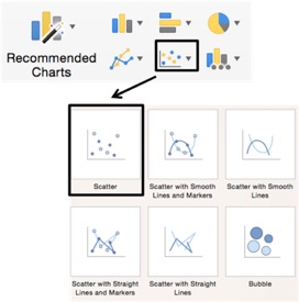
- Click the Insert Tab in Excel’s Ribbon. Find the section, in the middle of the ribbon, that has chart options. Move your cursor over the different chart types to see the chart descriptions. In this lab we most commonly use the X Y (Scatter) option and Scatter from the drop-down menu as shown in the photo on the right. This is the right option to use if you want to create a best fit line. You can also choose other options for graphing as you need.
- A graph of your data should appear on your spreadsheet. It may not have titles or axes labels. Before fixing this, check to make certain the dependent variable is on the Y-axis, and the independent variable is on the X-axis.
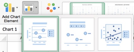
- If your graph does not show your axis labels or title, click on the graph. This will open the Chart Design tab in Excel’s ribbon. Click on the icon called Quick Layout, as shown on the right, and choose the first option that includes a title, axis labels, and a legend.
- Click and drag on a corner of your graph window to adjust it to your desired size. To move the graph to a new location in the Excel window, click and hold anywhere in the white space and your graph outside your grid lines and move it to a new location.
- Click and drag to select the text in the title box, then type your title. Make sure your title has details and is specific.
- Scientific graphs rarely use gridlines within the graph. Click on one gridline to select all the gridlines, then hit the delete key to delete them. You should do this for every graph you create.
- The legend Excel provides for this graph might not be necessary or informative. If so, remove it by clicking on it and hitting the delete key.
- Click on the X-axis title. An axis title box will appear on your graph – click in it and enter the title and units of measurement for your X-axis variable. Entering units in your axis titles is extremely important!
- Click on the Y-axis and enter the variable name and units of measurement for your Y-axis variable.
- If you want to personalize your graph by using different colors or changing design options, click on your graph to select it. The Chart Design tab will appear in Excel’s ribbon. Choose the tab called Format to view your options. Feel free to experiment to make the graph your own!
Analyzing Data for Best- Fit Line
Take a minute and look at your data points. If they fall in a relatively straight line, you can use Excel to calculate and draw a best-fit straight line through your data set as follows.
- Control-click on one of the data point symbols in your graph, then choose Add Trendline from the options. A Format Trendline window will open.
- Click on Trendline Options, and select Linear. Excel will use a statistical technique called linear regression to create a straight line that is the best possible fit to your data.
- Now scroll down in the Format Trendline window and check the boxes marked Display equation on Chart, and Display r-squared value on chart. Those options will give you the equation for your regression line and a statistic called r2. Display the equation and r2 value each time you insert a trendline. An example graph is shown on the right with sample data. This is not necessarily what you graph will look like.
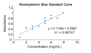
- The r2 statistic measures how well the straight line describes your data. It is a number between zero and one that tells you what fraction of the variation in y-axis values you can account for if you know their x-axis values. An r2 of one means that all the points lie right on the line – if you know concentration, you can predict absorbance perfectly. An r2 of zero means that there is no linear trend to the data, and knowing concentration will not tell you anything about absorbance. The higher the r2, the better the line fits the data points.
- Click and drag to move the equation or r2 value to the part of your graph that they can easily be seen.
Creating a Derivative (rate of change) Plot
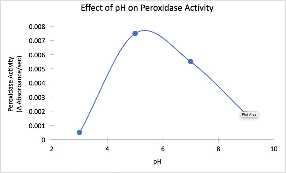
A derivative graph is a figure that is used to describe the rate of change of the variable that we measured in our experiment. The higher on the Y axis our values are, the faster the rate of change is occurring at that given X axis value. In the example below, the rate of activity for peroxidase peaks at around 5.5 pH. Before you can create a derivative plot, you need to have the slopes for each treatment. That can be done by creating best fit lines and using the equation provided for each treatment to determine the slope (rate). The slope is the number before the “x” in the equation.
- In a new table, create a column for treatment and a column for rate/slope.
- Enter your slopes for each treatment.
- Once you have all of your data entered, Click and drag to highlight the columns of data that you want to graph. Make sure you include the column titles when highlighting.
- Click the Insert Tab in Excel’s Ribbon. Find the section, in the middle of the ribbon, that has chart options. For a derivative plot, a best fit line is often not the best representation of your data. Instead, we want to use a smooth line to connect the points and visualize the data. Move your cursor over the different chart types to see the chart descriptions. Choose the X Y (Scatter) option and Scatter with Smooth Lines and Markers from the drop-down menu. An example of what this may look like is shown below.
- If you want to edit your graph, add axis labels, add a title etc., follow the instructions in the previous “Graphing your data” section.
Calculating Mean and Standard Deviation
- If you have multiple measurements per treatment and want to know the average or mean value of each group, you can calculate that in Excel. First click in an empty cell and label it with the word “average” and the name of your treatment. Make sure you label everything clearly, so you know which means goes with which treatment.
- In the cell next to it you will enter the prompts necessary for Excel to calculate your average. Begin by writing “=average”. As soon as you start typing the word average, a drop-down menu will show up next to your text.
- Choose “average” from the menu. This will auto-populate the cell with “=average()”. Select the cells/values that you want to calculate the average of. Do this by clicking on the first value and dragging to select all of the values you want to include in the calculation.
- Then hit the Return or Enter key. Always end a formula by hitting the Return/Enter key. When you hit the Return or Enter key, the average measurement for your treatment should appear. If you click anywhere else, Excel will add the cell in which you clicked to your formula. You will need to do this same process for each treatment.
- If you want to calculate the standard deviation of your treatments, you can do this in the same way. Begin by choosing an empty cell and label it with the words “Standard deviation” and the name of your treatment.
- Now enter a formula to get the standard deviation. In the cell next to your label, begin writing “=stdev.s”. As soon as you start typing the word average, a drop-down menu will show up next to your text. Choose “STDEV.S” from the menu. This will auto-populate the cell with “=stdev.s()”.
- Select the cells/values that you want to calculate the standard deviation of. Do this by clicking on the first value and dragging to select all of the values you want to include in the calculation. Hit the Return/Enter key.
- Your calculated standard deviation should appear. Remember to round this value to the appropriate number of significant figures. You will need to repeat the process for each treatment.
Save your Tables and Graphs
- From the File menu, select Save As. Name your file and select the save location.
- Make sure to save the file to Cybox or send it to yourself through email. Make sure that your file uploads completely to Cybox before closing. Lab laptops will delete all student files when they are shut down, so it is important that you save your file carefully before leaving lab.
- You will need to upload your completed file to Canvas for submission of your weekly assignments requiring graphs and tables.
