
2 Quantitative Techniques and Organic Molecules
After the week 2 lab, students will be able to:
- Demonstrate proper use of common laboratory equipment, including balances, pipettes, dispensers, and spectrophotometers
- Create a standard curve and use it to identify unknown concentrations of compounds
- Perform simple data analysis and data visualization techniques
- Identify bonds and functional groups of organic molecules and describe how they influence chemical behavior
-
Make connections between the structure and function of monomers and the macromolecules they form
Contribution Points:
 Consult with your TA to receive a stamp at the end of your lab period.
I have completed the necessary tasks during this week’s lab to earn Contribution Points. I am aware that point(s) may be deducted if my workspace is not appropriately clean at the conclusion of lab.
Introduction
During today’s lab, your objective will be to learn how to use many of the common pieces of lab equipment that you will utilize repeatedly in this course including balances, micropipettes, repeating pipette dispensers, spectrophotometers, and some of the software available on the lab computers. There are 4 different stations set up in the classroom. Each one is designed to teach you how to use a particular piece of equipment.
There are instructions at each station that will provide you with the information that you need to complete the activity. There are also video tutorials on the laptop computers that provide you with instructions on how to use the equipment. Please watch the video tutorial(s) carefully before beginning each exercise; then follow the directions to complete the activity. Complete the data tables and answer questions in your lab manual as you complete the lab activity. You will utilize this information to complete the post-lab assignment on Canvas.
Each station is set up with multiple copies around the lab classroom. Feel free to start at any station you would like. You do not need to wait in line to complete these in a specific order.
Station A: Balance Station
Not all pieces of equipment (even if they are the same model) will work exactly the same with every use. Many factors (general usage, wear and tear, improper usage, etc.) can impact that equipment’s ability to function properly. In order for a balance to work most effectively, it should be calibrated carefully. However, calibration takes time, skill, and isn’t always possible if you don’t have all the necessary tools available. The three balances in front of you have all been calibrated at some time in the past but may no longer be reliably accurate. They will all provide a mass for the objects you place on them, but the mass they report may have a degree of error, both within each balance and between balances. It will be your job to determine how much error is present in the readings you obtain from the three balances at this station.
- Please watch the video tutorial in order to learn how to use the balances.
- Choose two objects to weigh from the selection provided. You will need to choose one “heavy” object and one “light” object.
- Record the identity of each of your objects at the top of Table A.1.
- Weigh each of your selected objects on each balance at this station 3 times and record your data in Table A.1. Remember when you use a balance that you need to “tare” it with an empty weigh boat before taking EACH measurement. This removes any stored measurements from the balance so it will start its measurements from “0”, making sure to remove as much error as possible.
- After you have 3 measurements for each object from each balance, calculate the average mass for balances 1, 2, and 3 for both the “heavy” and “light” object in Table A.1 and in Table A.3.
- When you finish weighing your objects, please return them to the appropriate tray.
Station A: Balance Station
Complete this worksheet as you work through the activities in the first week’s lab. You can work in pairs but the answers to each question should be in your own words.
Light Object:
Heavy Object:
| Balance # | Mass 1 (g) | L.O. Mass 2 (g) |
L.O. Mass 3 (g) |
L.O. Avg Mass (g) | H.O. Mass 1 (g) |
H.O. Mass 2 (g) |
H.O. Mass 3 (g) |
H.O. Avg Mass (g) |
|---|---|---|---|---|---|---|---|---|
| Balance 1 | ||||||||
| Balance 2 | ||||||||
| Balance 3 |
| Measure | Light Object | Heavy Object |
|---|---|---|
| Expected Mass |
| Balance # | L.O. Average Measured Mass (g) |
L.O. % Error (absolute value) | H.O. Average Measured Mass (g) |
H.O. % Error (absolute value) |
|---|---|---|---|---|
| Balance 1 | ||||
| Balance 2 | ||||
| Balance 3 |
Analysis
Now that you have the mass of your objects, you will need to complete some simple statistics to determine if the mass you measured is what would be expected for each item. This will provide you with information about the accuracy of each of the balances you used. At the balance station there is a folder or flip card that contains the expected mass for each of the available items. Locate the information for the two items you selected and record their expected masses in Table A.2.
To calculate the % error of your measurements from each balance, use the equation below. Fill out Table A.3 to determine the percent error of each balance. Note: % error is an absolute value.
[latex]\% \text{error} = \frac{\text{measured value } – \text{ expected value }}{\text{expected value }} \times 100[/latex]
Which item (light or heavy), has a greater % Error? Why might this be the case?
Which balance has a greater % Error? Why might this be the case?
Station B: Pipette Station
Micropipettes are an important piece of lab equipment that you will utilize repeatedly during the course of the semester. They are also often used incorrectly by students, which can result in damage to the pipette and/or the dispensation of inaccurate volumes which can cause your experiment to fail. It is important that you learn how to effectively use a micropipette during today’s lab so you can use them in future labs without error. Carefully watch the video tutorial on one of the lab laptop computers. Once you have watched the video, proceed with the activity below.
1 Liter (L) = 1000 milliliters (mL)
1 milliliter (mL) = 1000 microliters (µl)
Micropipettes come in a multitude of sizes. Each size of micropipette will dispense solution in a specific range of volumes. It is important that you use the pipette correctly and do not attempt to dispense volumes that are outside its stated range. There are two different pipettes at this station, one that will dispense volumes under one milliliter (range dependent on model of micropipette) (small pipette) and one that will dispense volumes between 1 milliliter and 5 milliliters (large pipette).
One way to determine whether or not a pipette is dispensing the desired volume accurately is to use a balance to weigh the dispensed solution (we will use water), then use the expected weight of the volume of solution to check the accuracy.
We can figure out the expected weight of a specific volume of water because we know that the density of water at room temperature is 0.998g/mL. Since Mass = Density × Volume, 1.0 mL of water at room temperature would be expected to weigh 0.998g.
Your TA will have a cup on the TA bench that contains various cards with volumes written on them. Draw one paper from the Station B cup and record the volumes in the spaces provided on the assignment worksheet under Station B. Use these volumes for the activity at this station. Once you have recorded the volumes, please place the paper in the “Used Volumes” container.
- At this station, you will find two pipettes (one that dispenses volumes in a range of 200 µl to 1200 µl (0.2 mL to 1.2 mL) and another that dispenses volumes in a range of 1 mL to 5 mL, a balance, a small beaker, a large beaker of water, and pipette tips in two sizes.
- Select the small (0.2 mL to 1.2 mL) pipette and set it to dispense the volume that you selected from the cup on the TA bench.
- Place the small beaker onto the balance.
- “Tare” the balance so it reads “0.0 grams”. “Taring” the balance removes any stored measurements from the balance so it will start its measurements from “0”, making sure to remove as much error as possible.
- Place a blue pipette tip onto the pipette and carefully draw the designated volume of water into the tip.
- Dispense the water into the beaker on the balance. Be careful not to apply too much pressure on the pipette when you draw and dispense the solution. Record the mass of the dispensed volume in first column in Table B.1 as “measurement 1”.
- “Tare” the balance so it reads “0.0 grams”. As long as you “tare” the balance between measurements, you do not need to dump the old water out.
- Again, carefully draw the designated volume of water into the pipette tip and dispense the water into the beaker on the balance. Record the mass of the dispensed volume in Table B.1 as “measurement 2”.
- Repeat steps 6 – 8 two additional times (making sure to “tare” the balance between each measurement) for measurements 3 and 4 so you have a total of 4 measurements. Make sure to record all measurements in Table B.1.
- Eject the pipette tip and return it to the correct location at your station.
- Repeat all of the above steps using the large (1 mL to 5 mL) pipette so you have 4 measurements for each of your pipettes. Make sure you use the natural colored tips for this pipette.
- Once you have all of your measurements, calculate the average mass dispensed for both the small and large pipettes in the shaded row of Table B.1 and the second row of Table B.2.
Station B: Pipette Station
Assigned Volume for 200 µl to 1200 µl (0.2 mL to 1.2 mL) Pipette:
Assigned Volume for 1 mL to 5 mL Pipette:
| Measure | Small Pipette Mass of dispensed volume (g) |
Large Pipette Mass of dispensed volume (g) |
|---|---|---|
| Measurement 1 | ||
| Measurement 2 | ||
| Measurement 3 | ||
| Measurement 4 | ||
| Average |
Now that you have your measured values, do you notice any differences between them? Are all of your measured volumes for the small pipette the same?
Are all of your measured volumes for the large pipette the same?
Why might there be differences?
Analysis — % Error
To determine how accurate your pipetting is, you will use some simple statistics to calculate how much difference there is among your measured volumes. To do this, you should determine the expected mass for each of your volumes using the equation below. Record the expected mass for each volume in the first row of Table B.2.
The expected mass of the volume of water you dispensed can be calculated using the equation below. The density of water at room temperature is 0.998g/mL.
Expected Mass = Density × Volume
Calculate the % Error for each of your measurements and record them in the last row of Table B.2. Note: % error is an absolute value.
[latex]\% \text{error} = \frac{\text{measured value } – \text{ expected value }}{\text{expected value }} \times 100[/latex]
| Measure | Small Pipette | Large Pipette |
|---|---|---|
| Expected mass of assigned volume (g) | ||
| Average measured mass (g) | ||
| % Error |
Which pipette (small or large) had larger % Error? Why might this be the case?
Station C: Dispenser Station
During the course of the semester, you will find it necessary to dispense varying volumes of solutions in order to complete lab experiments. Our labs utilize a number of different dispensing options throughout the semester, so it is important that you gain some experience with each type of dispenser so you know how to use it when you encounter it in lab.
When having to dispense the same amount of solution multiple times (or by multiple people), it is often helpful to utilize a repeating pipette dispenser (especially if it is important that the solution amounts be exact each time). This dispenser consists of a bottle with a pipetting mechanism at the top which draws up the solution in the bottle to dispense it into the receptacle of your choice. We have varying types of repeating pipette dispensers in the lab, though they all function in the same manner.
Another dispenser you may encounter in lab is a squeeze bottle measuring dispenser. In this type of dispenser, a small measuring cup sits on top of a tube that runs inside a bottle. When you gently squeeze the bottle, solution is pushed up into the measuring cup. When you release the bottle, any excess solution drains back into the bottle and the desired volume of solution can be poured directly into the receptacle of your choice.
Please watch the video tutorial available on the laptop computers before doing the activity in order to learn how to use all dispensers correctly.
Each of the dispensers has been carefully set to dispense a specific volume for this exercise. In fact, each time you see a dispenser in lab, it will have been carefully set to a specific volume for your lab exercise. Never change the settings on the dispensers! If you notice that the dispenser is not dispensing the correct volume, consult with your TA so he or she can reset it for you.
All of the dispensers contain a solution dyed with red food coloring that will make it easier for you to see as you complete this exercise. One of the dispensers is set to dispense 1.0 mL of solution, another to dispense 5.0 mL of solution, and a third to dispense 9.0 mL of solution. In addition to the dispensers, there are several measuring devices available to you at this work station. You will find beakers, graduate cylinders, and #asks (in multiple sizes) for you to use as you complete the exercise.
To help you make comparisons in the lab, we have also placed a bottle of solution at the station which you will use to pour 7 mL of solution directly into a receptacle.
- Select any three different measuring devices (beakers, graduate cylinders, #asks) from the choices available to you at this station. You will use the same three devices for all of your measurements.
- Using the dispenser set to 1.0 mL, dispense 1.0 mL of solution into each of the 3 measuring devices.
- Set them side by side and visually compare the volumes using the gradations on the device. The same amount of solution has been dispensed into each of the three devices (as assured by using the dispenser), but does it appear as though each device has the same amount of solution?
- Dump the solution from the three measuring devices into the waste container at the station.
- Dispense 5.0 mL of solution into the same three measuring devices using the dispenser set to 5.0mL at the station.
- Place them side by side and compare them. Again, these measuring devices should all contain the same amount of solution. Do they appear as though they all contain the same amount?
- Dump the solution from the three measuring devices into the waste container at the station.
- Dispense 9.0 mL of solution into the same three measuring devices using the dispenser set to 9.0 mL at the station.
- Place them side by side and compare them. Again, these measuring devices should all contain the same amount of solution. Do they appear as though they all contain the same amount?
- Dump the solution from the three measuring devices into the waste container at the station.
- Now you will try simply pouring out the solution into your measuring devices. Using the bottle of solution at the station, pour out 7.0 mL of solution into each of your three measuring devices. Did you have any difficulty pouring out the correct volume into each measuring device?
- Place them side by side and compare them. Again, these measuring devices should all contain the same amount of solution, but it may have been more difficult for you to determine when you had poured out the correct amount, depending on the measuring device. Do they appear as though they all contain the same amount?
- Dump the solution from the three measuring devices into the waste container at the station.
Station C: Repeating Pipette Dispenser Station
At this station, you dispensed 3 volumes (1.0 mL, 5.0 mL, and 9.0 mL) into 3 different measuring devices and made visual comparisons of each of these volumes.
After dispensing the designated volumes from each type of dispenser into each of the measuring receptacles you made visual comparisons of the solutions in each receptacle. Did it appear as though they contained the same amount of solution? Why or why not?
After using the dispensers, you were asked to pour 7.0 mL of solution directly into your 3 measuring devices.
When comparing the 3 devices side-by-side, do they appear as though they contain the same amount of solution? Why or why not?
Based on your experience at this station in lab, which option for dispensing solution would you prefer to use in future labs? What reason(s) do you have for selecting this option?
Based on your observations at this station, which of the available dispenser options provides you with the most accurate and consistent volume when dispensing liquids? What evidence do you have to support this observation?
Station D: Spectrophotometer Station
A spectrophotometer is a machine that uses light absorbing properties to identify and quantify colored solutions. You will use the spectrophotometer repeatedly throughout the semester in Biology 2120L. Having an understanding about how a spectrophotometer works will be beneficial in helping you interpret the data it produces.
To help you understand how a spectrophotometer works, watch the spectrophotometer video linked on the course Canvas page.
To help you understand how to use the specific model of spectrophotometer used in our labs, please watch the video tutorial on one of the lab laptop computers. Once you have watched the video, you can begin the activity designed for this station.
When using a spectrophotometer, you can collect data in either percent transmittance (which is reported on a scale from 0 to 100), or absorbance (which can range from 0 to 2.5). The relationship between light absorbance and transmittance is shown in the equation below.
A = log10(1/T)
A = Absorbance
T = Transmittance
Because light absorbance units are directly and linearly related to the concentration of the substance(s) in solution (the higher the concentration the higher the absorbance), we prefer to collect our lab data in absorbance units. This direct and linear relationship between solution concentration and light absorbance units is known as the Lambert-Beer Law.
For this exercise, we will be using a dye called bromophenol blue. This dye is often used as a color marker in agarose gels and as a pH indicator. For our purposes, it is a dye that changes the color of solution—the higher the concentration of bromophenol blue, the darker the color of the solution.
We have prepared a set of cuvettes (or tubes) for you to use in your investigation today in lab. These cuvettes contain bromophenol blue solutions in varying concentrations.
- Each student in your lab section will be given a cuvette containing a bromophenol blue solution of a specific concentration.
- Each cuvette is labeled only with a sample number. It will be your job to obtain the absorbance of that sample’s solution and report it on the class data sheet.
- Follow the instructions from the spectrophotometer video to collect your measurements.
- Record your cuvette sample number and the absorbance of this sample at six wavelengths in Table D.1.
- Remember that you need to “blank” the spectrophotometer each time you change the wavelength.
- At each wavelength, record the color of light used in the spectrophotometer. You can do this by inserting a narrow strip of white paper into the sampling chamber and looking at it with your hands cupped to block out light from the lab. Record the color you see at each wavelength in Table 1.D.1. Note: If you are using the Genesys30 Spectrophotometers, you will need to blank the spectrophotometer at each wavelength before you will be able to view the light color.
| Wavelength | Light Color | Absorbance for Sample Cuvette #______ |
Absorbance for Sample Cuvette #______ |
|---|---|---|---|
| 440 | |||
| 540 | |||
| 580 | |||
| 590 | |||
| 600 | |||
| 660 |
- After you are done, return the cuvettes to the box labeled USED CUVETTES on the TA bench. DO NOT dump these out.
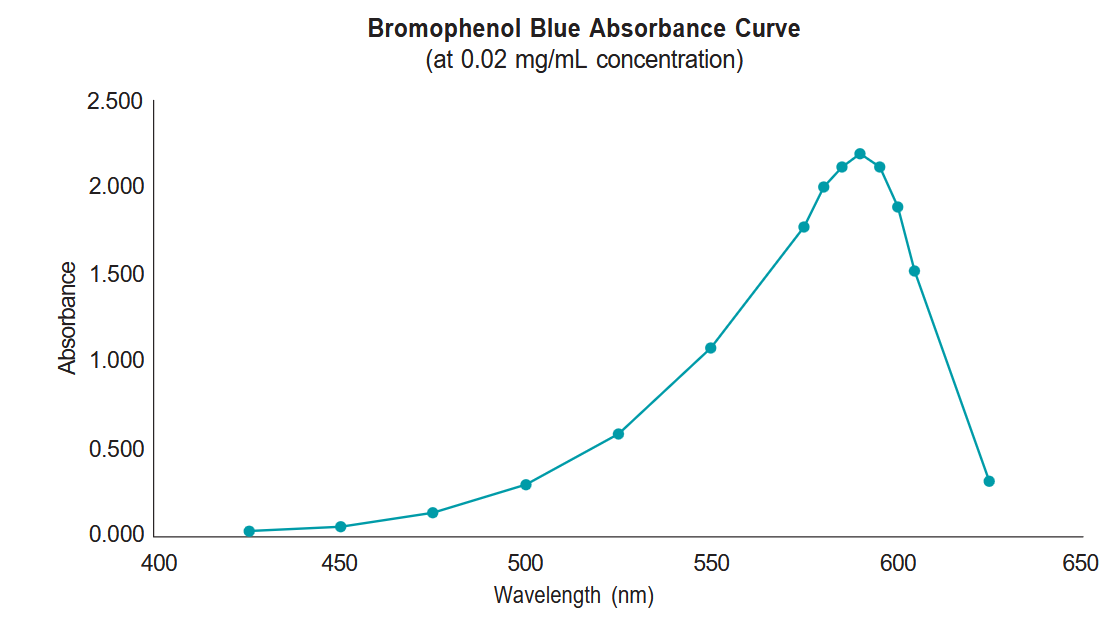
- We have already taken a careful look at the absorbance properties of bromophenol blue and have created an absorbance curve (below) that shows the absorbance of a solution of bromophenol blue (concentration of 0.02 mg/mL) at a series of light wavelengths. You can see from this graph that the wavelength that provides the greatest absorbance is 590 nm. In order to get the most reliable results for studying changes in bromophenol blue concentrations, it will be important to choose this wavelength for measuring your sample.
- Report the measurement of your sample at 590 nm to your TA. They will compile a class data sheet with all of your classmate’s measurements and you will use this data to create your graph.
Graph Your Data
Once all of the students in your lab section have obtained their sample’s absorbance, your TA will compile the class data file and make it available to you via the projector. YOU CAN NOT MAKE THE GRAPH UNTIL THE CLASS DATA IS PROVIDED BY YOUR TA. Open the Excel template labeled “Week 2 Lab Template” on one of the lab laptop computers and use the data from the class data sheet to work through the Excel instructions in Appendix: Ch. 2 to create a standard curve. Once the graph is complete, move on to the next section.
Report your sample’s absorbance at 590 nm on the class data file.
Follow instructions in your lab manual to complete the Excel activity associated with this station.
Note: You will need to upload your Excel file containing your data table and graph on Canvas for credit.
When constructing your graph in Excel, you will add a trendline that is the best fit for your data. Write the equation for this line from your graph on the line below:
Using the equation calculated for you on your graph, calculate the concentration of your “unknown” using the instructions below.
“Unknown” Absorbance:
Calculated Bromophenol Blue Concentration:
Calculating an Unknown Concentration
After you have created your graph, you can use it to make conclusions about additional data points. The graph you created using the instructions in Appendix: Ch. 2 should include an equation for the line that best fits the class data.
This equation is in the format:
y = mx + b
Where:
- y = absorbance
- m = slope of the line (Excel has calculated this for you)
- x = concentration of bromophenol blue in solution
- b = the location of the y-intercept of the line (Excel has calculated this for you)
On the TA bench, there will be a small bin labeled “Station D Unknowns” that contains pieces of paper with absorbance readings for bromophenol solutions with unknown concentrations written on them. Draw one piece of paper from this beaker and record your unknown absorbance on your assignment sheet. Return your paper to the “Used Absorbances” cup on the TA bench.
Since your unknown sample contains bromophenol blue, we know that it should fall along the same best fit line as your class data sample, so you can use the equation from your best fit line to calculate this unknown’s bromophenol blue concentration by only knowing its absorbance! Record both your unknown absorbance reading and calculated bromophenol blue concentration.
Investigating Organic Molecules
Cells are made up of many organic molecules. These organic molecules have a carbon backbone and contain various functional groups. The functional groups influence the behavior of the molecule within the aqueous environment of an organism and the chemical reactions the molecule can participate in. The types of atoms and bonds found in a molecule determines whether it: can participate in hydrogen bonding with water (hydrophilic) or cannot (hydrophobic), can release protons into (act as an acid) or attract protons from (act as a base) solution, or can form bonds with other molecules through condensation reactions to create larger molecules.
When smaller molecular subunits are joined together, they can form macromolecules. There are four main categories of macromolecules in cells: proteins, nucleic acids, carbohydrates, and lipids. These compounds have different properties because of the arrangement of the carbon atoms and the functional groups in their subunits, which leads to their vastly different functions in the cell.
According to the textbook (Freeman 8th ed, p. 79):
“When you encounter an organic molecule that is new to you, it’s important to do the following three things:
- Examine the overall size and shape provided by the carbon framework
- Identify the types of covalent bonds present based on the electronegativities of the atoms. Use this information to estimate the polarity of the molecule and the amount of potential energy stored in its chemical bonds.
- Locate any functional groups and note the properties these groups give to the molecule.
Understanding these three features will help you predict the molecule’s roles in the chemistry of life.”
This activity is designed to give you practice doing this. It will also familiarize you with the properties of various organic compounds that will be used in future labs, such as proteins (Week 3), carbohydrates (Week 4), and nucleic acids (Week 6). You should observe the models of molecules (water and organic molecules) and fill out the table concerning each molecule’s properties and predicted behavior.
To aid you with this, answer these questions first:
- Which six elements account for 99% of the atoms in your body?
- Which four elements in question 1 have roughly equal electronegativity, and therefore would form nonpolar covalent bonds with each other?
- Which two elements from question 1 have greater electronegativity, and therefore would form polar covalent bonds with the elements in question 2?
- Nonpolar covalent bonds make a molecule more (circle one) hydrophobic / hydrophilic.
- Polar covalent bonds make a molecule more (circle one) hydrophobic / hydrophilic.
| 1. Shaded boxes have already been filled out as an example.
2. Looks different in ring. 3. Consider: how many polar vs. nonpolar bonds overall? Are exposed regions nonpolar or partially or fully charged? |
|||||||
| Properties | Water | Leucine | Serine | Stearic acid | Phospholipid | Glucose | AMP |
|---|---|---|---|---|---|---|---|
| Type of molecule | — | Amino acid | Amino acid | Fatty acid | — | Mono- saccharide |
Nucleotide |
| Elements present (circle all) |
C H O N P S | C H O N P S | C H O N P S | C H O N P S | C H O N P S | C H O N P S | C H O N P S |
| Number of carbon atoms | 0 | ||||||
| Functional groups (draw, then find each on the molecule model) |
none |
Amino:
Carboxyl: |
Amino:
Carboxyl:
Hydroxyl:
|
Carboxyl: | Phosphate: | Hydroxyl:
Carbonyl:2 |
Hydroxyl:
Phosphate:
Amino:
|
| Types of bonds present (circle all) |
Polar covalent Nonpolar cov. |
Polar covalent Nonpolar cov. |
Polar covalent Nonpolar cov. |
Polar covalent Nonpolar cov. |
Polar covalent Nonpolar cov. |
Polar covalent Nonpolar cov. |
Polar covalent Nonpolar cov. |
| Hydrophilic, hydrophobic, or amphipathic? | hydrophilic | ||||||
| Why?3 | Only polar covalent bonds present, so partial charges would interact with water | ||||||
| Type of macromolecule it could contribute to? (circle one) | N/A |
Carbohydrate Lipid Nucleic acid Protein |
Carbohydrate
Lipid Nucleic acid Protein |
Carbohydrate
Lipid Nucleic acid Protein |
N/A (it is a lipid) | Carbohydrate
Lipid Nucleic acid Protein |
Carbohydrate
Lipid Nucleic acid Protein |
Appendix: Ch.2
Using Excel for Data Analysis and Graphing
Read the following and watch the Week 1 graphing tutorial on canvas to help you make your graph.
Excel is a spreadsheet program we’ll use to manage and analyze data. You will be using this program repeatedly throughout Biology 2120L. It is important that you use Excel for the completion of your data tables and graphs in Biology 2120L. Other graphing programs will not be sufficient. If you need assistance locating Excel for your computer, consult with your TA. These instructions are written as a step-by-step guide to help you analyze the spectrophotometer data that you collected during this week’s lab, but the instructions can be applied to any type of graphs you make in the future. Feel free to come back to this guide at any time to refresh your skills.
| Tube | Concentration (mg/mL) | Absorbance @ 590nm |
|---|---|---|
| 1 | 0.0025 | |
| 2 | 0.005 | |
| 3 | 0.0075 | |
| 4 | 0.01 | |
| 5 | 0.0125 | |
| 6 | 0.015 | |
| 7 | 0.0175 | |
| 8 | 0.02 |
Get Familiar with Excel
- Grab a lab laptop and turn it on. Locate the “Week 2 Lab Template” file in the Week 1 Folder on the desktop. Use this document to enter your data for this week’s lab.
- An Excel worksheet is arranged by columns, labeled with letters; and rows, labeled with numbers. Each box or cell on the worksheet corresponds to a column/row location. For example, the first box highlighted in the photo on the right, is cell A3. Going down the column the next box is A4. If you go to the right of cell A3, that cell is referred to as B3 and so on.
- You enter data into Excel by clicking on a cell, then typing in that cell. You can enter a number or text within a cell. To move around in a worksheet, click on a cell. You can also use the arrow keys on your keyboard to move you one cell in the arrow direction.
Enter Your Data
- Take some time to get familiar with the template provided to you for this week’s lab. There are columns provided for tube number, concentration, and absorbance. The tube numbers are already provided for you. Your TA will provide you with class values for the concentration and absorbance columns.
- In cell A2 type your name.
- In cell C2 type your lab section.
- Your instructor will project the compiled class data with the values from the spectrophotometer station activity onto the projector screen. Use these numbers to fill in your template.
- Enter the absorbance of each tube (using the projected class data) starting with tube 1 in cell C10, in the column “Absorbance”. Repeat for the absorbance of tubes 2-8.
- Before moving on, double check to make sure that each measurement was entered correctly.
Make a Standard Curve
We will be using the data you entered in the template to create a graph called a standard curve. A standard curve allows us to visualize the relationship between our two variables, concentration and absorbance. Once graphed, we can fit a trendline to the data.
- Click and drag to highlight the columns “Concentration (mg/mL)” and “Absorbance”. Do not include the column “Tube.” Make sure you include the column titles when highlighting.
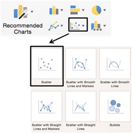
- Click the Insert Tab in Excel’s Ribbon. Find the section, in the middle of the ribbon, that has chart options. Move your cursor over the different chart types to see the chart descriptions. Choose the X Y (Scatter) option and Scatter from the drop-down menu as shown in the photo on the right.
- A graph of your data should appear on your spreadsheet. It may not have a titles or axes labels. Before fixing this, check to make certain the dependent variable (absorbance) is on the Y-axis, and the independent variable (concentration) is on the X-axis.
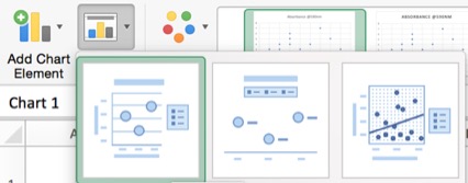
- If your graph does not show your axis labels or title, click on the graph. This will open the Chart Design tab in Excel’s ribbon. Click on the icon called Quick Layout, as shown on the right, and choose the first option that includes a title, axis labels, and a legend.
- Click and drag on a corner of your graph window to adjust it to your desired size. To move the graph to a new location in the Excel window, click and hold anywhere in the white space and your graph outside your grid lines and move it to a new location.
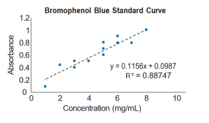
- Click and drag to select the text in the title box, then type your title. For this graph we can call it “Bromophenol Blue Standard Curve.”
- Scientific graphs rarely use gridlines within the graph. Click on one gridline to select all the gridlines, then hit the delete key to delete them. You should do this for every graph you create.
- The legend Excel provides for this graph is not necessary or informative. Remove it by clicking on it and hitting the delete key.
- Click on the X-axis title. An axis title box will appear on your graph – click in it and enter the title and units of measurement for your X-axis variable. In this case, “Concentration (mg/mL)”. Remember, entering units in your axis titles is extremely important!
- Click on the Y-axis and enter the variable name and units of measurement for your Y-axis variable. In this case, “Absorbance” (which has no units).
- If you want to personalize your graph by using different colors or changing design options, click on your graph to select it. The Chart Design tab will appear in Excel’s ribbon. Choose the tab called Format to view your options. Feel free to experiment to make the graph your own!
Analyze Data for Best-Fit Line
Take a minute and look at your data points. They should look pretty linear. Use Excel to calculate and draw a best-“t straight line through your data set as follows.
- Control-click on one of the data point symbols in your graph, then choose Add Trendline from the options. A Format Trendline window will open.
- Click on Trendline Options and select Linear. Excel will use a statistical technique called linear regression to create a straight line that is the best possible fit to your data.
- Now scroll down in the Format Trendline window and check the boxes marked Display equation on Chart, and Display r-squared value on chart. Those options will give you the equation for your regression line and a statistic called r2. Display the equation and r2 value each time you insert a trendline. An example graph is shown on the right with sample data. This is not necessarily what your graph will look like.
- The r2 statistic measures how well the straight line describes your data. It is a number between zero and one that tells you what fraction of the variation in y-axis values you can account for if you know their x-axis values. An r2 of one means that all the points lie right on the line – if you know concentration, you can predict absorbance perfectly. An r2 of zero means that there is no linear trend to the data, and knowing concentration will not tell you anything about absorbance. The higher the r2, the better the line fits the data points.
- Click and drag to move the equation or r2 value to the part of your graph that they can easily be seen.
Save Your Graph and Table
- From the File menu, select Save As. Provide a file name and save the file to the desktop.
- When the file appears on the desktop, make sure that you email it to yourself or save it on Cybox.
- Confirm that the file is saved properly so you will have access to it later.
