Part IV. ALGEBRAIC REASONING
12. Relationships Between Variables
In the previous chapter, our discussion of variables and functions largely assumed that relationships were known or developed independent of any measurement or data. However, functional relationships between variables can also be derived from data. Here, we explore two concepts that help us understand the strength and nature of systematic relationships between variables.
12.1 Correlation
In common parlance, the word correlation suggests that two events or observations are linked with one another. In the analysis of data, the definition is much the same, but we can even be more specific about the manner in which events or observations are linked. The most straight-forward measure of correlation is the linear correlation coefficient, which is usually written r (and is, indeed, related to the r2 that we cite in assessing the fit of a regression equation). The value of r may range from -1 to 1, and the closer it is to the ends of this range (i.e., [latex]\mid r \mid \rightarrow 1[/latex]), the stronger the correlation. We may say that two variables are positively correlated if r is close to +1, and negatively correlated if r is close to -1. Poorly correlated or uncorrelated variables will have r closer to 0.
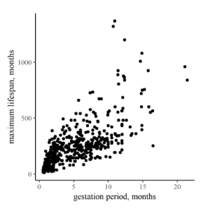
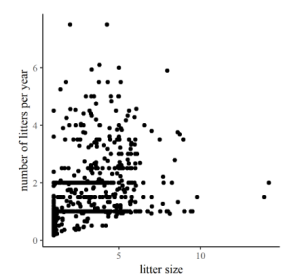
To the right are two plots comparing life-history and reproductive traits of various mammals. In the first one, Figure 12.1, the arrangement of points in a band from lower left to upper right on the graph is relatively strong, corresponding to a relatively high r of 0.73. In contrast, the correlation between litter number per year and litter size in Figure 12.2 is (surprisingly?) weak, producing more of a shotgun pattern and r a modest 0.36.
In the abstract, the mathematical formula for the correlation between two variables, x and y, can be written:
[latex]\large{r = \frac{1}{n}\sum_{i=1}^n \bigg(\frac{x_i - \bar{x}}{\sigma_x}\bigg)\bigg(\frac{y_i - \bar{y}}{\sigma_y}\bigg),} \tag{12.1}[/latex]
where the subscript i corresponds to the ith observation, the overbar indicates mean values, and [latex]\sigma_x[/latex] and [latex]\sigma_y[/latex] are standard deviations. The specifics of this formula are not of great interest to us. The important thing to understand is that when positive changes in one variable are clearly linked with positive changes in a second variable, this indicates a good, positive correlation, r > 0. The same is true if negative changes in one variable correspond to negative changes in the other. However, positive changes in one variable corresponding to negative changes in another indicate negative correlation, r < 0. It is also important to note that this is a good measure of correlation only for linear relationships, and even if two variables are closely interdependent, if their functional dependence is not linear, the r value will not be particularly helpful.
Nevertheless, correlation can still help us identify key relationships when we first encounter a dataset. Consider the changes in weather variables measured at a meteorological station as a function of time. Weather data can be very overwhelming due to the number of variables and the sheer volume of data. One handy way to isolate some of the strongest interdependencies among variables of interest is to look for correlations. A correlation matrix plot is essentially a grid of plots where each variable is plotted against all the other variables in a square array of panels. Relationships with strong positive or negative correlations immediately jump out, suggesting which relationships we might wish to investigate further. For example, let’s look at a month-long weather dataset downloaded from www.wunderground.com (Figure 12.3).
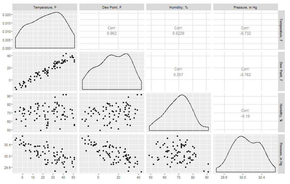
There is a lot of information in these plots, so let’s look at them piece by piece. Notice that the panels on the diagonal from upper left to lower right would be a variable plotted against itself (r = 1), and they are therefore replaced by a density distribution for each variable. Also notice that since the upper right half would be a mirror image of the lower left, there is just a number in each of those panels rather than a plot. In any case, here we have just selected four variables of potential interest, and you can immediately see that there is a strong positive correlation between mean temperature and mean dew point, with r = 0.962. The strength of the correlations from these plots (the six in the lower left) is indicated by the correlation coefficient in the (mirrored) corresponding panel in the upper right. There are also relatively strong negative correlations between temperature and pressure, and dew point and pressure. In contrast, we see weak correlations between humidity and temperature and humidity and pressure, as indicated by the low r values.
The important thing to remember from all of this is what the correlation coefficient can tell us: a high, positive correlation between two variables indicates that when one goes up, so does the other. A high negative correlation indicates that as one goes up, the other goes down. Low correlation coefficients indicate that a consistent linear relationship cannot be established. If correlation is established, however, this analysis doesn’t yet provide details about the functional relationships present.
12.2 Regression
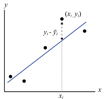
Regression is the process of fitting a mathematical function to a set of data points using some criterion for judging “goodness-of-fit”. The resulting “best-fit” function may then be used to predict unknown values, to forecast future values, or to evaluate the dependence of one variable upon another. Goodness-of-fit can be determined by one of many statistical techniques that determine how well a function describes the variations in the data used to generate it. The most common criterion for goodness-of-fit is called “least-squares”, so you might sometimes see the whole process called least-squares regression. Least squares means what it sounds like, sort of. When a function (let’s write it y=f(x)) is tested for goodness-of-fit, the difference between the y-values predicted by the test function, each of which we can call [latex]\bar{y_i}[/latex], at a given xi, and the yi-values in the data set are found, squared, and added together for the entire dataset. The best-fit line is then the one for which the sum of the squares of the residuals are minimized (least). This is very commonly done for linear equations, but we can use the same techniques for nonlinear equations as well.
| cumulative catch | catch/effort |
|---|---|
| 86 | 2.46 |
| 137 | 1.76 |
| 169 | 1.14 |
| 178 | 0.29 |
Some data sets that we may encounter just don’t appear to have linear trends though. In these cases, we can try transforming one or both variables[1] or we can attempt to perform nonlinear regression. As with many of the statistical and spatial methods discussed in this book, the heavy lifting for most of these options can—and probably should—be done with computer software. However, we should still be aware of what is happening in our data.
Example: brook trout electrofishing (Problem 4.7)
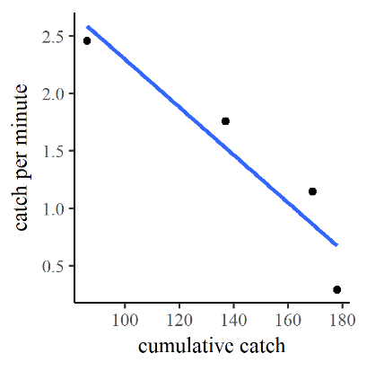
Having isolated the age-0 brook trout from each electrofishing traverse and computed the catch per unit effort [latex]c_{ue}[/latex] of that subset, we may now employ the Leslie method to estimate the total population of age-0 brook trout in the study reach. In this method, we create a dependent variable [latex]c_{cumul.}[/latex] corresponding to the cumulative number of fish removed in each pass, the “cumulative catch”. We then plot and perform a linear regression of the catch per unit effort as a function of cumulative catch, as illustrated in Figure 12.5.
By the Leslie method if we extrapolate the best-fit line to a vertical-axis value [latex]c_{ue} = 0[/latex], the cumulative catch value where that occurs is the estimated total population. This value can be estimated from the graph itself, but the result is better if we solve the for the value directly from the best-fit line. The equation of the best-fit line for this regression is:
[latex]c_{ue} = -0.0208 c_{cumul.} + 4.38.\tag{12.2}[/latex]
Note that the slope of this line (-0.0208), consistent with intuition, is a negative number. The y-intercept 4.38 corresponds to the hypothetical initial catch per unit effort at the very start of the first traverse. Rearranging and solving for [latex]c_{cumul.}[/latex] gives
[latex]c_{cumul.} = 210.6 - 48.1 c_{ue} \tag{12.3}[/latex]
and we find that the estimated total population is 210.
Exercises
- Discuss in a paragraph the benefits and drawbacks of deciding, prior to any data analysis, what type of function to seek best-fit parameters for.
- In Section 12.2.1, we skipped several steps in the algebraic manipulation that allowed solution for [latex]c_{cumul.}[/latex]. Carry out all the intermediate steps, showing your work completely, and determine whether the solution cited above is acceptable.
- Find a dataset that interests you within a public ecological or natural resource data repository[2], identify variables within a dataset that may be related, and perform a regression to see the nature of that relationship.
- Some common data transformations include logarithmic, exponential, and reciprocal. In these transformations, a modified variable is created by performing the selected operation on the original variable values. ↵
- For example, browse the Global Registry of Biodiversity Repositories. ↵

