
Instructions and Usability
4.2 User-Friendly Design
Definition of User-Friendly
User-friendly is a term that describes products, interfaces, or systems designed to prioritize ease of use and accessibility. This term often indicates that something is intuitive and straightforward, allowing users to complete tasks efficiently with minimal confusion or learning curve.
The term emerged from human-computer interaction (HCI) and user interface design, where creating accessible systems became a focus of design and function. The concept emphasizes design that considers the user’s perspective, reducing barriers to interaction and enhancing overall experience.
One thing to keep in mind about user-friendly is that it doesn’t always take into account accessibility needs, like needs for someone with low-vision or color-blindness. When we think about these terms, we think more about accessibility needs.
Another word or term for user-friendly is ease of use. Both terms mean the same thing and may be used interchangeably. But in the 21st century, we also want our technology to be personally enjoyable, and not just easy to use.
The Evolution of User-Friendly Design
Technology hasn’t always been easy to use. If you tried using a computer in the 1960s, you’d need to type complex commands just to get anything done. Here’s how we got from those difficult early systems to the smartphones and apps you use today:
- The Command Line Era (1960s-1970s) Early computers only understood text commands that you had to memorize and type perfectly. Only computer scientists and engineers could use them effectively. Think of it like having to speak a foreign language just to turn on your TV.
- The Graphics Revolution (1980s-1990s) Everything changed when computers started using pictures, icons, and menus you could click with a mouse. The Apple Macintosh and Microsoft Windows made it possible for regular people to use computers without learning programming languages. Suddenly, you could click a trash can icon to delete files instead of typing “delete filename.txt.”
- Studying How People Use Technology (1980s-Present) Researchers began seriously studying how people interact with computers. They discovered that understanding human psychology and behavior was just as important as the technology itself. This field, called Human-Computer Interaction (HCI), helped designers create interfaces that matched how people naturally think and work.
- The Internet and Mobile Era (1990s-Present) When websites and smartphones became popular, designers faced new challenges. How do you make a website that works on both a large computer screen and a tiny phone? This led to responsive design, or interfaces that automatically adjust to different devices.
- Putting Users First (1990s-Present) Designers started involving real users in the design process through interviews and testing. Instead of guessing what people wanted, they watched people use their products and improved them based on actual feedback.
- Design for Everyone (2000s-Present) Designers realized that truly user-friendly products should work for people with disabilities too. This means considering users who are blind, deaf, or have mobility limitations when creating interfaces.
- Beyond Just Usable, or Making It Enjoyable (2000s-Present) Modern user experience (UX) design isn’t just about making things easy to use, but it’s also about making them pleasant and engaging. Today’s designers consider how a product makes you feel, not just whether you can figure out how to use it. This has moved UX design more towards psychological needs.
Examples of User-Friendly Interfaces
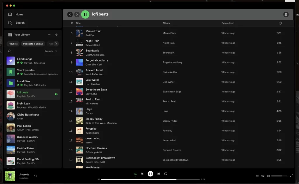
Spotify
If you’ve ever used Spotify, you probably didn’t have to think much about how to find your favorite songs or discover new music. That’s because Spotify’s designers put a lot of thought into making their app user-friendly. Here’s what makes it work so well:
- Simple Navigation The app’s layout is straightforward. You will find everything you need in the menu at the bottom of your screen. Home, Search, and Your Library are exactly where you’d expect them to be. You don’t have to hunt through complicated menus or remember where things are hidden.
- It Knows What You Like Spotify pays attention to what you listen to and suggests music you’ll probably enjoy through your “Discover Weekly” playlist. The app learns from your habits, so the more you use it, the better it gets at predicting what you want to hear.
- Finding Music Is Quick and Easy When you search for something, Spotify shows results clearly organized by artists, songs, albums, and playlists. You don’t have to scroll through endless lists or figure out confusing categories. Type in what you’re looking for, and you’ll find it fast.
- Making Playlists Is Simple You can easily add songs, rearrange them by dragging and dropping, and rename your playlists. It feels natural, not like you’re operating complicated software.
- Works Without Internet Download your music and take it anywhere. This is perfect for when you’re on a plane, have a limited data plan, or are somewhere with spotty cell service. Your music is always available when you need it.
The key to Spotify’s success is that it feels effortless so you can focus on enjoying your music instead of figuring out how to use the app.
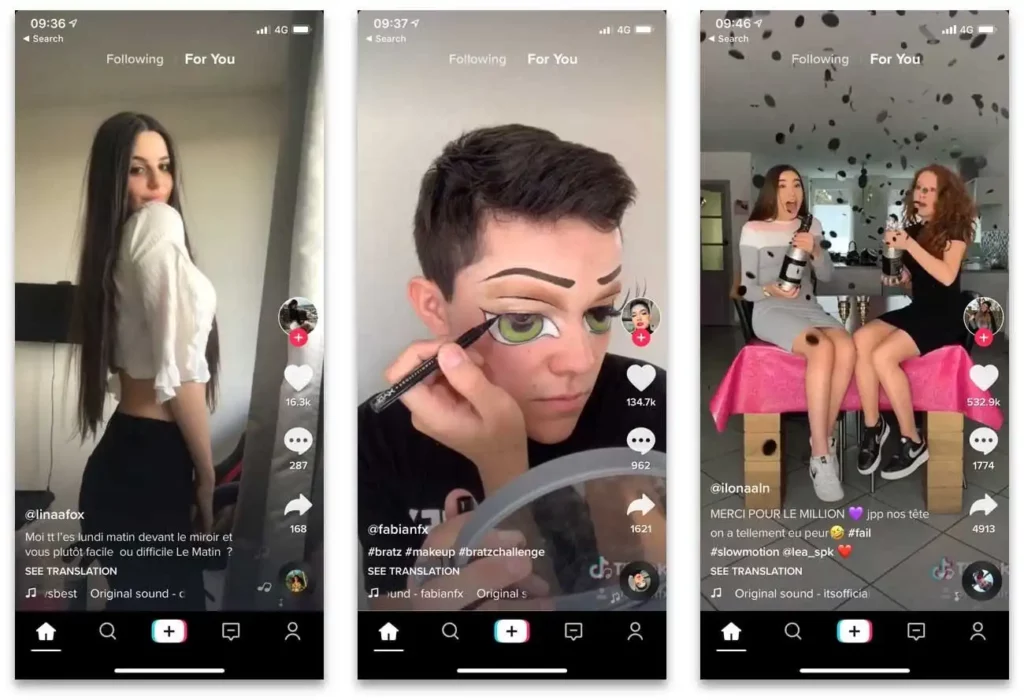
TikTok
You’ve probably spent way more time scrolling through TikTok than you planned. TikTok’s design is incredibly user-friendly and built to keep you engaged. Here’s what makes it work so well:
- The Endless Feed When you open TikTok, you immediately see videos playing automatically. There’s no complicated homepage or menus to navigate. Instead content that starts playing right away. The app learns what you like based on which videos you watch, like, or share, so your feed gets more personalized over time. It’s like having a TV channel that only shows stuff you’re interested in.
- Finding New Content Is Effortless The “For You” page is where TikTok’s magic happens. You don’t have to search for interesting videos because the app delivers them to you. If you want to explore specific trends or topics, the Discover tab lets you browse popular hashtags and challenges without getting lost in complicated menus.
- Making Videos Is Actually Fun Creating TikTok videos feels more like playing with a really advanced camera app than doing serious video editing. You can add music, filters, and effects with just a few taps.
- Interacting Feels Natural Liking, commenting, and sharing videos is super straightforward because the buttons are exactly where you’d expect them to be. The “duet” feature, where you can create split-screen videos responding to others, is easy to use and makes the app feel more social and interactive.
TikTok is a mobile app that feels less like technology and more like entertainment, which is exactly what keeps people coming back.
How to make your interface user-friendly
Below are some general rules to keep in mind with creating user-friendly interfaces:
- Simplicity: Keep the interface clean and uncluttered, prioritizing essential elements and minimizing distractions.
- Intuitiveness: Design the interface so that users can easily understand how to navigate and interact with it without the need for extensive instructions.
- Organization: Group related elements together logically and provide clear visual cues to help users understand the structure of the interface.
- Personalization: Offer personalized recommendations or customization options to cater to the individual preferences and needs of users.
- Efficiency: Streamline workflows and interactions to allow users to accomplish tasks quickly and with minimal effort.
- Feedback: Provide users with clear feedback on their actions, such as confirmation messages, error notifications, or progress indicators.
- Accessibility: Ensure that the interface is accessible to users of all abilities, with features such as keyboard shortcuts, screen reader compatibility, and adjustable font sizes.
- Consistency: Maintain consistency in design elements, layout, terminology, and interaction patterns throughout the interface to provide a cohesive and familiar experience.
- Integration: Integrate with other relevant services or platforms to provide users with a seamless experience across different tools and devices.
- Security: Implement security features to protect users’ data and privacy, such as encryption, secure authentication methods, and be proactive about potential security threats.
