Infographics are graphic or visual representations of data or facts that are shared in visually appealing ways within roughly one or two pages. Infographics are widely used because they can breakdown and display data in ways that use color and design in a way where a user can quickly grasp the data or other information.
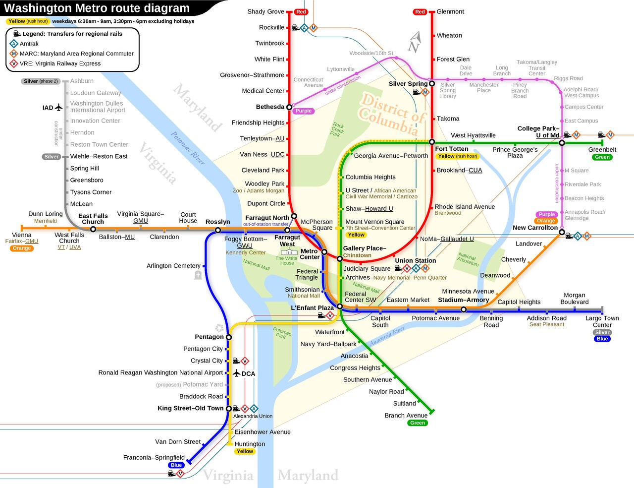
In Figure 2.3 is an example of a map as an Infographic made for usability. You can see the routes are colored, and include labels. The diagram also includes a legend to designate what particular symbols and colors mean. The map also uses landmarks to help orient the user.
Data visualizations are often used in infographics and may make up the entire infographic. There are many types of visualizations that can be used to represent the same set of data. Therefore, it is crucial to identify the appropriate visualization for the data set and infographic by taking into consideration graphical features such as position, size, shape, and color.
Representing Data in an Infographic
Time Series
Time-series data tracks values over time using several visualization methods. Index charts show percentage changes from a starting point rather than actual values, useful for comparing growth rates like stock performance. Stacked graphs layer area charts to show both individual and combined patterns, but can’t handle negative numbers and make trends hard to read. Small multiples display each data series separately for clearer individual trend analysis. Horizon graphs save space by compressing time-series data while maintaining detail, allowing more information to fit in less area.
Figure 2.4 Causes of Sea Level Rise, Wikipedia, ESA, CC BY-SA IGO 3.0, CC BY-SA 3.0 IGO <https://creativecommons.org/licenses/by-sa/3.0/igo/deed.en>, via Wikimedia Commons
Statistical
Statistical distributions show how data is spread out, commonly using histograms and box plots to display averages, medians, and outliers. Other methods include stem-and-leaf plots, which sort numbers by their first digit then second digit to show frequency patterns. Q-Q plots compare two datasets by plotting their values against each other to see if they’re similar. SPLOM uses multiple scatter plots to show relationships between several variables at once. Parallel coordinates plot data on vertical lines and connect related points with lines, efficiently displaying many variables in a compact space.
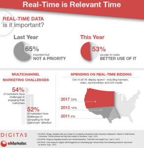
Figure 2.5 Flickr, Real Time is Relevant Time, https://www.flickr.com/photos/39039527@N05/8692484673
Maps
Maps naturally represent geographical data through several visualization methods. Flow maps use varied line widths and colors to show movement across time and space. Choropleth maps encode data through color-coded regions, while graduated symbol maps overlay symbols like pie charts onto geographic areas, enabling multiple data dimensions through shape, size, and color. Cartograms abandon geographic accuracy entirely, redrawing regions proportionally to data values—for instance, representing areas as circles sized by population rather than actual geography.
Hierarchies
Hierarchical data, like government structures or geographic entities, can be visualized through three main diagram types. Node-link diagrams resemble trees where nodes branch into subsections, offering tidy, space-efficient layouts. Adjacency diagrams use solid areas with nested subsections instead of connecting lines, making size representation easier than node-link versions. Enclosure diagrams also fill space but use containment rather than adjacency to show hierarchy, similarly enabling clear size comparisons between elements.
Networks
Network visualization reveals relationship structures through three primary methods. Force-directed layouts treat nodes as charged particles that repel each other while links pull connected nodes together, creating intuitive clusters. Arc diagrams arrange nodes along a single line with curved connections above or below, making community structures and bridges easily identifiable when properly ordered. Matrix representations map relationships to coordinate positions using color and intensity instead of text, allowing rapid processing of connection strengths while avoiding the visual clutter of overlapping lines in dense networks.
While all of these visualizations can be effectively used on their own, many modern infographics combine multiple types into one graphic, along with other features, such as illustrations and text. Some modern infographics do not even contain data visualization, and instead are simply a colorful and succinct ways to present knowledge. As a Technical Communicator, being able to visually share data and information clearly and accurately through an infographic or chart will be a valuable skill.