
Chapter 4: Measures of Similarity
William Beavis; Mark Newell; and Anthony Assibi Mahama
In an ideal reference breeding population, there is no structure consisting of sub-populations or aggregates of relatives organized into families and tribes. Plant Breeding populations, on the other hand, are organized into sub-populations. Perhaps the best-known example is represented by the heterotic germplasm pools in maize, e.g., Stiff Stalks, Non-Stiff Stalks, Lancasters, and Iodents. In cytoplasmic male sterile hybrid systems such as sorghum, the restoration pattern can be the primary divider of germplasm with additional subdivisions based on morphological characteristics and geographic origins, e.g., Kaoliang, Durra, and Feterita. Alternatively, coefficients of relationship and inbreeding among members of a breeding population can be used to represent the structure of the breeding population. Also, with the emergence of high throughput molecular marker technologies, it is possible to represent relationships among members of a breeding population using identity in state to produce a realized kinship matrix.
- Utilize coefficients of inbreeding and parentage to construct the numerator relationship matrix
- Utilize molecular marker information to construct a realized kinship matrix
Population Structure Based on Pedigree Information
Animal breeders were the first to utilize relationships among individuals for the purpose of providing Best Linear Unbiased Predictions in linear mixed models. The “A” matrix in the linear mixed model equation, also known as the Numerator Relationships Matrix (NRM) was originally used by Henderson to capture information from relatives to predict breeding values of animals. In essence, the A-matrix provides information on the proportion of alleles that are identical by descent between all pairs of individuals in a breeding population.
Specifically, the numerator relationships are equal to twice the coefficient of coancestry between any pair of individuals. In other words, [latex]A_{x,y}=2\Theta_{x,y}[/latex]. Thus, if we know the pedigrees of all members of a breeding population, we can construct an A-matrix using a recursive tabular method.
Recursive Tabular Method
A recursive tabular method for constructing the A-Matrix is described below:
- Order members of a pedigree chronologically, i.e., list parents before offspring. Assume that founder lines are not inbred and are not related to each other.
- Transpose the list and use this to represent columns for the [latex]A[/latex] matrix.
- Beginning with the cell represented by [latex]A_{1,1}[/latex] compute [latex]\Theta_{1,1}[/latex].
- Move to cell [latex]A_{1,2}[/latex] and compute [latex]\Theta_{1,2}[/latex]. This will be the same value that can be used for cell [latex]A_{2,1}[/latex]
- Move to cell [latex]A_{2,2}[/latex] and compute [latex]\Theta_{2,2}[/latex].
- Move to cell [latex]A_{1,3}[/latex] and compute [latex]\Theta_{1,3}[/latex]. This will be the same value for [latex]A_{3,1}[/latex]
- Move to cell [latex]A_{2,3}[/latex] and compute [latex]\Theta_{2,3}[/latex]. This will be the same value for [latex]A_{3,2}[/latex]
- Move to cell [latex]A_{3,3}[/latex] and compute [latex]\Theta_{3,3}[/latex]
- Repeat until all elements of the [latex]A[/latex] matrix are completed.
Population Structure Based on Markers
The Realized Kinship Matrix
Consider two cultivars scored for 1400 SNPs. We can ask whether this pair of cultivars has the same or different alleles at each locus. Intuitively, if they had the same allele at all 1400 loci, we would say that there are no detectable allelic differences between the two genotypes, i.e., that they are identical in state or that their similarity index = 1.0. Alternatively, if none of the alleles are the same at all 1400 loci, then we would say that the genotypes have no alleles in common, i.e., that their similarity index is zero. In practice, the two genotypes will exhibit a measure of similarity somewhere between these extremes.
Quantitative Measure for Similarity
Let us take this intuition and develop a quantitative measure for similarity. If the two cultivars (x and y) have the same pair of alleles at a locus, score the locus = 2; if one of the alleles is the same, score the locus = 1; otherwise, the score = 0. If we sum these up across all loci, the maximum score would be 2800. If we divide the summed score by 2800, we would obtain a proportion measure (designated [latex]S_{x,y}[/latex]) to quantify the similarity between the pair of lines. This concept can be represented algebraically as:
[latex]S_{x,y} = {1\over {2n}}\sum^n_{i=1}X_iY_i[/latex]
[latex]\textrm{Equation 1}[/latex] Formula for calculating the similarity between pairs of lines.
where:
[latex]n[/latex] = the number of loci,
[latex]\small X, Y[/latex] = the two cultivars.
Such a similarity measure could be converted into an “intuitive genetic distance” measure by subtracting [latex]S_{x,y}[/latex] from 1.
Measures of Distance
Our intuitive genetic distance would make sense if:
- There are only two alleles per locus.
- Our interpretation of the result does not include inferences about identity by descent, and
- There is no LD among the SNP loci.
However, most populations are more complex, requiring more nuanced measures of genetic distance. Population geneticists tend to use three distance measures depending upon the inference about the population structure they are trying to understand. These are:
- Nei’s Distance assumes all loci have the same neutral rate of mutation, mutations are in equilibrium with genetic drift, and the effective population size is stable. The interpretation is a measure of the average number of changes per locus and that differences are due to mutation and genetic drift.
- Cavalli-Sforza’s Distance assumes differences are due to genetic drift between populations with no mutation and interprets the genetic distance as an Euclidean Distance metric.
- Reynolds Distance is applied to small populations; thus, it assumes differences are due to genetic drift and is based on knowledge about coancestry, i.e., identity by descent for alleles that are the same.
Application of Distance and Similarity Measures
There are a large number of additional distance and similarity measures that can be applied to molecular marker scores, including Euclidean, Mahalanobis, Manhattan, Chebyshev, and Goldstein. Also, Bayesian Statistical approaches can be used to identify structure in the population (Pritchard et al, 2000) without resorting to the calculation of distance metrics. The choice of an appropriate method depends upon the type of molecular marker data and the research question. A thorough presentation of distance measures is beyond the scope of this course, but there are graduate courses on multivariate statistics in which issues associated with each of the distance metrics can be explored.
For now, let us assume that we decided to use our [latex]S_{x,y}[/latex] to represent differences between all pairs ([latex]x_{i}y_{j}[/latex]) of breeding lines. Next, suppose we extend the example from two lines to 1800 lines scored for 1400 SNPs. In this case, there are [latex]\frac{n(n-1)}{2}[/latex] = [latex]\frac{1,800(1,800-1)}{2}[/latex] = 1,619,100 estimates of pairwise distances among the lines.
Clearly, any attempt to find patterns in a data matrix consisting of all pairwise measures of similarity or distance will take considerable effort. Yet, these patterns in the data are essential to quantifying the structure in a breeding population because the structure will affect inferences about genetic effects. It is the need to find patterns in such large data sets that motivated the application of multivariate statistical methods such as principal components and cluster analyses in plant breeding populations.
Principal Component Analysis
The primary purpose for applying principal component analysis (PCA) to genetic distance matrices is to summarize, i.e., reduce dimensionality so that the underlying population structure can be visualized.
Conceptual Interpretation
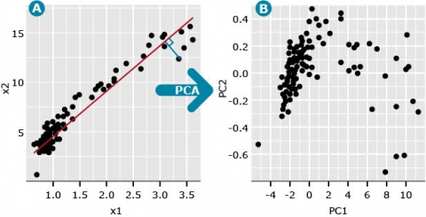
Imagine we have two variables, denoted x1 and x2, where x1 represents the distance scores between cultivar 1 and all other cultivars, and x2 represents the distance scores between cultivar 2 and all other cultivars. If we plot the x1 and x2 pairs of data, we might generate a plot such as seen in Fig. 1A. We could add distance data for a third cultivar and represent the data with a 3-dimensional plot. We could obtain data for as many cultivars as we might have interest in, but the ability to plot these in multi-dimensional space is not possible.
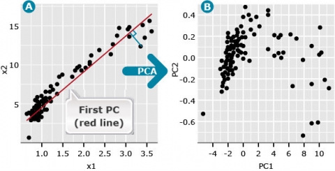
We refer to the first principal component (PC), also known as the first eigenvector, as a line (red) that minimizes the perpendicular distances (blue line) between the red line and the data points (Fig. 2A).
Principal Component Analysis – Interpretation
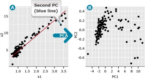
The second PC follows the same definition except that it represents a line through the data that minimizes the distance between a second line that is orthogonal (at a right angle) to PC1. The second PC minimizes the distance between the data and the second line. Since the second PC is orthogonal to the first, the distance among the data points represented by each PC is maximized. Thus we can plot data points represented by the first two principal components (Fig. 3B). By plotting the PCs instead of the raw data, we often find hidden structures in the data (compare Fig. 3A vs. 3B).
Subsequent PCs represent lines that are orthogonal to all previous PCs and minimize the distance between each PC and data points that maximize the variability among the orthogonal PCs. This means that each PC is uncorrelated to all other PCs.
A useful measure in PCA is the eigenvalue associated with each eigenvector (PC). The first eigenvalue is the proportion of maximum variability among the multidimensional data that is explained by the first PC. For the data depicted in Fig. 3B, the first eigenvalue is 0.997, and the second eigenvalue is equal to 0.003. Since the first PC is the vector (or line) that is plotted in the direction of maximum variability among data points, the first eigenvalue is always the largest, and each consecutive eigenvalue accounts for less variability than the prior PCs.
PCA Example
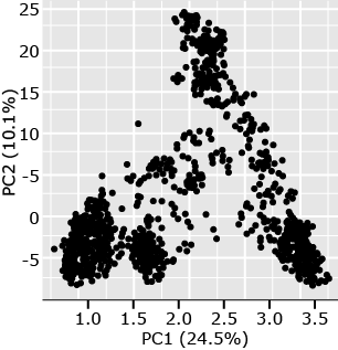
Let us consider an example from a set of 1816 barley lines scored for 1416 SNPs (Hamblin et al. 2010). In this analysis, there were [latex]\binom{1816}{2} \Rightarrow \frac{n \times (n-1)}{2}) = \frac{1816 \times (1815)}{2}) = \small 1,648,020[/latex] estimates of pairwise distances based on 1416 SNP scores for each of the barley lines. Eigenvalues for PC1 and PC2 accounted for 24.5% and 10.1% of the variability among pairwise genotypic distances. By plotting PC1 versus PC2 (Fig. 4), we observe four distinct clusters. Subsequent analyses of the lines represented by each point in the clusters revealed that the members of each cluster are from 2-row, 6-row, spring, or winter barley types. From a breeding perspective, we can see that most breeding for barley occurs within types rather than between types. The population structure is a result of breeding processes of selection, drift, and non-random mating.
Cluster Analysis
Similar to PCA, the purpose of applying cluster analysis to matrices of pairwise distance measures among a set of genotypes is to segregate the observations into distinct clusters. There are many types of cluster analyses, and a primary distinction is between supervised and non-supervised clustering. K-means is one of the supervised methods that have been widely adopted by plant population geneticists. The clustering method is supervised in the sense that K represents a pre-determined number of clusters. Designating the number of clusters is usually based on prior knowledge about groups of lines that are being clustered. For example, it might make sense to designate the four clusters of barley lines based on known breeding history in which different barley agronomic types are not inter-mated. K-means represents an iterative procedure with the following steps:
- An initial set number of K means (seed points) are determined (also called initialization); these are the initial means for each of the K clusters.
- Each genotype is then assigned to the nearest cluster based on its pairwise distances to all other genotypes within and among clusters.
- Means for each cluster are then re-calculated, and genotypes are re-assigned to the nearest cluster.
- Steps ii and iii are then repeated until no more changes occur.
Cluster Analysis Example
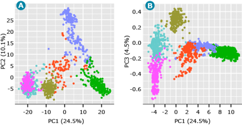
For the barley data, since the inter-mating rule is not absolute, i.e., some agronomic types are occasionally inter-mated, it could be informative to designate K = 6 (Fig. 5). Note that a plot of PC1 vs PC3 (Fig. 5B) demonstrates the value of plotting PCs beyond the first two. While the third PC accounts for only 4.5% of the variability among genotypes, the third PC helps to distinguish what appears to be members of the same cluster in Fig. 5A.
Hierarchical Clustering
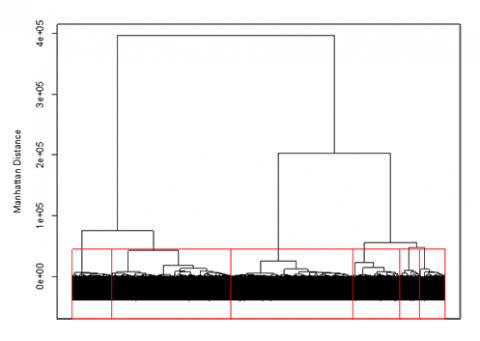
An unsupervised approach to clustering genotypic distance data is hierarchical clustering. This approach sequentially lumps or splits observations to make clusters. Applying the hierarchical approach to the barley data set, we can visualize the results using a dendrogram (Fig. 6). In the dendrogram, observations are arrayed along the x-axis, and the y-axis refers to the average genetic distance between breakpoints. For example, the horizontal line at 4e+05 indicates that there are two major groups with a distance between them of 4e+05. The user determines the height (distance along the y-axis) at which a horizontal line is drawn, and the number of clusters is chosen; this is drawn below in red for 6 clusters. The user may determine this by using the PC plots, cluster dendrogram, and any prior information that is known about the germplasm.
Hierarchical clustering can be implemented in many different ways. For genotypic data, the most common method is Ward’s, which attempts to minimize the variance within clusters and maximize the variance between clusters. Similar to K-means clustering, we can look at the PC plots to explore the results for hierarchical clustering to see how the lines were assigned to clusters.
How to cite this chapter: Beavis, W., M. Newell, and A. A. Mahama. 2023. Measures of Similarity. In W. P. Suza, & K. R. Lamkey (Eds.), Quantitative Genetics for Plant Breeding. Iowa State University Digital Press.
