
Chapter 5: Cluster Analysis, Association, and QTL Mapping
Thomas Lübberstedt; William Beavis; and Walter Suza
In Crop Genetics, we learned about a reference population that is in Hardy Weinberg Equilibrium and how to estimate the magnitude of deviations from HWE at a single locus or at a pair of loci in a breeding population. In this lesson, we will expand the use of these fundamental concepts to large data sets, where markers span the entire genome for a large number of breeding lines. We will address the concept of linkage disequilibrium, and how this relates to identifying genome regions affecting traits of interest.
- Understand detection and visualization of population structure, including measures of genetic similarity and distance, Principle Component Analysis, and Cluster Analysis
- Understand Linkage Disequilibrium, including its Conceptual basis, estimation, sources of linkage disequilibrium, and decay of linkage disequilibrium
- Understand associations between markers and phenotypes, including Genome-Wide Association Studies
- Understand the basis of QTL mapping
Measures of Distance Among Genotypes
Barley Example
Consider two barley varieties scored for 1416 SNPs. We can ask whether this pair of varieties have the same or different alleles at each locus. Intuitively, if they had the same allele at all 1416 loci, we would say that there are no detectable allelic differences between the two genotypes. Alternatively, if none of the alleles are the same at all 1416 loci, then we would say that the genotypes have no alleles in common. In practice, the two genotypes will exhibit a measure of similarity somewhere between these extremes.
Similarity Measure
Let’s take this intuition and develop a quantitative measure for similarity. If the two varieties (x and y) have the same allele at a locus, let’s score the locus = 1, otherwise the score = 0. If we sum these up across all loci the maximum score would be 1416. If we divide the summed score by 1416 we would obtain a proportion measure (designated sx,y) to quantify the similarity between the pair of lines. This concept can be represented algebraically as:
[latex]S_{x,y} = \frac{1}{n}\sum^n_{i=1}X_iY_i[/latex]
Such a similarity measure could be converted into an “intuitive genetic distance” measure by subtracting sx,y from 1.
Distance Measures
Our intuitive genetic distance would make sense if 1) there are only two alleles per locus, 2) our interpretation of the result does not include inferences about identity by descent, and 3) there is no LD among the SNP loci. However, most populations are more complex requiring more nuanced measures of genetic distance. Population geneticists tend to use three distance measures depending upon the inference about the population structure they are trying to understand. These are:
- Nei’s Distance assumes all loci have the same neutral rate of mutation, mutations are in equilibrium with genetic drift and the effective population size is stable. The interpretation is a measure of the average number of changes per locus and that differences are due to mutation and genetic drift.
- Cavalli-Sforza’s Distance assumes differences are due to genetic drift between populations with no mutation and interprets the genetic distance as a Euclidean distance.
- Reynolds Distance is applied to small populations, thus it assumes differences are due to genetic drift and is based on knowledge about coancestry, i.e., identity by descent, for alleles that are the same.
There are a large number of additional distance measures that can be applied to molecular marker scores including Euclidean, Mahalanobis, Manhattan, Chebyshev, and Goldstein. Also, Bayesian Statistical approaches can be used to identify structure in the population (Pritchard et al, 2000) without resorting to calculation of distance metrics. The choice of an appropriate method depends upon the type of molecular marker data and the research question. A thorough presentation of distance measures is beyond the scope of this course, but there are graduate courses on multivariate statistics in which issues associated with each of the distance metrics are explored.
Euclidean Distance
For now, let’s assume that we decided to use a Euclidean Distance to represent differences between all pairs of breeding lines. Next, suppose we extend the example above from two lines scored for 1416 SNPs to 1816 lines scored for 1416 SNPs (Hamblin et al. 2010). In this case, there are [(1816 x 1815) / 2] or [n × (n – 1)] / 2] = 1,648,020 estimates of pairwise distances among the breeding lines.
Clearly any attempt to find patterns in a data matrix consisting of all pairwise measures of similarity or distance would take considerable effort. Yet, these patterns in the data will reveal structure in the breeding population that need to be understood before applying Genome Wide Association Studies.
Principal Component Analysis
Conceptual Interpretation
The major purpose for applying principal components analysis (PCA) to genetic distance matrices is to summarize, i.e., reduce dimensionality, so that the underlying population structure can be visualized.
A conceptual interpretation of PCA: In the figure, imagine we have two variables, denoted x1 and x2 (Fig. 5A) with the following relationship: The first principal component (PC), also called the first eigenvector, can be thought of as a factor that minimizes the perpendicular distances (blue line) between the red line and data points. These data points represent the pairwise distance measures among the members of the population population. The second PC follows the same definition except that it represents a factor that minimizes distance between a second line, that is orthogonal (at a right angle) to PC1, and data that are plotted to maximize distance among the data points (Fig. 5B). Subsequent PCs represent lines that are orthogonal to all previous PCs and minimize distance between the line and data points that maximize the variability among the data points. This means that each PC is uncorrelated to all other PCs. Plotting the data points associated with each PC often reveals hidden structure in the data (compare Fig. 5A vs. 5B).
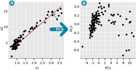
A useful measure is the eigenvalue associated with each eigenvector (PC). The first eigenvalue is the proportion of variation explained by the first PC. For the data depicted in Fig. 1A, the first eigenvalue is 0.997 and the second eigenvalue is equal to 0.003 (Fig. 5B). Since the first PC is the vector (or factor) that is plotted in the direction of maximum variability among data points, its eigenvalue is always the largest and each consecutive PC accounts for less than the one before.
Example Data
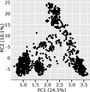
The following example (Fig. 6) is from a set of 1816 barley lines scored for 1416 SNPs (Hamblin et al. 2010). By plotting PC1 versus PC2, one can see that there are at least four distinct clusters in this plot. Subsequent analyses of the lines represented by each point in the plots revealed that the members of each cluster are from 2-row, 6-row, spring, or winter barley types. From a breeding perspective, one can see that breeding for barley generally occurs within types rather than between types, the structure is a direct result of the breeding process.
Discussion – Principal Component Analysis
- PCA is an approach that can be used for a wide variety of data sets besides genotypes, what other types of data related to plant breeding could PCA be applied? Think about other types of data you would encounter in which multiple variables are evaluated for a set of observations.
- The PCs can be thought of as a subset of variables that explain the majority of the variation for a given data set. If the first few PCs explain most of the variation, what is explained by the larger PCs?
Cluster Analyses
K-Means Clustering
Similar to PCA, the purpose of applying cluster analysis to matrices of pairwise distance measures among a set of genotypes is to segregate the observations into distinct clusters.
There are many types of cluster analyses, but plant population geneticists often use K-means clustering, where K is a pre-determined number of clusters based on previous knowledge about the data. This is an iterative procedure with the following steps:
- An initial set number of K means (seed points) are determined (also called initialization); these are the initial means for each of K clusters.
- Each genotype is then assigned to the nearest cluster based on its pairwise distances to all other genotypes.
- Means for each cluster are then re-calculated and genotypes are re-assigned to the nearest cluster.
- Steps 2 and 3 are then repeated until no more changes occur.
Running K-means clustering on the barley data set from above where K is equal to 6 generated the following scatter plot (Fig. 7).
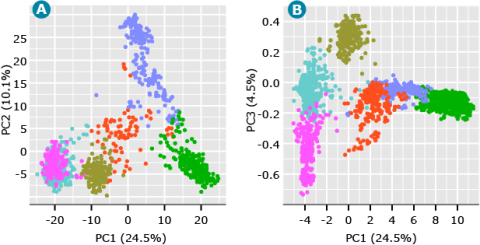
As shown in Fig. 7, we can start to visualize the distinct clusters representing the underlying structure of the barley breeding populations. The PC plot of PC1 versus PC3 (Fig. 7) also demonstrates the value of plotting PCs beyond the first two PCs. Although PC3 accounts for only 4.5% of the variation in the data, it suggests a separate cluster from what seemed to be a single cluster when looking at only PC1 and PC2 (Fig. 7).
Hierarchical Clustering
Another common approach to cluster analysis for genetic data is hierarchical clustering (Fig. 8). This approach sequentially lumps or splits observations to make clusters.
Applying the hierarchical approach to the barley data set we can visualize the results using a cluster dendrogram. Observations are arrayed along the x-axis and the y-axis shows the average genetic distance between breakpoints. For example, the horizontal line at 4e+05 means there are two major groups with a distance between them of 4e+05. The user determines the height (distance along the y-axis) at which a horizontal line is drawn and the number of clusters is chosen, this is drawn below in red for 6 clusters. The user may determine this by using the PC plots, cluster dendrogram, and any prior information that is known about the germplasm.
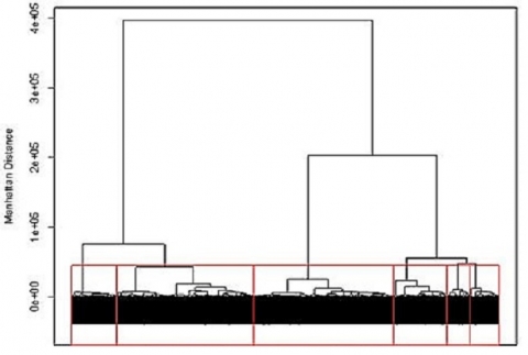
Hierarchical clustering can be implemented in many different ways. For genotypic data, the most common method is Ward’s, which attempts to minimize the variance within clusters and maximize the variance between clusters. Similar to K-means clustering, we can look at the PC plots to explore the results for hierarchical clustering to see how the lines were assigned to clusters.
Linkage Disequilibrium
Definition
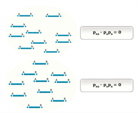
In population genetics, disequilibrium is a term used to describe the non-independence of alleles at one or more loci. Unfortunately, the term, linkage disequilibrium is often used to describe the concept at two or more loci, regardless of whether the loci are linked on the same chromosome. A less ambiguous and more accurate term for describing the concept is gametic disequilibrium. Regardless of which terms are used, the important concept is the occurrence of some combinations of alleles (genetic markers), in a population more often than would be expected from a randomly segregating and mating population.
Populations, in which combinations of alleles or genotypes can be found in the proportions expected from random segregation and mating, are said to be in equilibrium. This concept can be illustrated in a simple 2×2 contingency table (Table 1). The table shows the case for two loci, A and B (each with two alleles), when the loci are in linkage equilibrium. In this case, the joint probability (shaded red) is equal to the product of the marginal probabilities (shaded blue), thus the alleles at locus A and B are independent. Intuitively, “independence” means knowing the allele present at locus A does not help predict the allele present at locus B (or vice versa).
Table 1 A contingency table for two loci (A and B) in linkage equilibrium.
|
Locus A |
|||
| Locus B | Pr(A1) = pA | Pr(A2) = qA | |
| Pr(B1) = pB | Pr(A1B1) = pApB | Pr(A2B1) = qApB | pApB + qApB = pB |
| Pr(B2) = qB | Pr(A1B2) = pAqB | Pr(A2B2) = qAqB | pAqB + qAqB = qB |
| pApB + pAqB = pA | qApB + qAqB = qA | ||
Deviation
For the case when there is linkage disequilibrium between the two loci (Table 2), the joint probability does not equal the product of the marginal probabilities, instead there is a deviation denoted as D (disequilibrium). In this situation, the probability of an allele at one locus is dependent on the allele at the other locus and vice versa. Thus, linkage disequilibrium can be thought of as the dependence of alleles at two loci. Intuitively, “dependence” means knowing the allele present at locus A does help to predict the allele present at locus B. In Table 2, for example, if D is positive and allele A1 is present, the probability that B1 is present is greater than pB.
Table 2 A contingency table for two loci (A and B) in linkage disequilibrium.
|
Locus A |
|||
| Locus B | Pr(A1) = pA | Pr(A2) = qA | |
| Pr(B1) = pB | Pr(A1B1) = pApB + D | Pr(A2B1) = qApB – D | pApB + qApB = pB |
| Pr(B2) = qB | Pr(A1B2) = pAqB – D | Pr(A2B2) = qAqB + D | pAqB + qAqB = qB |
| pApB + pAqB = pA | qApB + qAqB = qA | ||
- Distinguish the concepts of gametic and linkage disequilibrium.
- In the table below, use algebra to show that pApB + qApB = pB. Explain why in a given row or column of the table below, one cell has +D and the other -D.
|
Locus A |
|||
| Locus B | Pr(A1) = pA | Pr(A2) = qA | |
| Pr(B1) = pB | Pr(A1B1) = pApB + D | Pr(A2B1) = qApB – D | pApB + qApB = pB |
| Pr(B2) = qB | Pr(A1B2) = pAqB – D | Pr(A2B2) = qAqB + D | pAqB + qAqB = qB |
| pApB + pAqB = pA | qApB + qAqB = qA | ||
Estimation of LD
There are three measures of LD between pairs of loci, including D, D’, and r.
1. D
The first and simplest method of estimating LD is denoted D and is calculated as:
[latex]D = p_{AB} -p_Ap_B[/latex]
In this calculation, D is equal to the difference between the joint frequency of the two alleles (pAB) and the product of their marginal frequencies. The value D ranges between -0.25 and 0.25 and is highly dependent on allele frequencies at each single locus.
2. D’
The second is standardized D, denoted D’, it is scaled based on the observed allele frequencies, therefore it will range from zero to one. It is calculated as:
[latex]D' = {-D \over min (p_Aq_B, q_Ap_B) } \quad for D<0[/latex]
[latex]D' = {D \over min (p_Ap_B, q_Aq_B)} \quad for D>0[/latex]
In this standardization procedure, D’ is less dependent on allele frequencies than D, although if one haplotype has a low frequency, D’ is often close to one.
3. r2
Lastly, the most common estimate of LD is r2, or the squared correlation coefficient between two loci. It is calculated as:
[latex]r^2 = \dfrac {D^2}{p_Aq_Ap_Bq_B}[/latex]
This estimate is typically the preferred estimate for genome-wide association studies.
Scores for eight individuals at two SNP loci are shown in the table below (adapted from Gaut and Long, 2003). These two SNP loci (A and B) are biallelic, and the frequencies for these alleles are pA for SNP-A and qA for SNP-T at the A locus, and pB for SNP-G and qB for SNP-C at locus B.
| Individual | Site 1 | Site 2 |
| Individual 1 | A | G |
| Individual 2 | A | G |
| Individual 3 | A | G |
| Individual 4 | A | G |
| Individual 5 | T | G |
| Individual 6 | T | G |
| Individual 7 | T | C |
| Individual 8 | T | C |
Given:
[latex]D = p_{AB} -p_Ap_B[/latex]
[latex]D' = -D/min(p_{A}q_{B},\ q_{A}p_{B})[/latex]
[latex]D' = -D/min(p_{A}p_{B},\ q_{A}q_{B})[/latex]
[latex]r^{2} = D^{2}/p_{A}q_{A}p_{B}q_{B}[/latex]
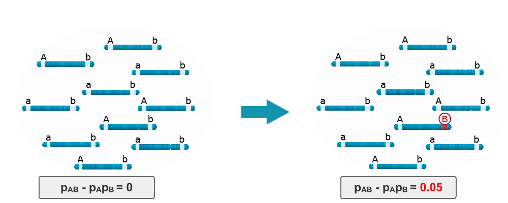
Sources of LD: Mutation
Consider LD in the base population is zero because the ‘b’ locus is monomorphic. Imagine that single mutation occurs in one of the haplotypes, namely from ‘b’ to ‘B’. LD between the A and B loci is no longer equal to zero, instead it is 0.05. Thus, a single mutation in a population can lead to LD between two loci.
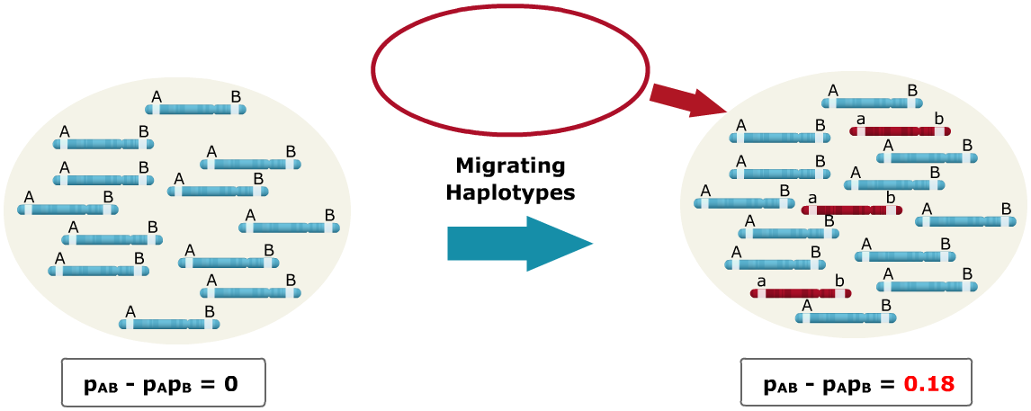
Sources of LD: Migration
A small population of haplotypes migrate into a larger population, where the alleles have different states. Alleles that have different states simply mean that the alleles are fixed at both loci for opposite alleles. As seen, the migrating haplotypes are fixed for the A and B loci with the ‘a’ and ‘b’ alleles, respectively, and the base population is fixed for ‘A’ and ‘B.’ The influx of migrating haplotypes with allele frequencies differing from those of the base population increases the LD from zero to 0.18.
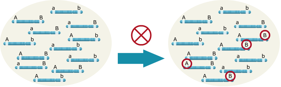
Sources of LD: Drift/Sampling
In the example below, when drift due to inbreeding occurs by random sampling alone, the ‘A’ allele happened to be transmitted more often with the ‘B’ allele, leading to LD between the two loci.
Sources of LD: Mixing of sub-populations
Two distinct subpopulations are present and LD is zero when calculated within subpopulations. In contrast, the level of LD between locus A and B increases to 0.25 when they are combined.
Fig. 12 The impact of population structure on the level of LD between loci. Click on the video to see the animation.
Decay of LD
Recombination is the only force that will systematically reduce LD. The level of LD (measured as r2) decays at a rate of (1-c)2 for a random mating population, where c is the recombination rate. Figure 13 shows the decay of LD across generations for a random mating population and between two inbreds at different recombination rates. The major difference between the two situations is that for a cross between two inbreds, LD declines to zero in the first (F2) generation for unlinked (c = 0.5) loci. This occurs because the F1 is doubly heterozygous for all pairs of polymorphic loci and so recombination between any pair of loci generates a new allelic combination. In contrast, in a random-mating population, loci polymorphic in the population as a whole are often homozygous in a given individual, such that recombination with that locus does not generate a new allelic combination. In general, as the recombination rate between pairs of loci increases, the decay of LD occurs more rapidly, thus LD persists over longer periods of time for loci that are closer as opposed to loci that are farther apart.
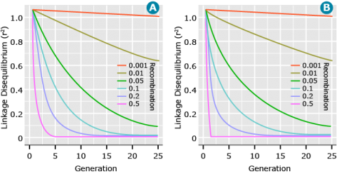
Affecting Parameters: Linkage
In Figure 13, it can be seen that when two loci have tighter linkage (less recombination) the LD between them is more persistent over time. Likewise, for two loci that are loosely linked (greater recombination), LD decays at a faster rate. In fact, the expected value of LD measured as r2 is
[latex]E(r^2) = \frac{1}{(1 + 4N_ec)}[/latex]
where:
Ne is the effective population size
c is the recombination rate.
From this expectation, we can see that as the recombination rate, c, increases, the LD, r2, decreases.
Affecting Parameters: Population Size
Effective population size Application of the same expectation of LD as above, shows that as the effective population size, Ne, is increased, the extent of LD decreases. This occurs because as Ne increases, the chance of drift to increase LD decreases and so the expectation is smaller.
[latex]E(r^2) = \frac{1}{(1 + 4N_{e} c)}[/latex]
Affecting Parameters: Mating System
The extent of LD is generally higher for autogamous than allogamous crops. The reason for this is that for an autogamous crop there are fewer effective recombination events. An effective recombination is an event that results in recombination generating non-parental allelic combinations.
Further Thought
- Is the concept of LD important for QTL mapping in F2 populations?
- What is the difference in the level of LD in an F2 compared to an F7 population? What would the implications of this be on the marker density requirement and mapping resolution?
- Verify that a recombination with a homozygous locus does not create allele combinations that are not already present in the parent.
Marker-Phenotype Associations
Genome-Wide Association Studies
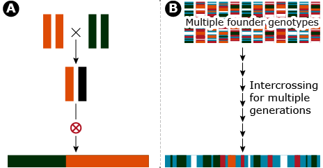
Historically, a common approach for QTL detection in plants is linkage mapping which is based on creation of segregating progeny derived from crosses of inbred lines. An alternative approach for quantitative trait locus (QTL) detection based on existing linkage disequilibrium (LD) among breeding lines is known as genome-wide association studies (GWAS).
The fundamental difference between linkage mapping and GWAS is the type of LD that is used to generate associations between the phenotypes and genotypes, recent vs. historical LD. Linkage mapping depends on the breakdown of recently generated LD whereas GWAS depends on historical LD broken down by many generations of recombination (Fig. 15). Typically, the application of linkage mapping in plant species, utilizes a recombinant inbred line population developed by crossing two inbred parents. Thus, at any given locus only two alleles per locus are sampled.
In contrast, GWAS has the capability of sampling N different alleles per locus where N is equal to the number of lines used, assuming all of the lines are inbred. Details of linkage mapping are covered elsewhere. Herein, we will use the concept of LD and introduce how historical LD can be used for QTL detection in a GWAS.
R-squared
Recall that r2 can be interpreted as a measure of similarity between two loci. For example, if an allele at one locus is always found in the same individuals with an allele at a second locus, then they are completely correlated, i.e., r2 = 1. LD between a marker locus (ML) and a QTL can result in a measure of phenotypic variability associated with the ML that can be used to infer variability in the QTL. From a practical perspective, this means that if a ML is in LD with a QTL, selection for an allele at the ML will result in co-selection for a functional allele at the QTL.
Rapid LD Decay
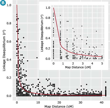
In cases where LD decays more rapidly there is opportunity to have high QTL resolution given a marker system with large numbers of markers. In this situation, higher marker densities are required in order to capture QTL variation. In contrast, linkage mapping approaches depend on less rapid decay of LD and therefore the marker density requirement is considerably less than for GWAS. This example is demonstrated in Fig. 16.
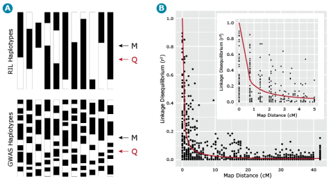
Barley Example
Let’s now return to our example barley data set consisting of 1816 barley lines scored for 1416 SNPs. We can estimate the similarity, i.e., r2 between all pairs of ML resulting in = 1,001,820 estimates of r2 for all pairs of marker loci. If we plot these estimates of LD relative to the physical or recombination distance (Fig. 17B) we notice that high estimates of r2 can exist between loci that are unlinked (map distances > 40 cM), thus the need for a term such as gametic disequilibrium, that distinguishes disequilibrium due to linkage from disequilibrium due to other causes, e.g., selection, drift or recent mixing of breeding populations. Also, note that the point when r2 is greater than .25, i.e., r is greater than .5, is at about 1 cM (Fig. 17B insert). This point can be used to estimate the density of markers that are needed to have a reasonable chance of detecting associations between ML and QTL. Thus if there are 1500 cM of recombination in the genome, at least 1500 ML are needed to have a reasonable chance of detecting significant associations between the SNP loci and a QTL that is responsible for a large amount of phenotypic variability.
Sources of LD
Recall that population structure can result in positive r2 values for reasons other than linkage between ML and QTL on the same chromosome. In particular recall the impact of mixing unrelated populations (Fig. 18). A classic example of the effect of population structure on GWAS was conducted in humans where there was a strong negative association between a particular haplotype and type 2 diabetes in two Native American tribes (Knowler et al. 1988). Initial analyses showed that a particular haplotype was associated with decreased disease incidence; it was later found that the haplotype was a marker for “Caucasian” admixture. The presence of the “Caucasian” alleles and the associated decrease of Native American alleles lowered the risk of disease, rather than the haplotype itself being the cause of the disease in Native Americans.
Data Analysis of GWAS
In order to assure that such false positive associations based on structure are accounted for, data analysis for a GWAS panel has been developed using a mixed-model approach (Yu et al. 2006) that includes factors for both population structure and known pair-wise pedigreed relationships among the breeding lines:
[latex]y = X\beta + S\alpha + Qv + Zu + e[/latex]
Equation 1
where y is a vector of phenotypic values, β is a vector of fixed effects, sometimes called nuisance parameters, α is a vector of marker effects, ν is a vector of population structure fixed effects, υ is a vector of random polygenic effects, and e is a vector of residual error.
While the details of Mixed Linear Model Analyses are beyond the scope of this course it is important to note that population structure can be accounted for in the analysis. In particular, the Q matrix can consist of a subset of the principal components, or it can consist of a matrix of the probability of each line belonging to a cluster derived from a cluster analysis. Thus, any ML QTL associations detected by the estimates of α will avoid false associations due to structure.
GWAS: Summary
Data Analysis of GWAS
Lastly, there is an issue of evaluating a very large number of ML for associations with a relatively small number of phenotypes. This is also known as the multiple testing problem. If we have 1500 ML and we set a statistical threshold of significance at 0.05, then we would expect there to be 1500 x .05 = 75 statistically significant associations that will occur simply by chance. To deal with this source of false associations, an appropriate correction method needs to be used. One example is the Bonferroni correction where a predefined p-value (e.g. 0.05) is divided by the number of markers and the resulting value is used as a new threshold value for significance.
In summary: Genome-Wide Association Studies have a high genetic resolution. Use of ancient recombination events. LD is the foundation upon which all ML QTL studies depend. Confounded by population structure.
Discussion
Imagine that you work for NuCo, a plant breeding company that is the result of a merger of two sorghum breeding companies. The germplasm from the two separate companies is now the breeding population for NuCo. NuCo also has acquired a molecular marker technology provider that is capable of producing allelic scores at a large number of loci on all breeding lines in the A, B and R breeding pools. Describe the technical and conceptual challenges that need to be addressed before NuCo can use GWAS to find the genes involved in biomass production.
QTL Mapping
Population Types for QTL Mapping
The population types available in maize include (but are not limited to) backcross (BC), F2, recombinant inbred lines (RILs), advanced intercross lines (AILs), doubled haploid (DH), and nested association mapping (NAM) (Table 3).
| Population | Created by… | Advantages | Disadvantages |
|---|---|---|---|
| F2 | Selfing an F1 | Quick and easy to create | Few recombination events means low level of precision |
| Backcross (BC) | Crossing F1 to a Parental line | Quick and easy to create | Few recombination events means low level of precision |
| Recombinant Inbred Lines (RILs) | Selfing of F1 and successive generations | High levels of recombination, can be continually reproduced | Many rounds of mating means a long time to produce |
| Advanced Intercross Lines (AILs) | Random mating of an F2 population that resulted from a cross of inbred parents | High levels of recombination, can be continually reproduced | Many rounds of mating means a long time to produce |
| DH | Chromosome doubling of a haploid | One step creation of a line that is homozygous at every locus. Good for investigating additive effects, linkage effects, and additive epistasis | Haploids are created at a low frequency, DH lines difficult and expensive to create. Expression of undesirable recessive traits and mutants |
| Nested Association Mapping Population (NAM) (maize) | 25 families of diverse maize lines crossed to B73. These lines then bred to create 200 or more NILs per family. | High allele diversity and statistical power. Very high mapping resolution. Combines linkage (QTL) and association analysis | Time consuming and expensive to create due to diverse founder lines, many rounds of mating and genotyping |
F2 Populations
F2 populations are created by the selfing of an F1. Like BC populations, F2 populations can be produced quickly, but will have relatively low genetic resolution due to only one generation of effective recombination. Very large populations are needed to achieve a high map resolution. F2 populations are more complex to analyze than BC due to the presence of three possible genotypes at a locus, which allows the possibility of investigating additive and dominance effects.
Backcross Populations
Backcross populations are created by crossing an F1 with one of the parental lines. This population can be produced quickly, but will produce a relatively low resolution map. Backcross genotypes cannot be proliferated unless they can be reproduced asexually. As such this population is limited with respect to the accumulation of large amounts of information as compared to populations that can be continually multiplied sexually (Burr and Burr 1991). BC populations will only contain two genotypes at any given locus and therefore cannot be used to analyze additive and dominance effects. However, backcrossing is useful to improve several target traits or to introduce new traits to existing populations. A donor is crossed to the existing material (the recurrent parent) to improve the target trait(s). Additional generations lead to backcross inbred lines (BIL) and will use the recurrent parent such that only the target traits remain of the donor parent (Xu 2010).
Recombinant Inbred Lines
Recombinant inbred lines (RILs) are produced from repeated selfing of individuals starting from an F1 until homozygosity is achieved. Due to the homozygosity, RILs can be reproduced indefinitely for evaluation in multiple experiments. Because numerous generations are required to achieve homozygosity, more recombination events occur during the production of RILs compared to BC or F2. This creates a more accurate and higher resolution genetic map, increasing the chance of finding recombinants between linked loci (Xu 2010). RILs will not be useful for traits that have small amounts of genetic variation in the parental lines used to create the RILs (Burr et al. 1988). The main disadvantage of RILs is the time required to create them (Burr and Burr 1991).
Advanced Intercross Lines
Advanced intercross lines (AILs) were introduced by Darvasi and Soller (1995). AILs are produced by randomly and sequentially intercrossing offspring of F1, with the next generations (F3, F4, F5, etc.) being created by randomly intercrossing the previous generation, with founding parents being two inbred lines. The probability of a recombination event between any two loci is enhanced. AILs show a fivefold reduction in the size of a confidence interval estimating QTL positions in comparison to an F2 population in an F10 AIL population. This is due to the large number of generations substantially increasing the cumulative number of recombination events. A single AIL can be more effective than a large number of RILs for fine mapping, but RILs can be preferred in cases where environmental variance needs to be reduced in order to evaluate a trait that has QTL with low heritability (Darvasi and Soller 1995).
Doubled Haploids
Doubled haploids (DHs) are produced by chromosome doubling of haploids through in vitro or in vivo methods. DH lines can be difficult to produce, but in one step lines that are entirely homozygous and homogeneous are produced (Xu 2010). This is a distinct advantage in evaluation of environmental effects, as DH lines can be identically reproduced as many times as needed across multiple environments, multiple studies, etc. As a result of their genetic makeup, there is no dominance or dominance related epistatic effects to be evaluated in DH lines. This allows better analysis of additive, additive related epistatic, and linkage effects (Xu 2010). While DH lines offer many benefits, they do have several disadvantages. Haploids can be difficult and expensive to obtain in large numbers and also eliminate potentially interesting lethal mutants in the haploid phase. DH lines may also suffer from reduced genetic diversity (Xu 2010). Since DH lines have only undergone one round of recombination, the genetic resolution is lower as compared to RIL populations (Burr and Burr 1991).
NAM Population
The NAM population was created to make use of the best features from linkage (QTL) and association mapping (McMullen et al. 2009). The NAM population consists of 25 families of diverse maize lines, each containing more than 200 NILs. About 136,000 recombination events were observed in this population. This means there are three recombination events per gene on average and allows for much higher resolution mapping. The NAM population has high statistical power, high allele diversity and short range of linkage disequilibrium that allow for very high resolution mapping. Once SNP information have been generated at high density for the founder genotypes, low density mapping of the 5000 NAM lines is sufficient, as missing SNP information can be inferred (imputed) from neighboring loci due to LD (Yu et al. 2008).
QTL Mapping Methods
Quantitative traits differ substantially from qualitative traits. Qualitative traits are usually controlled by one (or few) gene that has a distinguishable effect on the target phenotype. Quantitative traits are generally controlled by multiple genes that each have a small effect on the target phenotype. In addition, environmental effects, as well as genotype x environment interactions, can also play a large role when evaluating quantitative traits. While qualitative traits can be grouped into classes and often studied as segregating classes, quantitative traits require the application of proper statistical methods based on trait distributions. Because the factors underlying quantitative traits can be much more difficult to elucidate, a variety of mapping methods have been developed for a diversity of population structures. Since the introduction of molecular markers in the 1980’s, it has become possible to determine the location of a QTL through linkage (single marker, simple interval, composite interval, and multiple interval methods) or association analysis in a more efficient manner. In addition, the contribution of individual QTL to the phenotype can be established.
| Population | Advantages | Disadvantages |
|---|---|---|
| Single Marker Analysis | Quick | Cannot differentiate size of QTL from distance between marker and QTL |
| Simple Interval Mapping (SIM) | Can estimate both position and effect of QTL | Linked QTL often cannot be separated leading to ghost QTL or missing QTL |
| Composite Interval Mapping (CIM) | Better control over linked QTL. Finds multiple QTL and can analyze epitasis. Can estimate genetic value, genetic variance, and heritability | Higher computational burden. Selection of best QTL model is challenging |
| Multiple Interval Mapping | Able to separate linked QTL. Finds multiple QTL and can analyze epitasis. Can estimate genetic value, genetic variance, and heritability | |
| Associative Mapping | Higher resolution than linkage (QTL) analysis, high genetic diversity, no need for a breeding population | Population structure in natural populations can be difficult to model |
Single Marker Analysis
In single marker analysis, each marker is tested for an association to the quantitative trait value. For each marker genotype and QTL genotype combination, a genotypic frequency can be calculated based on the recombination rate and population type. For calculating the sample mean and variance, we assume that the values of the QTL are normally distributed with homogenous variances over the different QTL genotypes. Testing for marker-trait associations can be carried out by comparing the sample means for each marker across genotype classes by ANOVA, or by regression (Xu 2010). This is the easiest and simplest method of QTL detection, but single marker analysis cannot determine the size of QTL effects or the distance between marker and QTL. Both estimates are confounded since analysis occurs only at individual marker positions (Lander and Botstein 1989). In single marker analysis, we assume that QTL trait values and variances are normally distributed (Xu 2010). If a QTL is not located at a marker locus, significantly more progeny will be required as the variance explained by the marker will decrease in relation to the recombination frequency.
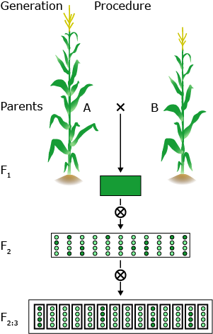
QTL mapping is a multi-step procedure that involves field and lab work as well as an elaborate statistical analysis.
In general, two homozygous lines that differ significantly for the trait under study are crossed. The F1 hybrid is selfed to produce a segregating F2 population. F2 individuals will be genotyped using molecular markers. F2 will be selfed to produce F2:3 lines for repeated field trials.
By crossing two lines, linkage disequilibrium is created between loci that differ between the parental lines. This is creating associations between marker loci and linked segregating QTL.
Experimental designs
F2:3 — in contrast to all other populations here three marker classes can be observed, therefore, dominance can be evaluated.
AIL — advanced intercross lines, Random mated populations, higher resolution, but decreased power of QTL detection.
RIL — homozygous genetic background, field trials can be repeated in multiple locations and years.
Single Marker Analysis (2)
Marker information and phenotypic data is combined and statistical tools are used to map and characterize QTL.
Expected QTL genotypic frequencies conditional on marker genotype.
The QTL mean for each marker genotype is equal to the frequency of each QTL type times the value of each QTL type, given the marker genotype.
F tests on the contrasts of marker classes test the following hypothesis:
a > 0
d > 0
r < 0.5
Additive effect: [latex](\mu_{MM} - \mu_{mm})/2 = a(1-2r)[/latex]
Dominance effect: [latex]\mu_{Mm} - (\mu_{MM} - \mu_{mm})/2 = d(1-2r)^2[/latex]
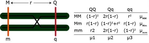
Example: [latex]\mu_{MM} = \mu_1 [(1-r)^2] + \mu_2[2r(1-r)] + \mu_3[r^2][/latex]
We have three equations but four parameters (u1 – u4, r). QTL effects and position of the QTL are confounded. We can only solve for the QTL effects if r is fixed.
Single Marker Analysis (3)
In single marker analysis, the only information we have are the means of each marker class. And based on this information it is possible to determine whether a marker is linked with a QTL. However, it is not possible to determine the effect of a QTL, because effect and QTL position are confounded.
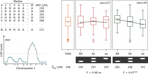
Example: Plant height, umc130
x̅ (MM) = 201cm
x̅ (Mm) = 196cm
x̅ (mm) = 191cm

| PHT (cm) | r = 0 | r = 0.2 | r = 0.4 |
|---|---|---|---|
| Additive effect | 5.0 | 8.3 | 25.0 |
| X (QQ) | 201.0 | 204.3 | 221.0 |
| X (Qq) | 196.0 | 196.0 | 196.0 |
| X(qq) | 191.0 | 187.7 | 171.0 |
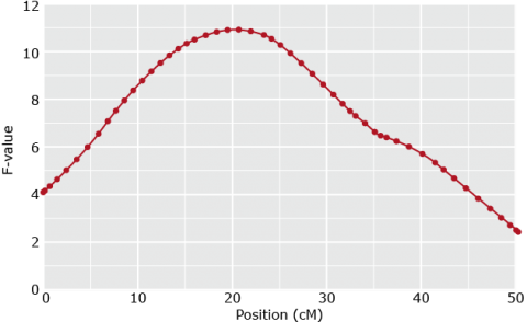
Simple Interval Mapping
In proposing interval mapping, Lander and Botstein (1989) addressed several shortcomings of single marker analysis. By using maximum likelihood, both a phenotypic value and a logarithm (base 10) of odds (LOD) score can be calculated for a QTL at any location on the genetic map. A QTL is found when a LOD values is higher than a predetermined critical value (values between 2 and 3 are often used). SIM uses a likelihood ratio test at every position within the single marker interval to test for a putative QTL. Both single marker analysis and SIM are methods used for locating a single QTL. Haley and Knott (1992) proposed a regression model for interval mapping and found little difference in results when compared with maximum likelihood. Closely linked QTL are difficult to separate by SIM, which can lead either to the discovery of false QTL or the failure in discovery of true QTL. Using interval mapping with regression analysis, Haley and Knott (1992) had trouble separating QTL that were as far as 20cM apart. SIM has a higher statistical power than single marker analysis for QTL detection and, therefore, requires fewer progeny (Lander and Botstein 1992, Haley and Knott 1992). In SIM, we assume no interference and that the three possible QTL genotypes follow normal distributions. As a result, the effect of QTL on the desired trait is a combination of these three normal distributions for the given marker locus (Xu 2010).
Effects at Flanking Markers
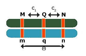
Effects at flanking markers: Can be used to separate QTL position and effect
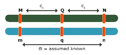
Contrast: [latex]Y_{Mm} - Y_{mm} = (1 - 1c_1)a[/latex]
Contrast: [latex]Y_{Nn} - Y_{nn} = (1 - 2c_2)a[/latex]
No interference: [latex]\theta = c_1 + c_2 - 2c_1c_2[/latex]
3 equations and 3 unknowns: [latex]c_1, c_2, a[/latex]
So, the solution can be obtained for all three unknowns.
This is flanking marker information to separate position and effect are implicitly implemented in interval mapping, although the procedure to get the estimates differs from solving analytically.
Quantitative Trait Locus (QTL) Mapping
Simple Interval Mapping (SIM): QTL Regression Interval Mapping
To estimate QTL position, effect separately
Use [latex]\theta = c_1 + c_2 - 2c_1c_2[/latex]
Regression Model
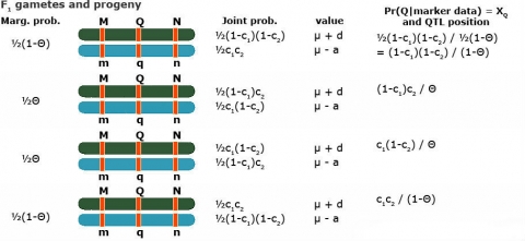
Simple Interval Mapping (SIM): A regression model for phenotype given marker data at a given (assumed) position of the QTL
- Two possible QTL genotypes: Qq or qq
[latex]\text{If} \quad Qq \rightarrow E(Y_1\ |\ Qq) = \mu + d \\ \text{If} \quad qq \rightarrow E(Y_1\ |\ qq) = \mu - a[/latex]
- Put those two together with
[latex]P(Qq\ |\ \textrm{marker data}) = X_{Q_i} \quad and \quad P(qq\ |\ \textrm{marker data}) = 1- X_{Q_i}[/latex]
- [latex]\eqalign { E(Y_i\ |\ M) &= (\mu + d)X_{Q_i} + (\mu - a)(1 - X_{Q_i}) \\ &= (\mu - a) + (a +d)X_{Q_i} \\ &= m + b_QW_{Q_i} }[/latex]
Thus the following regression model can be used to analyze the data
[latex]Y_i = m + b_QX_{Q_i} + e[/latex]
with the regression coefficient bQ expected to be equal to (a+d)
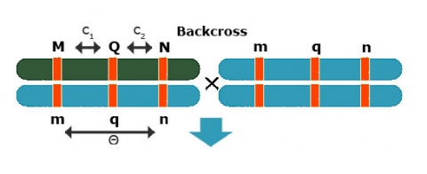
Backcross Regression Interval Model
Simple Interval Mapping (SIM): Backcross regression interval model
At a given (assumed) position of the QTL fit:
[latex]Y_i = m + b_QX_{Q_i} + e_i\quad \textrm{with} \ E(b_Q) = a + d[/latex]
Fit Model for various positions of QTL (e.g. in steps of q cM)
Position with lowest RSS or highest F-test gives best estimate of QTL position (c1) and effect (bQ=a+d)
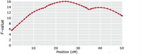
Composite Interval Mapping
Composite interval mapping expands on SIM and single marker analysis by allowing the detection of multiple QTL. Single marker analysis and SIM can show false (“ghost”) QTL in cases where multiple QTL are linked and in coupling phase on the same chromosome. Markers between these linked QTL may show, inaccurately, the highest phenotypic score (Xu 2010). Simple interval mapping can also give less accurate results for unlinked QTL. CIM uses other markers, outside the interval being tested, as cofactors to control the genetic background. While scanning a particular marker interval for presence of a QTL, CIM eliminates the effects of other QTL by using multiple regression analysis (Zeng 1993, Jansen 1993). For these reasons, CIM is more precise than SIM and single marker analysis (Zeng 1993). While CIM improves upon SIM in identifying QTL, closely linked QTL with opposite effects can contribute to missing QTL. This occurs because CIM is unable to simultaneously consider, and remove the variation associated with, multiple QTL that have already been found in the search for other QTL. As such, linked QTL with opposite effects on the phenotype can cancel out each other (Kao et al. 1999). For example, CIM was unable to find two QTL in radiata pine due to one QTL 61cM away from the left marker in the 3rd interval of linkage group 1 having an effect of 81.05 and a second QTL at the left marker of the 4th interval in linkage group 1 having an effect of -92.99. These positions are 11.8cM apart (Kao et al. 1999). Multiple interval mapping was used to distinguish these QTL.
Multiple QTL Problem
Backcross:
[latex]E(Y_{Mm} - Y_{mm}) = \color{red}\underbrace{{(1-2c_1)(a_1 + d_1)}}_\text{QTL 1} + \color{blue}\underbrace{{(1-2c_2)(a_2 + d_2)}}_\text{QTL 2}[/latex]
In the above formula, QTL 1 is red (left), QTL 2 (right) is blue.
1-QTL models
Ghost QTL
(if in coupling phase)
or no QTL
(if in repulsion phase)
Multiple QTL Solution
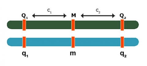
Composite Interval Mapping (CIM): Solution
Add markers as co-factors to control for QTL in other intervals
Eg. When mapping a QTL in interval C-D, include B and E as co-factors:
[latex]Y_i = \underset{inside(B-E)}{\underbrace{{\color{red} {b_aX_{add,i}+b_dx_{dom,i}}}}} + \underset{outside(B-E)}{\underbrace{{\color{blue} {b_BX_{B,i}+b_EX_{E,i} +e_i}}}}[/latex]
-
-
- The red (left) part of the equation is affected only by QTL in B-E. Use to detect QTL in C-D interval.
- The blue (right) part of the equation controls for QTL outside B, outside E
-
In general — include markers just outside the interval as co-factors
Can include other (unlinked) QTL markers as co-factors to reduce residual variance
There’s no single perfect strategy on how to choose co-factors.
Multiple Interval Mapping (MIM)
Multiple Interval Mapping (MIM) Multiple interval mapping was proposed by Kao et al. (1999) to apply SIM and CIM to a multiple QTL model and incurs a much heavier computational burden. Whereas SIM and CIM use one interval at a time to find a QTL, MIM uses multiple intervals concurrently to find multiple putative QTL. MIM not only discriminates among separate linked QTL, but also allows for the search and analysis of epistatic QTL as well as the estimation of genotypic effects, the estimation of genotypic variance components, and the heritability of individual traits. MIM obtains better accuracy and power for QTL mapping, but identifying the best QTL model becomes a more complicated task (Kao et al. 1999). Because genotypic data at QTL is not directly observed (marker data is), maximum likelihood estimation of QTL position and effects is used to infer the distribution of the genotype of QTL. If there are a large number of QTL, these estimates can quickly become very difficult to manage. Kao and Zeng (1997) developed formulas to handle this problem that assume no crossing-over interference, which means independence between flanking marker genotypes. To search for QTL to fit into the model, model selection methods are used as it is not possible to consider all model possibilities. Kao et al. (1999) discuss several of these selection methods.
References
Gaut, B. S., and A. D. Long. 2003. The lowdown of linkage disequilibrium. Plant Cell 15:1502-1506.
Hamblin, M. T., T. J. Close, P. R. Bhat, et al. 2010. Population structure and linkage disequilibrium in U.S. Barley germplasm: Implications for association mapping. Crop Sci. 50:556-566.
Knowler, W. C., R. C. Williams, and D. J. Pettitt. 1988. Gm3;5,13,14 and type 2 diabetes mellitus: an association in American Indians with genetic admixture. Am. J. Hum. Genet. 43:520-526
Newell, M. A. 2011. Oat (Avena sativa L.) quality improvement for increased beta-glucan concentration. Doctor of Philosophy Dissertation, Iowa State University.
Pritchard, J. K., M. Stephens, and P. Donnelly. 2000. Inference of population structure using multilocus genotype data. Genetics 155:945-959.
Yu, J., G. Pressoir, W. H. Briggs, et al. 2005. A unified mixed-model method for association mapping that accounts for multiple levels of relatedness. Nature Genet 38:203-208.
All references for the section on QTL mapping can be found in:
Jeffrey, B., and T. Lübberstedt. 2014. Molecular breeding of bioenergy traits. Compendium of Bioenergy Plants: Corn (in print, electronic or web-based form), S. Goldman (ed.), Science Publishers/Taylor & Francis/CRC PRESS, Boca Raton, FL, USA, 198-215.
How to cite this module: Lübberstedt, T., W. Beavis, and W. Suza. (2023). Cluster Analysis, Association, and QTL Mapping. In W. P. Suza, & K. R. Lamkey (Eds.), Molecular Plant Breeding. Iowa State University Digital Press.
