
Chapter 1: Basic Principles
Ken Moore; M. L. Harbur; Ron Mowers; Laura Merrick; Anthony Assibi Mahama; and Walter Suza
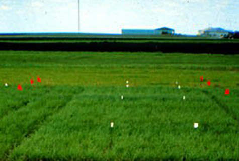
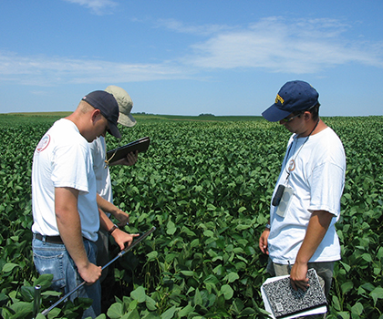
Most agricultural knowledge, including seed science and plant breeding, has been learned through the process of experimentation. Recommendations about crop varieties, seeding rates, and other management practices are all based on information acquired from experiments (Fig. 1). This lesson introduces you to basic concepts of experimentation.
- How the scientific method relates to agronomic research
- The different approaches to experimentation used in agronomy
- The roles of replication, randomization, and design control in experimentation
- The different types of data collected in agronomic experiments
- Measures of center and dispersion
- How to organize and summarize data with Excel
Scientific Method
Four Basic Steps of the Scientific Method
The scientific method helps lead to discovery of new knowledge. The goal of plant-related agricultural research is to develop new knowledge about crops and how they interact with the environment. The scientific method is a process used by researchers to discover new knowledge about their field of endeavor. It involves the systematic application of four procedures (Fig. 2).
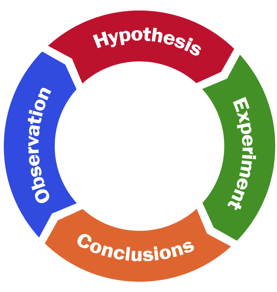
- Observation—recognition of the question
- Hypothesis—a tentative explanation of the observed phenomena
- Experiment—testing the hypothesis
- Conclusion—accept or reject the hypothesis
Iterative Process
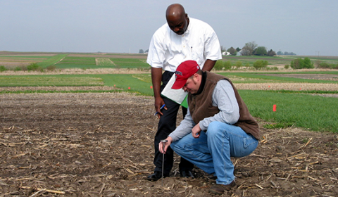
The scientific method is an iterative process. Often the results of one experiment lead to new questions and further experiments. The process can be viewed as iterative rather than linear. What is gained from one experiment can be used to refine knowledge gained from previous experiments. Then further experiments can follow, leading to findings in the same direction or leading to knowledge in a completely new direction of research. This method of research is termed inductive in that particular observations (Fig. 3) are used to support a more general conclusion. A known problem exists, but no solution is apparent. The goal of research is to discover answers to some question or problem.
Statistical Science
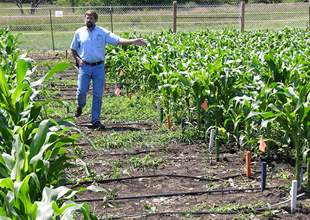
Before the advent of modern scientific methods, people simply observed phenomena, and without experiments found them difficult to explain. Others who may not have observed exactly the same thing, could ask, “Is what you saw just a chance occurrence, with no true underlying cause?” By designing experiments to test the repeatability and explore causes, we have a better process for drawing conclusions (Fig. 4).
The key point is the question, “Did this just occur by chance?” This is where statistics and probability enter into the scientific method. Scientists want to rule out chance happenings, so they often agree that if there is less than 0.05 probability of occurrence by chance, we must be observing a real effect.
Usage Example
An agronomist observes that all alfalfa varieties appear to grow best when planted on side slopes in pastures. Thinking about what might account for this observation, the agronomist develops the hypothesis that differences in soil characteristics between slopes and other landscape positions are responsible. An experiment is designed to test the hypothesis. Data are collected from several sites; it is concluded that there is indeed a relationship between soil type and alfalfa adaptation. However, the experiment was not conducted in such a way to establish a causal relationship. Therefore, a new hypothesis is developed which states that alfalfa adaptation is a function of soil pH, which differs for the soil types. This leads to a new experiment, and so on.
Experimental Design
Observational Experiments
Experimental design allows researchers to control factors influencing outcomes. Statistical analysis is a powerful approach to understanding collections of data. The analysis employed depends on the type of data and the manner in which it was collected. There are two broad categories or approaches to research that commonly are used: observational experiments and designed experiments.
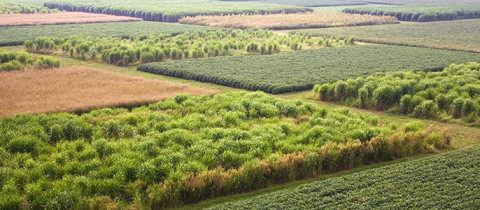
Observational experiments involve collecting data from a population of individuals to which no treatments have been applied (Fig. 5). They are descriptive in nature and usually involve studying the relationships among two or more variables of interest. It is important to understand that the variables studied in an observational experiment occur naturally and are not manipulated by the researcher in any way. An example of an observational experiment would be a comparison of groundwater nitrate concentrations among several Iowa counties.
Designed Experiments
Designed experiments differ from observational experiments in that data are collected from units that have been manipulated by the researcher in some way before the data are collected (Fig. 6). This is often described as applying treatments to experimental units. Some good agricultural examples of treatments are the application of specific fertilizer rates and the planting of specific crop varieties for the purposes of comparison. In agronomic terms, the smallest entity to which treatments are applied is usually a field plot.
Key Characteristics
- Replication – treatments are repeated two or more times on different experimental units (plots)
- Randomization – treatments are randomly assigned to experimental units (plots)
- Design Control – how treatments are applied to various groupings and sizes of experimental units (subplots, plots, blocks, locations)
Design Principles
Replication allows scientists to increase the accuracy of their results.
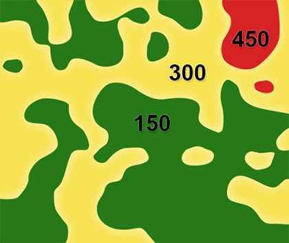
Why is replication important? Let’s consider an example. A farmer wants to know if a new variety he has heard about is better than the one he has grown for the past few years. To find out, he might decide to plant a few acres of the new variety and compare its yield with his current one. This is a reasonable approach, but there are some potential problems. Soil properties vary considerably among and within fields. If the varieties are planted in separate fields or even areas within a field, any yield difference observed between the varieties may actually be caused by differences in soil properties (Fig. 7).
Separating Effects
To separate the effects of variety and soil properties, it is necessary to replicate or repeat the comparison over more fields or plots. By comparing the yield averaged over replications (fields), the farmer will get a clearer and truer picture of how the varieties will perform over his/her whole farm. The more times the comparison is replicated, the more likely that any observed difference in yield is due to the variety planted. This is why replication is an essential part of designing field experiments to compare crop varieties.
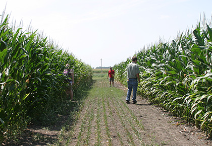
Let’s use an example to demonstrate. A farmer wants to compare his favorite corn hybrid with one recommended by his father-in-law. He decides to plant two of his smaller fields to compare the hybrids (Fig. 8).
Here are the details on the two fields the farmer wishes to use. For simplicity, we assume each field has one soil type only (Tables 1 and 2).
| Soil characteristics |
Amount of organic matter and minerals | ||
| Sharpsburg – silty clay loam, 9-14% slope, moderately well-drained, surface layer depth is 8-18cm, subsoil layer depth is 122cm | moderate organic matter | ||
| low subsoil P | |||
| medium subsoil K | |||
| Soil characteristics | Amount of organic matter and minerals | ||
| Macksburg – silty clay loam, 0-2% slope, somewhat poorly drained, surface layer depth is 61cm subsoil layer depth is 140cm | high organic matter | ||
| low subsoil P | |||
| medium subsoil K | |||
What are some possible ways of approaching this problem? Here are three options for performing this experiment, and the results are shown in Tables 3, 4, and 5.
Option 1
The farmer decides to plant Field 1 with the new variety and Field 2 with the old variety. When he harvests, he finds the following results (Table 3):
| Field 1 | Field 2 |
|---|---|
| New yield variety: 8780 kg/ha | Old yield variety: 9410 kg/ha |
Option 2
The farmer decides to plant Field 1 with the old variety and Field 2 with the new variety. When he harvests, he finds the following results (Table 4):
| Field 1 | Field 2 |
|---|---|
| Old yield variety: 7530 kg/ha | New yield variety: 10660 kg/ha |
Option 3
Realizing that there is a soil fertility difference between the fields, he decides to plant half of each field with each variety. This produces the following results (Table 5):
| Field 1- Plot 1 | Field 1 – Plot 2 | Field 2 – Plot 1 | Field 2 – Plot 2 |
|---|---|---|---|
| Old yield variety: 7530 kg/ha | New yield variety: 8780 kg/ha | Old yield variety: 9410 kg/ha | New yield variety: 10660 kg/ha |
Increasing Precision
The replication of both corn hybrids on both fields allows us to better separate yield effects due to hybrids and due to fields. We estimate a 1250 kg/ha difference due to hybrids. Although we cannot be sure this difference would repeat in another year or on another pair of fields, the replication has provided a better insight into the variety of differences in these fields.
It is clear that which field the hybrids are planted in will have a large impact on the outcome of the experiment. When using Option 1 or 2, the effects of hybrid and field are confounded. The only reasonable solution is to replicate the experiment.
Replication also increases precision and allows a measure of repeatability.
We saw in the previous example that sampling more fields or areas (replication) improved accuracy for testing yields of two hybrids. Replication also allows us to see repeatability in our data, i.e. how consistent the treatment effects are and how much error the experiment has. More “reps” result in more precision in the measurement of hybrid yield differences.
Randomization
Random assignment of treatments to experimental units is necessary to avoid unintentional bias in the results. Continuing the example from above, the farmer, for practical reasons, might consider planting replications of the same hybrid in adjacent fields. However, this may lead to bias in the results because fields located adjacent to one another tend to be more similar than those located farther apart. If the hybrids to be planted in each field are chosen at random, any bias that may occur due to soil properties or other characteristics associated with the fields is left to chance.
Randomization ensures that the yields measured in the experiment are due only to the treatment (hybrid) and the random effect associated with the field where it was grown. Randomization gives an equal chance that each treatment (hybrid) will be assigned to each experimental unit (field). This equal-chance assignment provides a probability basis for the statistical tests of hybrid differences.
Design Control
Design control helps reduce undesirable error variation. Design control refers to the way in which treatments are assigned to experimental units. In the ideal experiment, differences among experimental units treated alike will be small compared to those between units receiving different treatments. In this case, we say that the experimental units are homogeneous, and no design control is necessary. Many times, however, it is not possible to identify the required number of experimental units (plots) that are similar enough to compare all of the treatments in an experiment. In this case, we say that the experimental units are heterogeneous, and often we can improve the precision of the experiment by exercising some design control.
Blocking
One form of design control is blocking experimental units into homogenous groups called blocks. When each block is large enough to accommodate the complete set of treatments of interest, we refer to the design as a randomized complete block design (RCBD). The RCBD is a very common design used in agricultural field experiments. There are many other types of design control that we will discuss in subsequent lessons.
In our example above, we could greatly improve the precision of the experiment by blocking treatments (hybrids) according to the field. In this case, we would make certain that each hybrid is planted the same number of times in each field. The field effect (1880 kg/ha) would be distributed evenly over each hybrid such that the differences in means between treatments should reflect the true difference between hybrids (1250 kg/ha). Not only does blocking treatments in this manner improve the estimates of the means, but we will see later that it greatly improves (reduces) the error variance used to test the significance of treatment effects.
Types of Data
Quantitative vs. Qualitative
Usually, when we conduct an experiment, we are interested in collecting information on certain characteristics of our experimental units. These characteristics are generally referred to as variables. Variables describe some measurable attribute such as yield or color.
Variables can either be qualitative or quantitative. Qualitative variables are those to which no meaningful numerical values can be assigned. Qualitative variables are often referred to as either classification or categorical variables because they can be used to group data. However, their order has no inherent meaning.
Quantitative variables, on the other hand, are numerical in nature. They can be ranked along some scale of measurement, which has inherent meaning.
For example, variables in a variety trial might include seed yield and seed color. Yield is a numerical variable and the values collected for this variable would therefore be quantitative. We would be interested in knowing which variety has the highest value for seed yield. Seed color, such as white or yellow, is a description of the seed, but it cannot be ranked numerically. Therefore, color would be a qualitative variable.
Each variate has a value. For example, plant height is a variable and if we measure it five times we have five variates. The variates might have values of 79, 81, 82, 83, and 85.
Discussion Topic
Write down short responses to the following questions, and then if possible, check your classmates’ responses to see how the perception and use of statistics in agriculture professions varies, and its level of incorporation in agricultural businesses.
- If you have had a job in a business related to agriculture, what was your job title and position, what were your job responsibilities, and did you personally use statistics to do your job?
- How did statistical analysis (as an area of science) interact with your position, and your job or your company’s decisions or policies?
- How do you foresee statistical analysis and design affecting your professional decisions in the future?
Measures of Center and Dispersion
Nominal and Ordinal Scales
There are a number of measurement scales used in agronomic research, including nominal, ordinal, and continuous. A nominal scale, meaning “in name only”, is a system of classifying or categorizing qualitative data. Examples of nominal scale classification schemes are sex, plant taxonomy, and soil type. The values are generally characters, such as M or F, rather than numeric data types. Sometimes you categorize data using numbers, even though they are just names, for example, block 1 and block 2, or varieties 1, 2, and 3. It is important to remember that even though the data type is numeric, the order of treatments has no intrinsic meaning.
Data collected on an ordinal scale can be arranged in order according to rank. However, the rank value contains no information about how similar or different two adjacent values are; all that can be said is that one is larger than the other. That is to say, equal differences between any two points on an ordinal scale may not have equal meaning. Agronomists often use arbitrary scales to numerically rank the characteristics of soils and plants. A plant breeder, for example, might devise a scale for ranking disease resistance in progeny plots. The scale is useful for ranking the disease resistance of the genotypes evaluated, but the rankings do not indicate how much actual disease is present.
Continuous Scales
Continuous scales differ from ordinal scales in that they have a constant interval size. Therefore, the difference between two values has a known quantitative meaning. Examples are temperature, concentrations of phosphorus and potassium in soil solution and plant height and weight. Continuous variables theoretically can take any value in the range afforded by your measuring device, for example, 67.3528…°C (Fig. 9).

The types of analysis which can be performed on a data set depend on the type of measurement scale used. You will learn more about this as we study various statistical procedures.
Significant Digits
Use common sense when reporting the results of your experiments, and report results only with proper significant digits. Express numerical results only to the level of precision warranted by the measuring instruments. For example, if corn yields are measured in kg per plot, say 8.95 kg, and corrected for grain moisture, e.g. 28.3%, we might get a calculated yield equal to 11.48153 Mg/ha. What should we report? Since the original measurements are three digits, we should report 11.5 Mg/ha. The key principle is to do calculations with as high precision as possible but report only to the level of precision that data warrants.
When reporting results, do not report with more precision than the least precise measurement. For example, you may be trying to measure ear length of maize in an experiment. The ruler used can be read to the nearest millimeter. You might be able to approximate your measurement to the decimal fraction between millimeters. For this individual measurement, you would then be measuring to the 0.1 mm place. When reporting average ear lengths in your company report, how precise can you be in your averages?
Calculation Statistics
The concept of significant digits when performing calculations using software programs should be somewhat obvious. When calculating statistics in Excel and other statistical programs, the programs will typically output as many digits as you allow. When you have measured ear length to the 0.1-millimeter precision, reporting an average ear length of 225.39568 mm does not make any sense. Using the convention would lead to reporting 225.4 mm.
It is important, however, to keep as many digits as your calculator or computer can accommodate for intermediate calculations. For example, the statistical program SAS uses double precision in its statistical computations and is more accurate than Excel for some of these calculations. It is when you report your results that you need to remember to round off to the proper number of significant digits.
Standard of Measurement
The standard of measurement in the sciences and most countries in the world besides the United States is the metric (System International; SI) system. In scientific reports, metric measurements are standard. The U.S. system is known as the Imperial system. Examples in this course will be given in the metric system.
The importance of having a measurement standard cannot be overstressed. A recent NASA (National Aeronautics and Space Administration, the federal agency) mission to Mars lost its satellite because of a miscommunication between the builder of the satellite (which used English units) and the user (which operated the satellite using metric measurements). Because of this error, a $125 million satellite was lost.
Populations and Samples
A population is a set of individuals for which we draw inferences. The purpose of experiments is to draw conclusions about a population. For example, we might want to draw conclusions about all mid-season maturity corn plants on irrigated farms near Grand Island, Nebraska. The population is a theoretical concept. It is generally a very broad group of individuals to which we wish to extend inferences from our experiment.
The way we draw conclusions about populations is to take samples. For example, our experiment may have been conducted on seven farms in the Grand Island area. We earlier saw randomization as a key idea in getting an unbiased sample, and we will explore this idea further in later chapters. From the sample in our experiment, we want to infer the properties of a population represented by that sample.
Parameters
Parameters characterize a population and are estimated from sample statistics. There are certain descriptive measures for the population that define the center. Others describe how dispersed the population values are. We sample values from the population to get information, albeit incomplete, about the population and its parameters. We calculate sample statistics to estimate population parameters. For example, we calculate the sample average (i.e., sample mean) to estimate the true population mean.
Although it may seem at first to be a minor point, we need to distinguish the true population values or parameters from the estimates of them called statistics. An easy way to remember the difference in definitions is the mnemonic device: population and parameter begin with the letter p, and sample and statistics begin with s. The true average corn yield in an area is a population parameter. It is estimated with a sample average, our sample statistic. It is important to remember that the sample average is not the true average yield for the farms in the target area and can vary from sample to sample. We can get into trouble by assuming that the sample average is the true average instead of reporting a range of yields in which the true parameter is likely to be contained.
Population and Sample Mean
Measures of the center are the mean, median, and mode. The sample mean (sample average) is a measure of the center of a population. It is calculated by averaging the values in the sample. The formula for the sample average is:
[latex]\bar{x} = \frac{\sum x}{n}[/latex]
[latex]\text{Equation 1}[/latex] Formula for calculating sample average,
where:
[latex]\bar{x} =[/latex] sample mean
[latex]\sum{x}=x_1+x_2+...+x_n[/latex]
[latex]\text{Equation 2}[/latex] Formula for calculating the summation of multiple varieties,
where:
[latex]x_1[/latex]= [latex]1^{st}[/latex] variate,
[latex]x_2[/latex]= [latex]2^{nd}[/latex] variate,
[latex]x_n[/latex]= [latex]n^{th}[/latex] variate,
[latex]n[/latex]= sample size (# of individuals measured or variates).
We use Greek letters for parameters and Latin letters for statistics. The sample mean [latex]\bar{x}[/latex] is used to estimate the population mean μ. For example, suppose our seven sample values are: 178, 170, 203, 185, 199, 178, 210 kilograms per hectare of a certain crop variety, corrected to 15.5% grain moisture. The sample mean is 189 kg/ha.
Median and Mode
Other measures of center include the value which occurs most often in the sample, called the mode, and the median, the (n+1)/2 ranked number when the observations are sorted by value. The median can be thought of as the middle number in the series. 50% of the measurements are above the median; the other 50% are below. For our example, the sample mode is 178. The sample median is 185, seen by ordering the values: 170, 178, 178, 185, 199, 203, 210. If the sample contains an even number of observations, the median is the average of the two middle values.
Variance
Measures of dispersion include the difference between the highest and lowest values in the sample (the range), the variance, whose formula is listed below, and its square root, called the standard deviation. The variance is an average of squared deviations from the mean. Its formula is:
[latex]S^2=\frac{\sum(x - \bar{x})^2}{n-1}[/latex]
[latex]\text{Equation 3}[/latex] Formula for calculating the variance,
where:
[latex]S^2[/latex]= sample variance,
[latex]x[/latex]= each variate in the sample,
[latex]\bar{x}[/latex]= sample mean,
[latex]n[/latex]= sample size (# of individuals measured or variates).
This formula has two parts, the numerator, which is a sum of squared deviations, and the denominator (n-1), called degrees of freedom. The Greek letter, Sigma (Σ), in the formula means “sum the terms which follow”. Any value not exactly coincident with the mean contributes positively to the variance through this sum of squares. In the earlier crop example, even the yield of 185, which is close to the sample mean of 189, has a small contribution to the variance (185-189)2 = (-4)2 =16. The more distant from the mean, the higher will be the contribution of each value to this numerator sum of squares. The value 210 contributes (210 – 189)2 = 212 = 441 to the sum of squares. For our example, the sample variance is 226 and the sample standard deviation is 15 kg/ha.
The reason for dividing by (n – 1) is to make the sample variance an unbiased estimator for the population variance. This concept is called the degrees of freedom. This is an important concept, but equally difficult to explain! Basically, the deviations – the value of [latex](x - \bar{x})[/latex] for each individual in the sample must sum to zero, by definition of the sample mean (try it!). Because of this, only n – 1 of the individual values are free to vary. For example, if the n – 1 deviations sum to 9, then we know the nth value must equal [latex](\bar{x} - 9)[/latex]. You can also think of the denominator as telling you that it is impossible to get a sample variance if your sample only has one value (division by zero is impossible).
Standard Deviation
The standard deviation is simply the square root of the variance. It is recorded in the same units as the original measurements. It is very often used as the measure of spread or dispersion of a sample. In the chapter on Distributions and Probability, as we explore the normal, bell-shaped distribution, we will see that the standard deviation is very useful. (For a normally distributed random variable, 95% of the values of the population are within about two standard deviations of the mean.) We use the sample variance s2 to estimate the population variance σ2. The sample standard deviation s estimates the population standard deviation σ.
Coefficient of Variation
Another measure of variation, which is independent of the units of measurement, is the ratio of standard deviation to sample mean, called the coefficient of variation (CV). The formula is:
[latex]CV=\dfrac{S}{\bar{x}}{}{100{\%}}[/latex]
[latex]\text{Equation 4}[/latex] formula for calculating coefficient of variation,
where:
[latex]CV[/latex]= sample coefficient of variation,
[latex]S[/latex]= sample standard deviation,
[latex]\bar{x}[/latex]= sample mean.
For our example with crop yields, the CV is 15.03/189 = 7.95%. The CV is most often used when computed with the “error” standard deviation divided by the experiment mean. In this sense, it measures the random and unexplained variation in an experiment. You will see in future units how the experiment variation is partitioned into “explained” and error variance.
The CV, because of its independence from units, can be used to compare variation for different traits or even for different crops. We might contrast the variation in a soybean variety yield trial with a corn one, citing that the CV is 12% for the soybean trial compared with 8% for corn yields. However, care is needed in interpreting any of these statistics. Since the CV is the ratio of standard deviation to mean, traits with a low average, such as near-zero stalk lodging, may have extremely large CVs, often hundreds or even over a thousand percent.
Excel Exercises
Introduction
Microsoft Excel is a powerful tool for organizing, analyzing, and displaying data. In this lesson, we will be using data from the Iowa Crop Performance Test program in central United States to demonstrate how to organize data in Excel. In this exercise, you will learn how to enter data and equations, sort data, filter data, create a pivot table, and make a graph in Excel.
The Excel Exercises in this course were designed under version 2010. If you are using a newer version of Excel, the way the program functions or your view of the results may differ from what is depicted in the lessons.
Excel Exercises
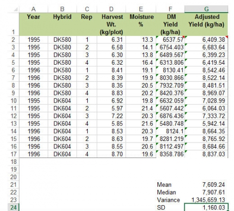
The data used to generate the examples below were collected during the 1995 and 1996 growing seasons as part of the Iowa Crop Performance Test program. Two representative hybrids grown near Oskaloosa, Iowa, were selected for the purpose of these exercises.
Each hybrid was planted at a seeding rate of 11,736 kernels per hectare. Plots consisted of four 5.49 m rows spaced 76.2 cm apart. Yield data were collected from only the center two rows. Plot yields are in units of kilograms per plot.
For Exercise 1, download the Excel file here.
Data are organized in spreadsheets in rows and columns. In Excel, rows are designated by numerals and columns by capital letters. Each intersection of a row and column is called a cell and is labeled using the column letter and row number (e.g. B3).
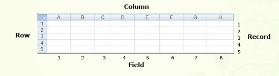
The data in the Hybrid Test Data worksheet are arranged using this format. The first row contains headings that identify each of the columns (fields). Each subsequent row (record) contains all of the data pertaining to a specific field plot (Fig. 10). At this point, each record consists of:
Ex. 1: Data Columns
Each plot is identified by the year and field replication in which it was grown together with the treatment (in this case, hybrid) that was applied to it. In statistical jargon, year, replication, and hybrid are independent class variables. The remaining two columns contain measurements that were made on the plots. These represent dependent variables and the goal of our analysis is to determine how they are affected by the independent variables.
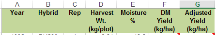
The yield data in column D of the Hybrid Test Data worksheet is in units of kgs per plot, which is not very meaningful to most people. Columns F and G are labeled DM Yield (kg/ha), and Adjusted Yield (Kg/ha). However, the cells below these headings do not contain data.
Using the data in columns D and E together with the information described in the introduction section, calculate the missing values in columns F, and G.
HINTS:
- A hectare is 10,000 square meters.
- Each plot is two rows wide by one row long.
- Adjusted yields are calculated on a 15% moisture basis.
Ex. 1: Column F Formula
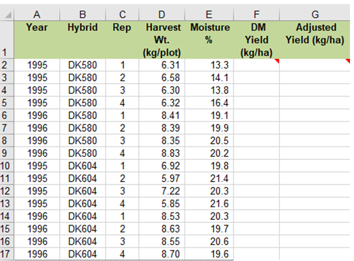
In the data worksheet, cells with a red triangle in the corner contain helpful comments (Fig. 11). Place the cursor over the cell to read the comment. Note that cell F2 occurs at the intersection of Row 2 and Column F on the spreadsheet.
- Type the following formula into the cell F2: =D2*1195*((100-E2)/100)
- After entering the formula in cell F2, press “Enter”. Next, select the cell (F2) by clicking on it to highlight it. Once highlighted, grab the square in the lower right corner and drag it down to cell F17 to copy the formula into the remaining empty cells in the F column.
Here is the reasoning behind the formula in the F2 cell:
- First, we convert from kilograms per plot to kilograms per hectare. So we multiply by 1195 to convert from a two-row, 5.49 m plot (for 76.2 cm rows, this would be 8.37 m2) to a hectare. (Check the math: 10,000 m2 (one hectare) divided by 8.37 m2 = 1,195.)
- Second, we multiply by (100 – E2)/100. This calculates the percentage dry weight, which is (100 – grain moisture)/100. Multiplying the kilograms per hectare by the percentage dry weight gives us the dry matter yield per hectare.
Ex. 1: Column G Formula
- Type the following formula into the cell G2: =D2*1195*0.85
- After entering the formula in cell G2, drag the cursor over it to select the cell. Once highlighted, grab the square in the lower right corner and drag it down to cell G17 to copy the formula into the remaining empty cells in the G column.
Here is the reasoning behind the formula in the G2 cell:
You are adjusting the yield to 15% (0.15) moisture by dividing by 0.85 (which equals 1-0.15). Doing that increases the yield by 15% to account for the standard moisture in reported grain yields
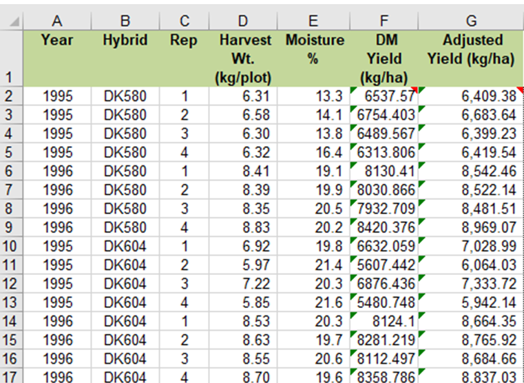
Ex. 1: Completed Data Table
- Excel formulas always begin with the equal sign.
- Spreadsheet formulas can be written with relative cell references so that once a formula is entered, it can be copied to other cells.
Your completed data table should look like Table 12.
Sorting data in Excel is easy. You can quickly sort a data set using several fields at once by following the directions below.
Steps:
- Using the mouse, select the data you wish to sort.
- Make sure not to include the header row (Field Names) in your selection.
- Select Sort from the Data menu at the very top of the screen.
- Enter the field you wish to sort by in the space provided.
- Select Values in the Sort On field.
- Select whether you want ascending or descending sort order in the Order field.
- To add another field to Sort by, select Add Level at the top of the dialog box.
- Repeat the steps above to select the Field, Values, and Order.
- Click OK to sort the data.
Sort the data in Hybrid Test Data spreadsheet by Hybrid, Year, and Replication.
Your completed data table should look like Table 13.
Often when you are working with a large data set you want to isolate a subset of the data for analysis. It is possible to do this simply by sorting the data so that the information you want is grouped together. In the sort example in Exercise 2 we regrouped the data by year making it easier to compare the two hybrids within each year. With larger data tables that use more than three sort fields, it is easier group data using a filter.
Steps:
- Using the mouse, select the data you wish to filter. Be sure to select the top row which contains the data labels.
- Select Filter from the Data menu.
- A small box with an arrow in it will appear in the lower right corner of each cell in the header row.
- Click on any of these boxes to filter data by that field.
- A pull-down menu will appear containing the available filters for that field.
- Select the one you want, and only data matching that criterion will be displayed.
- You may use any combination of filters to select a specific subset of the data.
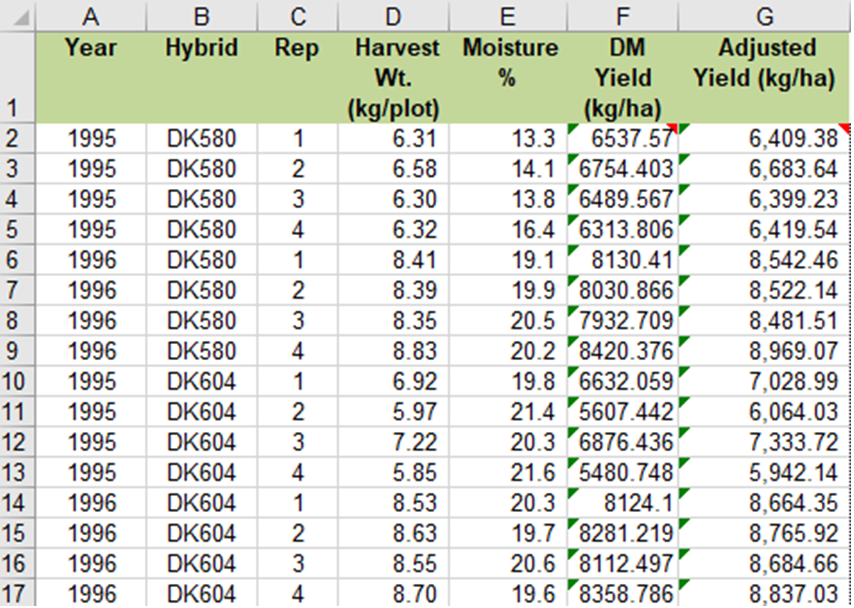
Filter the data in Hybrid Test Data spreadsheet to display data only for 1995 and DK604.
Your completed table should look like Fig. 14.
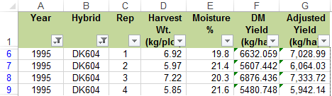
A pivot table is used to summarize data contained in other tables. It is an extremely powerful tool for evaluating data. In our case we will use a pivot table to compare means of the two hybrids for each of the two years. Follow the steps outlined below to create a summary table of adjusted yields for the Hybrid Test Data.
Steps:
- Using the mouse, select the data you want to summarize. Be sure to select the top row which contains the data labels.
- Select PivotTable from the Insert menu.
- A dialog box will open and the data you have selected will automatically appear in the box next to Select a table or range.
- Click the circle next to New Worksheet and then OK.
- The next screen will show an empty table with a panel on the right side titled PivotTableFieldList, which is used to format the table:
- Drag the Year field into the Row Labels box in the panel.
- Drag the Hybrid button into the Column Labels box in the panel.
- Drag the Adjusted Yield button into the Values box in the panel.
- Click on the Sum of Adjusted Yield field and select Value Field Settings… from the popup menu that appears.
- Select Average from the list of options that appear, then click OK.
- The 2 x 2 table you have created will be displayed in the new worksheet.
Your completed pivot table should look like Table 15.
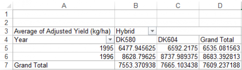
Now that the data is summarized in a pivot table it is a simple process to graph the results. Since Hybrids are a qualitative variable, we will use a bar graph. Follow the steps outlined below to graph the adjusted yield means for the Hybrid Test Data.
Steps:
- Using the mouse, select any cell within the pivot table.
- Select PivotChart from the Tools toolbar.
- Select Column from the Insert Chart menu on the left of the dialog box.
- Select the side-by-side chart type (first item under Column)
- A graph will appear within the worksheet.
- You can rearrange the chart by dragging the field labels between the Legend Fields… and Axis Fields (Categories) boxes in the panel to the right of the screen.
- To change the location of the graph:
- Right-click anywhere within the margins of the graph.
- Select Move Chart…
- Click the circle next to New sheet: and enter a label for the new worksheet.
- Click OK to finish.
- To change the appearance of the graph:
- Right-click anywhere within the margins of the graph.
- Select Format Chart Area… from the popup menu.
- Change settings under each tab to alter the appearance of the graph.
Your completed graph should look like Fig. 16.
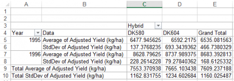
We have already created a pivot table to summarize data from the Hybrid Test dataset. In Exercise 4, we used a pivot table to calculate means (or averages) of the two hybrids for each of the two years. In this exercise, we will modify that table to include a common measure of dispersion, the standard deviation (SD).
You should already have created a pivot table that displays means of the hybrids for each year averaged over reps. Follow the steps below to calculate the standard deviation for each hybrid by year treatment combination.
Steps:
- Using the mouse, select any cell within the pivot table. This should pull up the PivotTable Field List on the right of your window.
- Drag the Adjusted Yield button into the Values box in the panel. This will create another cell in the table that is labeled Sum of Adjusted Yield.
- Click on the Sum of Adjusted Yield field and select Value Field Settings… from the popup menu that appears.
- Select StdDev from the list of options that appear, then click OK. The resulting 2 x 2 table should now show the mean of each combination of hybrid and yield along with its standard deviation.
Your completed pivot table should look like this Fig. 17):
Excel has a number of embedded functions that can be used to calculate common statistics. In this example, we will use Excel functions to calculate the mean, median, variance and standard deviation of the adjusted yield values in the Hybrid Test Data worksheet.
In Excel, functions are entered as formulas in the cells where you want to display the results. Follow the steps below to calculate the mean, median, variance and standard deviation of the adjusted yield values in the Hybrid Test Data worksheet.
Steps:
- Starting with the Hybrid Test Data worksheet where you calculated Adjusted Yield values in Part 1, enter the label “Mean” in cell F19.
- Enter the formula =AVERAGE($G$2:$G$17) in cell G19. This calculates and displays the overall mean in cell h29. The dollar signs ($) in the formula indicate an absolute range relative to rows and columns, which will allow you to copy and paste the formula in other cells without losing reference to the correct range of data.
- Adding additional calculations is now as easy as entering a new label, copying the formula you just entered into a new cell, and editing it to call a different function.
- Using the approach just described, calculate the median, variance, and standard deviation (SD) for the adjusted mean values. The Excel functions for these three statistics are: =Median(range), =Var(range), and =Stdev(range).
The cells you entered into the Hybrid Test Data worksheet should look like this (see box in lower right corner) (Fig. 18):
Excel comes with an add-in called Analysis Toolpak which contains a number of macros for calculating various statistics. The tools represented by the macros in Analysis Toolpak will have some limitations as your analyses become more complex, but they are useful for simple cases and for understanding how to interpret basic statistics. Your installation of Excel may not have the Analysis Toolpak installed and ready to use. If that is the case, follow these instructions to activate the Add-In (Fig. 19).
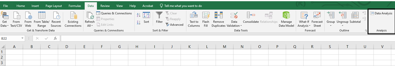
Steps:
- Under the “Data” menu, select “Data Analysis” from the “Analysis” group.
- Select Descriptive Statistics in the Data Analysis dialog box that appears and then click OK.
- A new dialog box will appear labeled Descriptive Statistics. Click on the spreadsheet icon at the far right of the line labeled Input Range:
- Use your mouse to select the range of data listed under Adjusted Yield (h3:h27).
- Under Output Options select New Worksheet Ply: and Summary Statistics and then click OK. A table of descriptive statistics will be created and displayed in a new worksheet.
The table of descriptive statistics should look like Fig. 20.
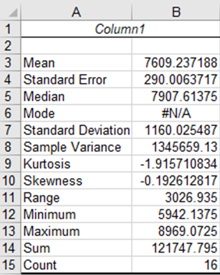
You should be familiar with all of these statistics except the Standard Error, Kurtosis, and Skewness. The standard error is another measure of dispersion. It is the square root of the variance divided by the number of observations (count). It will become more important later in the course when we learn about mean comparisons. The Kurtosis and Skewness statistics relate to the distribution of the data and are useful for evaluating whether or not a set of observations are distributed normally. We will learn more about them in future lessons as well.
Summary
- Iterative process of discovery
- Observation, Hypothesis, Experiment, Conclusion
- Statistics answers “Did this occur simply by chance?”
Replication
- Increases accuracy by better sampling
- Increases precision of treatment averages
- Gives a measure of repeatability
Randomization
- Provides insurance against bias
- Gives statistical basis for hypothesis tests
Design Control
- Reduces error from confounding factors (eg. blocking to remove soil variation)
Measurement Scales
- Nominal (in name only) / Ordinal (can be ordered) / Continuous
- Report only significant digits
Parameters
- Characterize the population
Statistics
- Calculated from the sample to estimate parameters
Measures of Center
- Mean, median, and mode
Measure of Dispersion
- Standard deviation, variance, range, and coefficient of variation (CV)
How to cite this chapter: Moore, K., M.L. Harbur, R. Mowers, L. Merrick, A. A. Mahama, & W. Suza. 2023. Chapter 1. Basic Principles. In W. P. Suza, & K. R. Lamkey (Eds.), Quantitative Methods. Iowa State University Digital Press.
A four-stage process used by researchers to discover new knowledge. The four stages are: 1) Observation, 2) Hypothesis, 3) Experiment, and 4) Conclusion.
Iteration is a process where knowledge gained from a previous experiment is used for the next experiment.
An experiment in which variables studied occur naturally and are not manipulated by the researcher.
An experiment in which variables studied have been intentionally manipulated by the researcher.
A procedure or manipulation for which you wish to measure a response. Some good agronomic examples are the application of specific fertilizer rates and the planting of specific crop varieties for the purposes of comparison.
The physical entity which can be assigned at random to a treatment. It is also the unit of statistical analysis.
An aspect of experimental design in which the treatment array is duplicated several times.
Process of assigning experimental units without any bias. Usually executed by random number generation.
Application of restrictions on randomization in the design of an experiment for the purpose of better controlling recognizable sources of variation; for example, blocking to control soil variation in a randomized complete block experiment.
With only one replication the effects of hybrid and field are confounded; they cannot be separated from one another.
With respect to a measurement system, accuracy is the degree of closeness of measurements to the actual or true value of the quantity that is being measured.
(1) Plants comprising the population are genetically identical.
(2) Population is comprised of genetically identical plants.
Characterizing individuals with non-homozygous allelic genetic constitutions, or populations of plants with individual plants of different genetic constitution. When referring to experimental units, units considered to differ in composition or structure are called heterogeneous. Usage: Not applied to a single locus, where the term is heterozygous. n. heterogeneity.
A form of design control where experimental units are grouped into homogenous groups called blocks.
Variables describe some measurable attribute such as yield or color.
Qualitative variables are those to which no meaningful numerical values can be assigned. Compare quantitative.
Quantitative variables are numerical in nature. They can be ranked along some scale of measurement which has inherent meaning. Compare qualitative.
Qualitative variables that can be used to group data. However, their order has no inherent meaning.
Qualitative variables that can be used to group data. However, their order has no inherent meaning.
A measurement made on a variable.
A measure of the lightness or darkness of a color. It is given a numerical value equal to the square root of the percentage of incident light reflected by the sample being described. The value scale ranges from 0 to 10, with 0 representing pure black and 10 representing pure white. Munsell color notations use value along with hue and chroma to describe soil colors.
A system of classifying or categorizing qualitative data.
Data collected on an ordinal scale can be arranged in order according to rank. However, the rank value contains no information about how similar or different two adjacent values are; all that can be said is that one is larger than the other. That is to say, equal differences between any two points on an ordinal scale may not have equal meaning.
The offspring of two parents.
Continuous scales differ from ordinal scales in that they have a constant interval size. Therefore, the difference between two values has a known quantitative meaning.
With respect to a measurement system, precision is the degree to which repeated measurements show the same results under unchanged conditions. Similar to the concepts of reproducibility and repeatability.
For plant breeding: a group of individuals of the same species within given space and time constraints.
For statistics: the complete set of units with a common trait for which a certain value summarizing the measured data is needed.
A common trait of a population, such as the mean or standard deviation.
