
Chapter 7: Linear Correlation, Regression and Prediction
Ron Mowers; Dennis Todey; Kendra Meade; William Beavis; Laura Merrick; Anthony Assibi Mahama; and Walter Suza
Determining the relationship between two continuous variables can help us to understand a response to an associated action. The concept of linear correlation can illustrate a possible relationship between two variables. For instance, the ideas that more rainfall and more fertilizer available to a crop produce greater yield are very plausible. To determine whether a relationship exists statistically, employ the use of linear models. Once a relationship is established, methods of linear regression can be used to quantify the amount of response and strength of the relationship, such as finding that 5 cm of additional precipitation produces a 30 kg ha-1 yield increase or applying 10 kg ha-1 less N reduces yields by 40 kg ha-1. For students of plant breeding, the concepts of regression and prediction will be fundamental to understanding Quantitative Genetics and Breeding Values.
- The proper use of and differences between correlation and regression
- How to estimate a correlation relationship from a scatter plot
- How to establish a linear relationship between a dependent variable and an independent variable using regression methods
Correlation
Correlation is a measure of the strength and direction of a linear relationship.
The Pearson Correlation Coefficient (r), or correlation coefficient for short, is a measure of the degree of linear relationship between two variables. The measure determines how close to linear is the change in one variable with respect to the other. The emphasis is on the degree to which they vary linearly. Later in this lesson, we will discuss regression, where the interest is in the rate of change, and how one variable is predicted by the other. In correlation, the strength of the relationship is of interest.
The correlation coefficient may take any value between 1 and –1.
The sign of the correlation coefficient (+, –) defines the direction of the relationship, either positive or negative. A positive relationship means that a positive change in one variable is related to a corresponding positive change in the other (e.g. more fertilizer produces more yield), while a negative relationship produces a negative result (e.g. increasing numbers of black cutworms decreases yields).
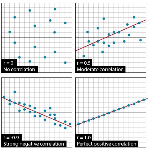
The absolute value of the correlation coefficient describes the strength of the relationship. A correlation coefficient of 0.50 indicates a stronger degree of linear relationship than one of r = 0.40. Likewise, a correlation coefficient of r = –0.50 indicates a greater degree of relationship than one of r = –0.40. Thus, a correlation coefficient of r = 0.0 indicates the absence of a linear relationship; correlation coefficients of r = +1.0 and r = –1.0 indicate perfect linear relationships (Fig. 1).
Scatter Plots
A straightforward and necessary way to visualize correlations is through the use of scatter plots. Usually, the dependent variable is plotted on the vertical axis of the plot while the other variable is plotted on the horizontal axis. Such a plot can provide evidence of a linear relationship between the variables. An example is shown below in Fig. 2.
How well related are these two measurements? What is their correlation coefficient?
This animation estimates some correlations by drawing an approximate visual best-fit line (blue) using randomly generated data sets. Then the “Show” reveals the least-squares regression line (red).
Correlation: Calculating r
Correlation is an often misused concept and statistic. When two things are correlated, what does that really mean? Misconceptions about correlations between variables are common. Correlations can also be totally spurious. For example, a positive relationship between the number of sheep in the United States and the number of golf courses does not mean that sheep numbers have increased because there are more golf courses. Both variables are likely to be related to an underlying trend of increasing population in the U.S. Many things can be correlated, but it is the physical or biological relationship that gives a correlation relevance. Correlation only states the degree of linear association (not cause and effect) between the two variables.
Calculation of r involves estimating the covariance of two variables or how much they vary together. The correlation is defined in the equation below, where one of the variables is represented by x and the other by y.
[latex]r= {\frac{S_{xy}}{\sqrt{S_{xx}} x \sqrt{S_{yy}}}}[/latex],
[latex]\text{Equation 1}[/latex] Formula for calculating correlation, r.
where:
[latex]S_{xy}[/latex] = sum of products = [latex]y[/latex] = [latex]\sum{xy} - \frac{\sum{x}\sum{y}}{n}[/latex],
[latex]S_{xx}[/latex] = sum of squares of [latex]x[/latex] = [latex]\sum{x^2} - \frac{\sum{x}^2}{n}[/latex] ,
[latex]S_{yy}[/latex] = sum of squares of [latex]y[/latex] = [latex]\sum{y^2} - \frac{\sum{y}^2}{n}[/latex].
The correlation equation may seem monstrous at first. Do not panic! Actually, the concept behind the equation is closely related to the z-scores we calculated earlier.
The numerator, the sum of squares of xy (Sxy), measures the combined distances of all points from the center of the plot [latex](\bar{x}, \bar{y})[/latex]. The more closely X and Y are related, the greater this value will be.
The denominator is the product of the square roots of the sums of squares of X and Y. The product of these two roots quantifies how much X and Y vary independently of each other.
Thus, r is the ratio of the amount that X and Y vary together to the amount X and Y vary in total. The more X and Y vary together, the greater the ratio will be. The maximum possible values (1 or -1) occur when all variation in X and Y is related.
How individual variables vary is of interest. If large Y’s are associated with large X’s, it would stand to reason that there would be a positive correlation between the variables.
Correlation Example
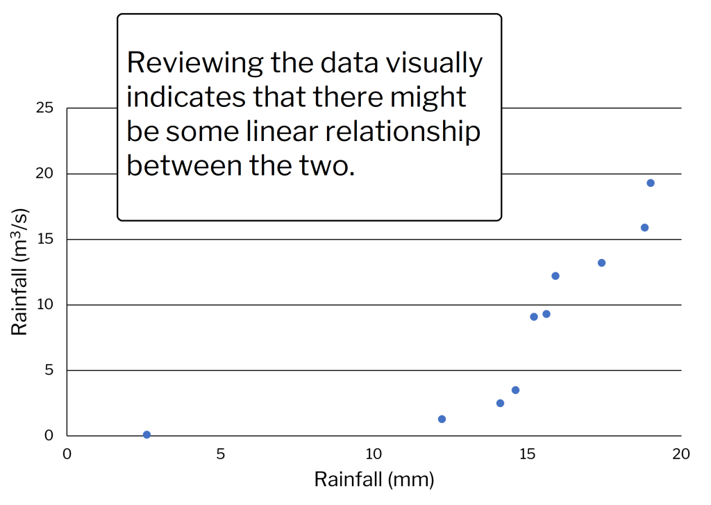
Some measurements were taken on the amount of flow, Y (m3/s), in a normally dry drainage ditch next to a field. These were measured from run-off after 30 minutes rainfalls. The total rainfalls were designated as X and measured in millimeters (mm). Hydrologists wanted to know how much water ran off under different conditions and how closely the two measurements were related in this field. The relevant sums are included along with the computational form of the r calculation (Table 1).
| x | x2 | y | y2 | xy |
|---|---|---|---|---|
| 2.6 | 6.76 | 0.1 | 0.01 | 0.26 |
| 12.2 | 148.84 | 1.3 | 1.69 | 15.86 |
| 14.1 | 198.81 | 2.5 | 6.25 | 35.25 |
| 14.6 | 213.04 | 3.5 | 12.25 | 51.1 |
| 15.2 | 231.04 | 9.1 | 82.81 | 138.32 |
| 15.6 | 243.36 | 9.3 | 86.49 | 145.08 |
| 15.9 | 252.81 | 12.2 | 148.84 | 193.98 |
| 17.4 | 302.76 | 13.2 | 174.24 | 229.68 |
| 18.8 | 353.44 | 15.9 | 252.81 | 298.92 |
| 19.0 | 361.0 | 19.3 | 372.49 | 366.7 |
| Σx = 145.4 | Σx2 = 2311.98 | Σy = 86.4 | Σy2 = 1137.88 | Σxy = 1475.15 |
Correlation Example Calculations
Using Equation 1 and the data in Table 1, [latex]r[/latex] is calculated as shown below.
Sum of products, [latex]S_{xy}[/latex] = [latex]\sum \textrm{xy} - \frac{\sum \textrm{x} \sum \textrm{y}}{\textrm{n}}[/latex]=[latex]1476.8[/latex] – [latex]{\frac{(145.5)(86.5)}{10}}[/latex] = [latex]218.2[/latex]
Sum of squares of [latex]x[/latex], [latex]S_{xx}[/latex] = [latex]\sum \textrm{x}^2[/latex] – [latex]\frac{(\sum \textrm{x}^2)}{\textrm{n}}[/latex] = [latex]2313.4[/latex] – [latex]\frac{145.5^2}{10}[/latex] = [latex]196.4[/latex]
Sum of squares of [latex]y[/latex], [latex]S_{yy}[/latex] = [latex]\sum \textrm{y}^2[/latex] – [latex]\frac{(\sum \textrm{y}^2)}{\textrm{n}}[/latex] = [latex]1139.4[/latex] – [latex]\frac{86.5^2}{10}[/latex] = [latex]391.2[/latex]
[latex]r[/latex]= [latex]{\frac{218.2}{\sqrt{196.4} x \sqrt{391.2}}}[/latex]= [latex]0.79[/latex]
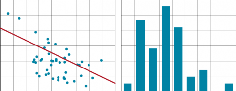
The computed r-value is 0.79. This is a moderately large correlation. How large the correlation is, depends upon the variability of the data. Correlations can range well above 0.9 or below -0.9 in many cases. Physically, there would seem to be a cause and effect here (Fig. 3). Heavier rainfall would produce more run-off, while light rainfall produces little or none. The best indicator of that can be seen at the heaviest rainfall rates, where the magnitude of the run-off increases substantially. The one data point at lower rainfall levels is problematic. We assume it is real. Occasionally, a single outlier data point can slightly skew a relationship. Although not as linearly related to the other data, it does fit the plausible model: lighter rainfall, less run-off.
Ex. 1: Calculating the Correlation in a Bivariate Set of Data
As shown in the examples displayed in the text, a good first guess in establishing a relationship between variables is to view the data on an X-Y scatter plot. Trends should start to appear. We will produce a scatterplot in Excel and determine the correlation.
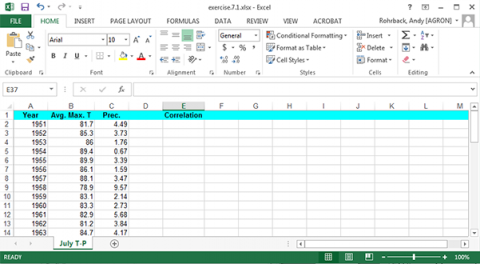
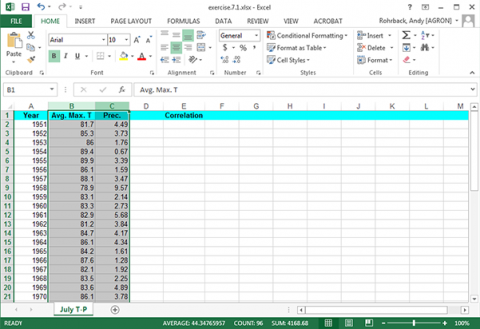
- Open the QM-mod7-ex1data.xls workbook. It is July weather data with average temperature and precipitation data.
Ex. 1: Bivariate Set of Data (1)
We will begin by producing a scatter plot to view the data. For this analysis, the Temperature will be assigned to the x-axis and Precipitation to the y-axis.
Ex. 1: Bivariate Set of Data (2)
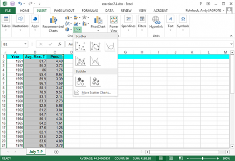
Highlight the two columns with the precipitation and temperature data (Fig. 5).
Select the Insert tab and click the Scatter Plot tool. Select the first type (Fig. 6).
Ex. 1: Bivariate Set of Data (3)
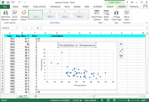
Change the x-axis label to Temperature, the y-axis label to Precipitation, and the plot title to Precipitation vs. Temperature (Fig. 7). Click on each text box in the plot to change it.
Ex. 1: Bivariate Set of Data (4)
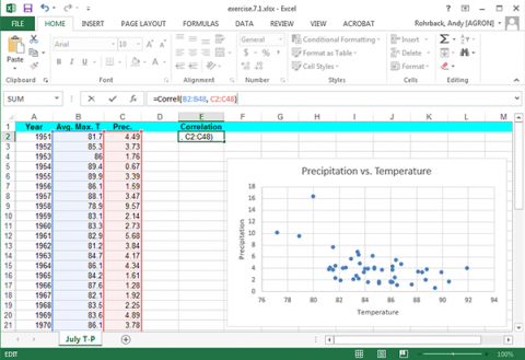
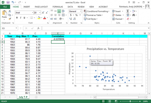
The correlation between precipitation and correlation can be easily calculated. Label a fourth column “Correlation” and enter the formula “=Correl(B2:B48, C2:C48)” (Fig. 8).
Ex. 1: Bivariate Set of Data (5)
The correlation is moderately large (but not exceptionally high), with an r-value of -0.534. You may see the effects of an outlier here. The correlation between July temperatures and precipitation makes sense. This relationship follows a meteorological pattern.

More precipitation wets the soil surface, causing more latent heating and less warming of the air by sensible heating. More precipitation generally means more clouds Fig. 9). Both are associated with lower temperatures. The single data value at the top may skew your view of the correlation while having a rather small effect on the total correlation. There does seem to be a qualitative relationship without a very strong correlation.
Ex. 1: Bivariate Set of Data (6)
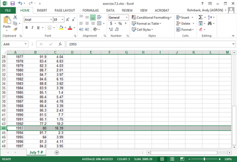
Hold the cursor over the possible outlier in the Excel scatterplot Fig. 10).
Select the row with 1993 data in the original data and delete it (Fig. 11).
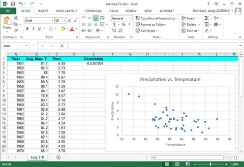
The plot and correlation will change (Fig. 12). However, be careful when discarding what appears to be an outlier. It is a good idea to try and determine if there was an obvious experimental error that can be found. If there is not, it may not be a true outlier.
Discussion: Correlation
How much did the correlation change by removing the 1993 data? What do you think about the results of this?
Linear Regression
Linear Regression establishes a predictive relationship between two variables. While correlation attempts to establish a linear relationship between two variables, regression techniques try to determine a predictive relationship between the two. Translated, “Can values of one variable be used to predict values of the other?”
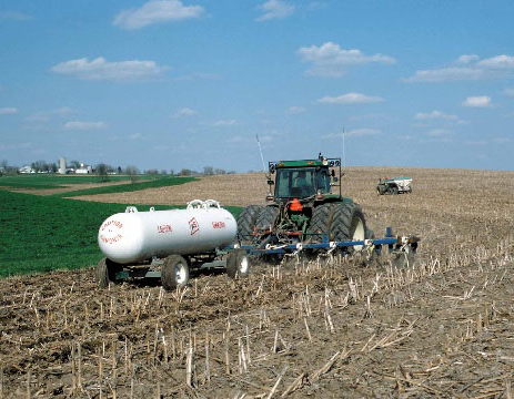
When someone wishes to apply fertilizer (Fig. 13), the expected amount of yield gained for the amount of fertilizer applied is needed. Sound economic and ecological choices may be based on regression and relationships between variables. Understanding the regression relationship allows the producer to use the amount of fertilizer that can give the best yield or financial return for the money invested.
Several other physical variables obviously are involved in translating the fertilizer into a yield result, such as rainfall, soil fertility, pest populations, etc.
Regression Lines
Referring to the scatter plot diagrams in the web exercise, one can estimate the magnitude of a correlation. When establishing a regression relationship, a single line delineating the relationship is necessary. One could use several methods to estimate the linear relationship that best fits the data.
Connecting the two endpoints in the data or eyeballing a resultant line are two examples. These will usually provide a qualitative result that lacks precision and accuracy.
In the animation above, we drew a line of “best fit” by eye and observed the least-squares regression line was different. The regression line is that line that minimizes the sum of squared vertical distances of points on the line. If you mentally determined the line minimizing the perpendicular distances, it would not be the same as the least-squares regression line. The regression line is “best” in the sense of least error for the line with fixed x-values.
Sources of Variation
The preferred method to estimate a regression line is to use the data to numerically calculate the line which minimizes the error or the scatter of the points around the line. This is done using the least-squares method. (Fig. 14)
The result of a linear regression is an equation of the form ([latex]\hat{\textrm{Y}} = \hat{\alpha} + \hat{\beta} \textrm{x}[/latex]). The hats over Y, α, and β indicate these are estimates, not the actual regression line. This equation determines the relationship between the x and a predicted [latex]\hat{\textrm{Y}}[/latex] based on the estimated slope of the regression line and the vertical intercept [latex]\hat{\alpha}[/latex].
As we have discussed before, we do not know the actual relationship between the two variables. Therefore, we estimate it, based on gathered data. We assume there is a true regression line: y = α + βx + ε, and we estimate intercept with α and slope with [latex]\hat{\beta}[/latex].
Point-Slope Formula
The point-slope formula to create the line can be found using sums of squares as calculated in the previous section. The slope of the line is determined using this equation.
[latex]\beta[/latex] = [latex]\frac{S_{xy}}{S_{xx}}[/latex]
[latex]\text{Equation 2}[/latex] Formula for calculating point-slope.
where:
[latex]S_{xy}[/latex] = sum of products = [latex]y[/latex] = [latex]\sum{xy} - \frac{\sum{x}\sum{y}}{n}[/latex],
[latex]S_{xx}[/latex] = sum of squares of [latex]x[/latex] = [latex]\sum{x^2} - \frac{\sum{x}^2}{n}[/latex].
Note the similarities to and distinct differences from the calculation of r. There are an infinite number of lines which can be described with this slope, thus another piece of information to describe a line is necessary.
Y-Intercept Formula
A specific point on the line (usually the vertical-intercept) along with the slope fixes a single line to the data. The Y-intercept of the line is determined by the equation below.
[latex]\hat{\alpha}= \frac{\sum \textrm{y} - \hat{\beta}\sum \textrm{x}}{\textrm{n}}[/latex], OR
[latex]\hat{\alpha}=\bar{y} - \hat{\beta\bar{x}}[/latex].
[latex]\text{Equation 3}[/latex] Formular for calculating the Y-intercept.
Another point which the line intercepts is the point ([latex]\bar{\textrm{X}}, \bar{\textrm{Y}}[/latex]). Knowing a point on the line and its slope completely describes the regression line through the data.
Example Calculation: Slope
Using the data from the previous section, we can calculate the regression slope using a hand computational formula in Equation 2.
[latex]\beta[/latex] = [latex]\frac{S_{xy}}{S_{xx}}[/latex]
Sum of products, [latex]S_{xy}[/latex] = [latex]\sum \textrm{xy} - \frac{\sum \textrm{x} \sum \textrm{y}}{\textrm{n}}[/latex]=[latex]1476.8[/latex] – [latex]{\frac{(145.5)(86.5)}{10}}[/latex] = [latex]218.2[/latex]
Sum of squares of [latex]x[/latex], [latex]S_{xx}[/latex] = [latex]\sum \textrm{x}^2[/latex] – [latex]\frac{(\sum \textrm{x}^2)}{\textrm{n}}[/latex] = [latex]2313.4[/latex] – [latex]\frac{145.5^2}{10}[/latex] = [latex]196.4[/latex]
[latex]\beta[/latex] = [latex]\frac{218.2}{196.4} = 1.11[/latex]
The Y-intercept of the data can be calculated similarly.
[latex]\hat{\alpha}= \frac{\sum \textrm{y} - \hat{\beta}\sum \textrm{x}}{\textrm{n}}[/latex]
[latex]\hat{\alpha}=\frac{86.5-1.11(145.5)}{10}[/latex]
[latex]\hat{\alpha}= -7.4[/latex]
Example Calculation: Interpretation
This line indicates that according to the measured data, the run-off will increase by 1.11 m3/s for each additional mm of rainfall. The line created is the “best” in describing the linear response of run-off to the associated rainfalls (Fig. 15).
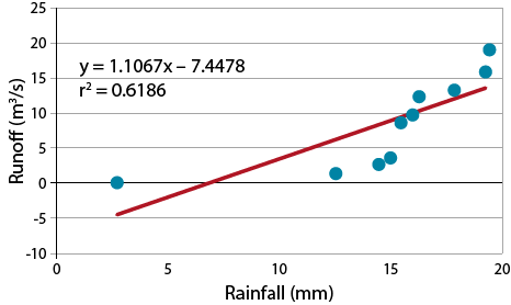
The strength of the relationship is r2, i.e., the correlation coefficient squared. Note that the line fitted to the data intercepts the vertical axis at a negative value. An initial interpretation of “negative runoff” is clearly nonsense, but a little reflection on the nature of the problem suggests that up to a certain level of rainfall the water will infiltrate the soil before there is runoff. Thus the negative value can be interpreted as the “infiltration potential” of the soil. You may also notice that there is some bias in the way the data deviate from the regression line. The line overestimates the run-off for rainfalls from 10-15 mm and underestimates above 16 mm. This hints that a linear relationship may not be the best choice for this relationship.
Exercise 2: Plotting Data to Estimate Regression

Photo by Iowa State University.
We will now use data to calculate a regression line. We could have calculated a regression line for the previous data, but since it is not obvious which is the cause and which the effect for July temperatures and precipitation, using one to predict the other is somewhat questionable (Fig. 16).
Here we will use the relationship between water stress and corn yield reduction in Iowa.
Water is the independent variable with yield being the dependent (or predicted) variable. In this case, the researcher controlled the amount of water applied and measured the yield.
Ex. 2: Plotting Data (1)
Download and open the Excel file QM-mod7-ex2data.xls. Select the “Water stress” worksheet.
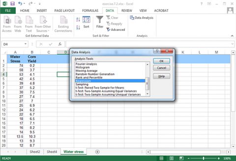
Ex. 2: Plotting Data (2)
Select the Data tab and click on the Data Analysis tool.
Scroll down to Regression; highlight it and click OK (Fig. 17).
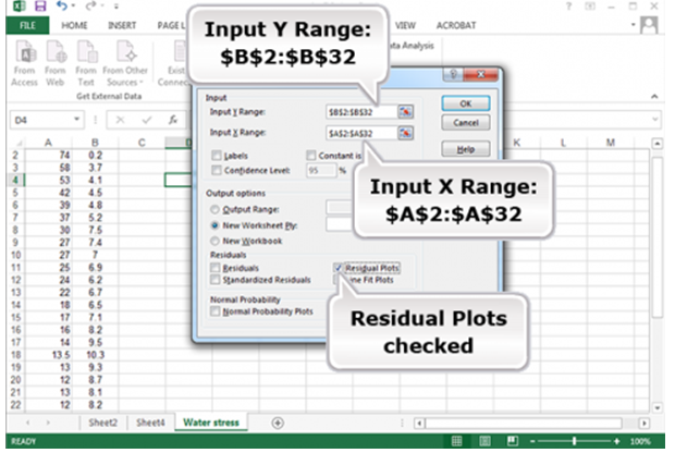
Ex. 2: Plotting Data (3)
Fill in the options as shown (Fig. 18):
Ex. 2: Plotting Data (4)
This gives the Linear Fit for the least squares regression line and an ANOVA for Regression. It also gives the residual plot (Fig. 19).
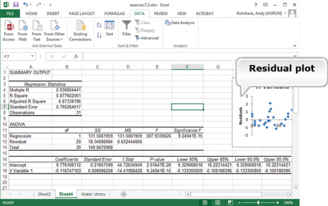
Notice that the prediction equation is : E(Yield (in 1000 kg/ha)) = 9.78 – 0.117 (Water Stress) (Fig. 20). This can be determined from the coefficients for Intercept and X Variable 1. The regression equation is Y = 9.78 – 0.117(WS) + error.
Ex. 2: Plotting Data (5)
Save this analysis in Fig. 21 for Exercise 3.
Estimation Formula
Sources of Variation include the line and deviation from the line. The line produced in linear regression is calculated to minimize the average distance of the Y-values from the line. Thus, summing the deviations of the actual Y-values from the regression-predicted values will equal 0. Measurement of observed data always has some variability associated with it due to the nature of error in experimental data. This variability can be accounted for and partitioned into its sources with an Analysis of Variance (ANOVA). Some variability of the Y’s occurs because of their relationship with X. This is quantified by the squared correlation coefficient (r)2, the proportion of variance in Y that can be accounted for by linear association with X. The rest of the variability around the line cannot be accounted for (at least in its relationship with the X variable). This is attributed to error. The linear model that accounts for this is depicted in this equation.
[latex]Y[/latex] = [latex]\alpha + {\beta{x}} + \varepsilon[/latex]
[latex]\text{Equation 4}[/latex] Model or formula for estimation of parameters.
where:
[latex]\alpha[/latex]= estimated Y intercept
[latex]\beta[/latex]= estimated slope
[latex]\epsilon[/latex]= deviation of Y value from line (error)
Errors
The true error is assumed to be in the measurement of the Y values only (Fig. 21). It is assumed that the X’s are fixed or that their measurement error is very small. The situation where the X’s have error is termed a bivariate normal distribution, in which case the assumptions for regression are not valid. We saw the effect of measurement errors in the X-variable in an earlier “Try This”. Some other assumptions are necessary for regression:
- for any value of X there is a normal distribution of errors
- the variances must be the same for all Y values
- the Y-values are randomly obtained and independent of each other
- the mean of the Y-values at a given X is on the regression line
Notice that these assumptions — independence of Y-value, normal distribution, constant variance, and adequacy of the model — will be essential throughout the remainder of the course.
Sum of Squares
It can be shown that the total sum of squares for Y is the sum of that associated with the regression line and that from the errors, or sum of squares not related to the relationship with X.
The correlation coefficient squared, r2, from the previous section describes the amount of variation attributable to the regression equation below. For example, if r2 = 0.75, then 75% of the total variation in Y is accounted for by the linear regression.
The total Sums of Squared (SS) deviations in the response variable (Y) is given by Equation 5.
[latex]\sum_{i=1}^{n}(Y_{i}-\bar{Y})^2[/latex]
[latex]\text{Equation 5}[/latex] Formula for Sums of Squared (SS) deviations.
This represents the total variability about the average response variable and is used extensively throughout this and future units.
Regression and Total SS
Because we have to estimate one parameter (the average response) in the total SS, we need to recognize that there are n-1 degrees of freedom (df) associated with this calculation.
[latex]\textrm{Regression SS} = \beta \times \textrm{Sxy} = \beta \times \bigg[\sum \textrm{xy} - \frac{\sum \textrm{x} \sum \textrm{y}}{\textrm{n}} \bigg][/latex].
[latex]\text{Equation 6}[/latex] Formula for calculating regression sums of squares.
where:
Total SS = Sum of squares of [latex]y[/latex], [latex]S_{yy}[/latex] = [latex]\sum \textrm{y}^2[/latex] – [latex]\frac{(\sum \textrm{y}^2)}{\textrm{n}}[/latex]
or
[latex]S_{yy}[/latex] = each observation = [latex]\sum(y_{i}-\bar{y})^2[/latex]
Partitioning Variation
The total sum of square deviations can be partitioned into regression and residual sums of squares based on these formulae.
[latex]\textrm{Regression SS} = (r^{2}S_{yy})\textrm{(Residual or error)} =(1-r^{2})S_{yy}[/latex],
[latex]\text{Equation 7}[/latex] Formula for partitioning components of total sums of square deviation.
This captures the essential relationship between the correlation coefficient, the variance of the Y values, and the partition of variation into that associated with the model (Regression SS) and that which is unexplained (residual). As the residual becomes large relative to the total variance, the correlation coefficient becomes smaller. Thus, the correlation coefficient is a function of both the residual and the total variance of Y.
Statistical Significance
Statistical Significance of the regression relationship can be tested with an F-test. The calculated regression slope is based on gathered data, from a sample. Calculations based on these data estimate the actual regression relationship. Even though we have calculated a regression coefficient, it is merely an estimate of how the variables are related. The true relationship may be slightly different from the one calculated. This could result in stating that there is a relationship when none exists. Testing the significance of the slope of the regression is done in a manner similar to other types of hypothesis testing.
The null and alternative hypotheses for this test:
[latex]H_{0}:\beta=0[/latex]; [latex]H_{A}:\beta \neq 0[/latex].
[latex]\text{Equation}[/latex] 8 Null and alternative hypotheses.
Formula for F
The test is used to determine if the slope of the regression line is different from 0. Two related statistical tests may be used to test this hypothesis. The first, shown below, uses the sums of squares to determine if the regression coefficient captures enough of the variance in the data using the F test.
F= [latex]\frac{\textrm{Regression MS}}{\textrm{Residual MS}}\textrm{(with 1 and n-2 degrees of freedom)}[/latex].
[latex]\text{Equation 9}[/latex] Regression F test formula.
If the slope explains a significant proportion of the variability in the regression, then the slope is considered different from 0. If not enough variation is explained at some level of significance, often 0.05, then the slope cannot be considered different from 0.
ANOVA Table
As discussed, the variability can be partitioned. The linear regression sum of squares is calculated as shown in the Analysis of Variance (ANOVA) table or using the equation from the previous section. The ANOVA table for linear regression is shown in Table 3.
| Source of Variaton | Sum of Squares | Df | Mean Square | F |
|---|---|---|---|---|
| Regression | [latex]\hat{\beta}Sxy[/latex] | 1 | [latex]\frac{\textrm{Regression SS}}{\textrm{Regression Df}}[/latex] | [latex]\frac{\textrm{Regression MS}}{\textrm{Residual MS}}[/latex] |
| Residuals | [latex]\textrm{Syy - regression SS}[/latex] | n -2 | [latex]\frac{\textrm{Residual SS}}{\textrm{Residual Df}}[/latex] | n/a |
Notice the sums of squares and degrees of freedom for regression. The regression SS is written as a formula involving a ratio. This equates to the proportion R2 of the Total SS of Y (Equation 6). The regression relationship has 1 df, because the test is for the slope being zero. In an ANOVA, mean squares are SS divided by df.
Example: ANOVA
Let’s test the regression calculated from the previous data set. Calculating the sum of squares for Y gives a value of 391.3. Knowing the r2 value of 0.62, we can fill in the following ANOVA table:
| Source of Variation | Sum of Squares | Df | Mean Square | F | P < F |
|---|---|---|---|---|---|
| Regression | 242.1 | 1 | 242.1 | 12.95 | 0.007 |
| Residuals | 149.2 | 8 | 18.7 |
The F-test is used to compare the equality of variances. In this case, we are testing whether the variance associated with the estimated slope,  , is greater than the residual variance.
A calculated F value greater than the critical F value indicates the slope is significantly different from zero. Alternatively, most statistical software will calculate the probability of a given F value.
Ex. 3: Calculating a Regression Line and Testing the Slope (1)
In this exercise we will use Excel to find the regression equation. Calculations from the raw data are possible, but equations can be calculated easily using statistical software.
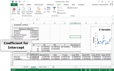
Return to the water stress computer output from the last exercise or re-run that analysis (Fig. 22).
A great deal of information is available from the Summary Output and Analysis of Variance (Fig. 22).
- R (correlation between yield and water stress)
- R-Squared (R2)
- Adjusted R Square
1-(Residual MS/Total MS)
A better measure for “goodness of fit” in multiple regression and comparing regression lines with different numbers of replication than is R-squared. - Standard Error (square root of the residual mean square)
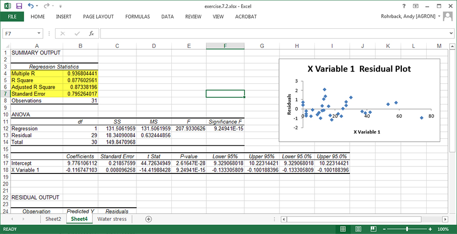
- Again, notice the regression equation (Linear Fit). E(Y) = 9.78 – 0.117x Is the slope statistically significantly different from zero?
- The ANOVA table, which has the F-test for slope based on the residual mean square (0.632), supplies the answer.
- The Prob > F, which tests the null hypothesis of no linear regression relationship (i.e., slope =0), implies to reject H0 because the probability is < .0001.
- There is another test for the significance of water stress, as a t-ratio for water stress in the table beneath the ANOVA.
- The regression slope, estimated by -0.117, is significantly different from zero.
Ex. 3: Calculating a Regression Line and Testing the Slope (2)
We can get some information on how well the line fits the data by examining the Residual plot.
The sum of the residuals should be 0 (or very small due to rounding errors of the computer and software). The plot of residuals displays how the actual Y values deviate from the regression-predicted Y values at each X. These should be scattered randomly along the X-axis. If there is any regularity to the residuals, the data may not be fit well by linear regression, or one of the assumptions of linear regression may have been violated. This is a small data set, so it would be easy to think that there is a pattern there. However, given the small size of the sample, it does appear to be approximately randomly distributed around zero.
Confidence Limits
Confidence limits can be established for the regression slope.
When you have calculated a regression line and tested the slope for significance, you can be reasonably assured that the sampled regression line approximates the slope, b, of the model. Testing whether the slope describes a significant amount of the total variability is based on the F-test. From Table 24, we note that the calculated F value of 12.95 is a really large value relative to an F distribution where the slope is equal to zero. Indeed, the probability of getting such a value or larger (P>F), given the null hypothesis, is 0.007. Thus the data do not support the null hypothesis of no linear response, although we might be wrong with such a statement about 7 times out of a thousand.
Another test related to the F-test is the t-test. The t-test can be used to test the significance of the regression line or more commonly it can be used to set error limits of the regression line. Typically, these are displayed as error bars encompassing some percentage of the data based on the estimated variance, s2. These limits come in three different types, error bars describing a confidence interval where the regression line occurs, error bars around the estimate of the average response, and bars encompassing an individual predicted value for a given X.
Equation
Confidence limits are the lower and upper bounds of a confidence interval. In the context of regression line they can be used to test whether the slope of the regression line is different from 0. The null hypothesis is that the slope of the regression line is 0. The alternative hypothesis is that the slope of the line is not zero. If the confidence interval includes 0, the slope cannot be considered different from 0 at that level of significance. The error is merely that associated with the regression line. Confidence limits on a regression line are similar to those calculated for sample means (Equation 10).
CL=[latex]\hat{\beta} \pm {t}\times\text {SE}[/latex].
[latex]\text{Equation 10}[/latex] Formula for calculating confidence limits.
where:
[latex]\beta[/latex] = slope estimate
t = t – value for the given degrees of freedom and significance level
SE = standard error of [latex]\hat{\beta} = \sqrt{\frac{\textrm{Residual Mean Square}}{\textrm{Sxx}}}[/latex]
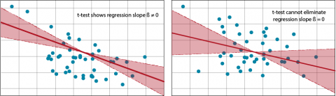
Using t-Test
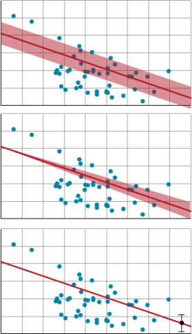
Restructuring Equation 10 to solve for t allows us to use a t-test for testing whether the slope is different from 0. That test is equivalent to the F-test of regression in the ANOVA. The confidence limits bracket possible slopes of the regression line (Fig. 24). A 95% confidence interval for the slope of a regression line means that this procedure will bracket the true regression slope 95% of the time.
When the standard error is large or the estimated slope of the regression line is small, a distribution will fail the t-test because a slope of 0 is possible under the given confidence level. Limits on the estimates of a specific Y from the equation, correspondingly, will have a wider limit. The estimate of the mean or predicted values includes not only the variance of the regression line but also that of individual means or values at each X-value.
Open the Excel water stress workbook you used earlier (Fig. 22 or Fig. 23).
Directly underneath the ANOVA table is a table with t-ratios and confidence intervals for the intercept and Water Stress coefficients.
A 95% confidence interval for [latex]\hat{\beta}[/latex] is between -0.133 and -0.100.
This is also easily computed from the formula
[latex]\hat{\beta}\pm{t}\times\text{SE}[/latex]
or
-0.117±(2.045)(0.0081)
where, with alpha = 0.05 in two tails and 29 error df, the table t-value is 2.045 and the standard error for b is 0.008096.
Use a calculator to show that the confidence limits for [latex]\hat{\beta}[/latex] match those in the table.
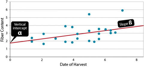
Replicated Regression
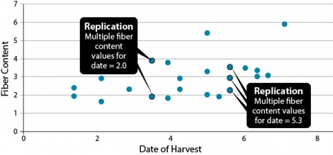
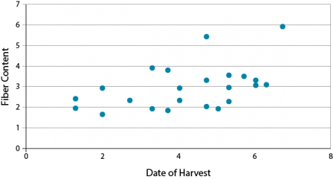
These data on fiber content in corn kernels related to harvest date shows replication: some samples harvested on the same date have different fiber contents (Fig. 25).
Regression in replicated data allows a goodness-of-fit test. Agronomic experiments are usually replicated. In this situation, when the data are grouped, replication of Y values at X’s will occur (Fig. 26). Calculating a total regression includes the variability in Y replication at the X values.

The initial ANOVA table provides the sum of squares and the test for the significance of the regression line. After the 1 df for regression, 21 df remain. This variability can be partitioned into the two sources discussed, the lack of fit to the model and the pure error. The lack of fit variability comes from the difference between the actual means of the Y’s at each X, and the regression line predicted Y at each X. This value describes how much error is associated with the regression line. This value can be tested to determine if the regression lack of fit is different from 0. The error which is left over is termed Pure error.
| Source | SS | Df | MS | F | P < F |
|---|---|---|---|---|---|
| Regression | 6.32 | 1 | 6.32 | 6.26 | <.05 |
| Residual | 21.19 | 21 | 1.01 |
Error Calculation
Pure error is the deviation sum of squares of each individual Y from the mean Y at each X. The degrees of freedom are the sum of one less than the number of replicated Y’s at each X. The pure error is calculated and subtracted from the residual to find the lack of fit.
[latex]\text{Total Error}=\sum_{i=1}^{n}\sum_{j=1}^{n_{i}}(Y_{ij}-\bar{Y_{i.}})^2[/latex].
[latex]\text{Equation 11}[/latex] Formula for calculating total error.
where:
i = level of X
j = each replicated Y at a given X
Yij = each observation at a given level of the x (independent variable)
Yi = mean for each level of the x variable
In effect, you are calculating a new sum of squares that estimates the total variance of observations around the mean for each value of x. This tells us how scattered were the data points we tried to fit with the regression line. The pure error degrees of freedom are calculated as:
[latex]\text{Pure Error df} =\sum_{}(n-1)\text{at each X}[/latex].
[latex]\text{Equation 12}[/latex] Formula for calculating pure error df.
Example: ANOVA Table
These equations produce the ANOVA table (Table 6).
| Source | SS | Df | MS | F | P < F |
|---|---|---|---|---|---|
| Regression | 6.32 | 1 | 6.32 | 6.26 | < .05 |
| Regression | 21.19 | 21 | 1.01 | ||
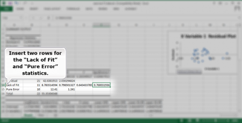
| Lack of fit | 8.78 | 11 | 0.79 | 0.64 | |
| Pure error | 12.41 | 10 | 1.24 |
The second F test compares the MS-lack of fit to the MS-pure error. This tests the linearity of the regression line. Since it is not significant, we assume the regression is linear and we do not have to try another model.
In this exercise, we will calculate the ANOVA presented in the lesson for replicated measurements of fiber content over different harvest dates. This will require calculating the ANOVA and partitioning the degrees of freedom and sums of squares.
- Download the QM-mod7-ex5data.xls file and save it.
- Run the regression analysis covered in Exercise 2 on this data set, then go back to the worksheet with the original data set.
- The lack of fit test is not calculated automatically in the regression analysis, so we will have to do it step-by-step.
On the same page as the data set, add two columns. Label one Date and the other Mean at Date. (Fig. 27)
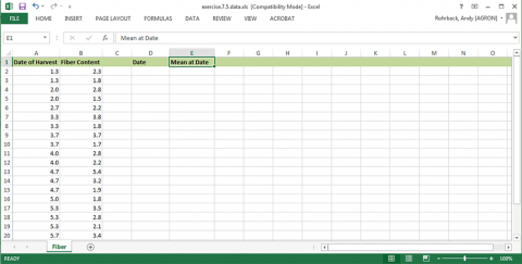
Ex. 5: ANOVA with Replicated Data (2)
Under date, copy each of the dates once (Fig. 28).
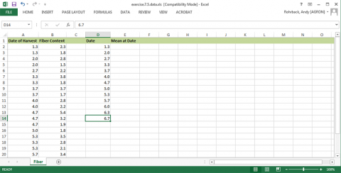
Under Mean at Date, calculate the average of the observations at the given date (Fig. 29).
Ex. 5: ANOVA with Replicated Data (3)
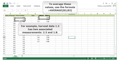
Now we will find the residuals associated with pure error using the means that were calculated (Fig. 30).
- Insert a new column next to the Fiber Content data.
- Place the average for each date next to the associated date. Use this formula: =LOOKUP(A2,E$2:E$14, F$2:F$14)
- Add another new column for the residuals.
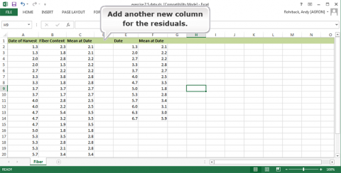
Fig. 30 Date of harvest and fiber content. - The residuals can then be determined by subtracting the mean at each date from the observation at that date. =B2-C2
- Add another column and insert the sums of squares (SS) associated with pure error by squaring each of the residuals. =POWER(D2,2)
- Add another column and insert the sums of squares (SS) associated with pure error by squaring each of the residuals. =POWER(D2,2)
- Then sum all the squares of residual pure error. =SUM(E2:E24)
- The degrees of freedom for pure error are calculated by determining the number of observations at each date and subtracting one from the number of replications at each date. =IF(COUNTIF(A$2:INDIRECT(“A”&ROW()),A2)>1, “”, COUNTIF(A$2:A24,A2)-1)
- These values are then summed. =SUM(F2:F24)
- The mean squares for pure error are then calculated by dividing the pure error sums of squares by the degrees of freedom for pure error.
- The lack of fit sums of squares and degrees of freedom can be found by subtracting the pure error sums of squares or degrees of freedom from the residual sums of squares.
- The mean squares for lack of fit are found by dividing the lack of fit SS by the lack of fit DF.
- Calculate the F-test for the lack of fit test by dividing the lack of fit MS by the pure error MS.
- Finally, the p-value for the F-test can be found using the formula “=f.dist.rt(A,B,C)” where A is the F-statistic, B is the df for lack of fit, and C is the pure error DF.
Ex. 5: ANOVA with Replicated Data (4)
Fill in the values in the ANOVA table under the regression analysis.
Insert two rows for the “Lack of Fit” and “Pure Error” statistics (Fig. 31).
Add the values you calculated to the ANOVA table under the regression analysis.
The completed analysis can be found in QM-mod7-ex5solved.xlsx.
Summary
Correlation (r)
- Measures degree or strength of linear relationship
- Tells direction of linear relationship; positive implies x and y increase or decrease together; negative (y decreases as x increases or vice versa)
- Ranges between -1 and +1, with 0 being no linear relationship
- The scatter plot is important to help interpret
Linear regression
- Establishes a mathematical relationship between two variables
- Prediction equation is Y = a + bx
- Parameter estimates are intercept (a) and slope (b)
- The line of best fit minimizes squares of vertical deviations from the line
ANOVA for Regression
- Has sources of variation for regression with 1 df and error with (n – 2) df
- r2 = (square of correlation) is the proportion of variation attributed to linear regression
- Tests statistical significance of linear regression
Confidence Limits
- Can be established for regression slope
- CL = b ± tsb
- Can also be computed for a mean of y-values or individual y given x.
Regression with Replicated Data
- Allows a goodness-of-fit test of the model
How to cite this chapter: Mowers, R., D. Todey, K. Meade, W. Beavis, L. Merrick, A. A. Mahama, & W. Suza. 2023. Linear Correlation, Regression and Prediction. In W. P. Suza, & K. R. Lamkey (Eds.), Quantitative Methods. Iowa State University Digital Press.
