
Chapter 15: Multivariate Analysis
Ursula Frei; Reka Howard; William Beavis; Anthony Assibi Mahama; and Walter Suza
Multivariate datasets: for each unit, various variables have been assessed. What information do we want to extract?
- Group the units based on the various variables into groups.
- Determine how the variables interact, and which of them have the main effects on the units.
- Eliminate variables that eventually overshadow the effects of those variables we are really interested in.
- Reduce the complexity of the dataset so we can use graphical tools to help us in interpretation.
- Analysis, graphical display and interpretation of complex datasets
Measures that Describe Similarities/Dissimilarities Between Units or Variables

If we are asked to describe a group of diverse objects, as given in Figure 1, our mind would automatically start to look for attributes these objects have in common and others that allow us to divide them into groups.
- Common: these are all letters
- Different: Letters: A & B
- Font size: large & small
- Case: upper & lower
- Color: red & black
We are still able to say which of the objects are identical = highest similarity (for example, the 2 black uppercase “A” in large font – positions 1 and 4 in Fig. 1, or the 2 red lowercase “a” in small font – positions 2 and 9, but we have to take a closer look to find the objects pairs, that share the least of the variables = lowest similarity.
Example 1: Data Sheet
Even in a very small dataset, it would be nice to have algorithms at hand to compute similarities/dissimilarities between the objects.
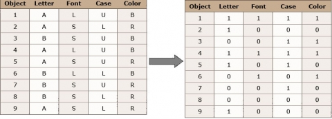
Fig. 2 (above) shows a datasheet we can create based on the objects in Figure 1. We have 9 objects and 4 variables. These are categorical/ordinal variables. For this example, we can transform the variables into binary variables since each of them has only two states.
Example 1: R Output
There are many different approaches how to compute the dissimilarity between objects. Without looking into detail, let’s just try out one and use R to calculate the distance matrix for the example.
## load packages
library(“cluster”)
#load the binarey datasheet (Ex1.csv)
Ex1_data <- read.csv(“Ex1.csv”, header = T)
Ex1_data
Letter Font Case Color
1 1 1 1 1
2 1 0 0 0
3 0 0 1 1
4 1 1 1 1
5 1 0 1 0
6 0 1 0 1
7 0 0 1 0
8 0 0 0 0
9 1 0 0 0
#calculate the simple matching coefficient with the function daisy
daisy(Ex1_data, metric = “gower”)
Dissimilarities:
1 2 3 4 5 6 7 8
2 0.75
3 0.50 0.75
4 0.00 0.75 0.50
5 0.50 0.25 0.50 0.50
6 0.50 0.75 0.50 0.50 1.00
7 0.75 0.50 0.25 0.75 0.25 0.75
8 1.00 0.25 0.50 1.00 0.50 0.50 0.25
9 0.75 0.00 0.75 0.75 0.25 0.75 0.50 0.25
Metric : mixed ; Types = I, I, I, I
Number of objects : 9
|
R output for the initial example.
The simple matching coefficient computes the percentage of variables that are different between two objects. If you have a look into the dissimilarities matrix, you can see that, for example, the object pair 1-4 has a dissimilarity value of zero (d14 = 0) – these are the 2 identical large, black, uppercase “A”, we identified earlier.
You can also see that for cases where the dissimilarities are expressed as numbers between 0 and 1, there is a simple relation between similarities (sij) and dissimilarities (dij) (Equation 1):
[latex]S_{ij}=1-d_{ij}[/latex].
[latex]\textrm{Equation 1}[/latex] Equation for relating similarity with dissimilarity.
where:
[latex]S_{ij}[/latex] = the similarity,
[latex]d_{ij}[/latex] = the dissimilarity.
Furthermore, a dissimilarity, dij, is also called a distance or metric if it fulfills certain properties:
[1] dij >= 0 and dij = 0 if and only if i = j
[2] dij = dij
[3] djk =< dij + djk
Calculating Similarities/Dissimilarities for Different Data Types
Calculating Similarities and Dissimilarities in Binary Data
In molecular marker data based on allelic non-informative marker systems (for example, AFLP data), only the presence or absence of a specific band can be scored.
Similarity coefficients calculated in a binary marker data set depend on the question if the absence of the marker alleles in both observed objects should be taken into account or not and also if alleles present in both observed objects should be counted once or twice.
The first step is to determine which bands are common or different in two objects:
aij – number of bands present in both objects i and j
bij – number of bands present in object i but not in j
cij – number of bands present in object j but not in i
dij – number of bands absent in both objects i and j
Different Coefficients
Simple matching coefficient:
[latex]\small D(SM)=1 - \normalsize \frac{a_{ij} + d_{ij}}{a_{ij} + b_{ij}+c_{ij} + d_{ij}}[/latex].
[latex]\textrm{Equation 2}[/latex] Equation for calculating simple matching coefficient.
where:
[latex]a_{ij}[/latex] = number of bands present in both objects i and j,
[latex]b_{ij}[/latex] = number of bands present in object i but not in j,
[latex]c_{ij}[/latex] = number of bands present in object j but not in i,
[latex]d_{ij}[/latex] = number of bands absent in both objects i and j.
The simple matching coefficient (Equation 2) computes the percentage of variables that are different between two objects related to all variables observed.
Jaccard’s coefficient:
[latex]\small d(J)=1 - \normalsize \frac{a_{ij}}{a_{ij} + b_{ij}+c_{ij}}[/latex].
[latex]\textrm{Equation 3}[/latex] Equation for calculating Jaccard’s coefficient.
where:
[latex]a_{ij}[/latex] = number of bands present in both objects i and j,
[latex]b_{ij}[/latex] = number of bands present in object i but not in j,
[latex]c_{ij}[/latex] = number of bands present in object j but not in i,
[latex]d(J)[/latex] = Jaccard’s coefficient.
The Jaccard’s coefficient takes only those observations into account where an observation was made – if, for example, a marker band is absent in both objects observed, then the observation is considered as non-informative and not included in the calculation (Equation 3).
Dice coefficient:
[latex]\small D(SOR)=1 - \normalsize \frac{2a_{ij}}{2a_{ij} + b_{ij}+c_{ij}}[/latex].
[latex]\textrm{Equation 4}[/latex] Equation for calculating Dice coefficient.
where:
[latex]2a_{ij}[/latex] = two times the number of bands present in both objects i and j,
[latex]b_{ij}[/latex] = number of bands present in object i but not in j,
[latex]c_{ij}[/latex] = number of bands present in object j but not in i,
[latex]d(SOR)[/latex] = Dice coefficient.
The Dice coefficient (Equation 4) is similar to Jaccard’s coefficient as non-informative observations are not included, but a band present in both objects is counted twice.
Calculating Dissimilarities for Marker Data
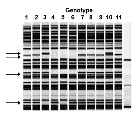
Example 2: Marker Data
First, we score the presence/ absence of the marker bands in each genotype (Fig. 3), and Table 1.
| m1 | m2 | m3 | m4 | |
|---|---|---|---|---|
| 1 | 0 | 1 | 1 | 1 |
| 2 | 0 | 1 | 1 | 1 |
| 3 | 1 | 0 | 1 | 0 |
| 4 | 0 | 0 | 0 | 1 |
| 5 | 0 | 0 | 0 | 0 |
| 6 | 0 | 0 | 0 | 1 |
| 7 | 0 | 1 | 1 | 1 |
| 8 | 0 | 1 | 1 | 1 |
| 9 | 0 | 1 | 1 | 1 |
| 10 | 1 | 1 | 1 | 1 |
| 11 | 0 | 1 | 1 | 1 |
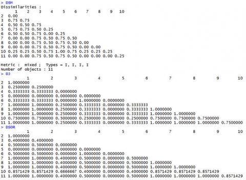
Then we can calculate the dissimilarities dSM, dJ, and dSOR using R (Example 2 [CSV]).
For the simple matching coefficient, we can use the function daisy{cluster}; the other coefficients can be calculated with the function betadiver{vegan}. Encoding for the different diversity measures can be found in Koleff et al. (2003) Journal of Animal Ecology, 73, 367-382.
Dissimilarity Matrices (Fig. 4)
Calculating Similarities and Dissimilarities in Categorical Data
Categorical variables are non-numerical, and it is not possible to apply any order to them.
In order to calculate distances between objects described by categorical variables, the variables can be transformed into binary variables, as we did already in example 1, for the special case when only two states for each variable are possible. If there are more than 2 states, we will have to proceed a bit differently.
| Common Name | Species Name | Origin | On noxious weed list | Flower | Growth form |
|---|---|---|---|---|---|
| Musk thistle | Carduus | nonnative | 1 | Purple | biennial |
| Scotch thistle | Onopordum | nonnative | 1 | Purple | biennial |
| Canada thistle | Cirsium | nonnative | 1 | Purple | perennial |
| Bull thistle | Cirsium | nonnative | 0 | Purple | biennial |
| Anderson’s thistle | Cirsium | native | 0 | Red | perennial |
| Snowy thistle | Cirsium | native | 0 | Red | biennial |
| Douglas or swamp thistle | Cirsium | native | 1 | White | biennial |
| Elk or Drummond thistle | Cirsium | native | 1 | White | biennial |
| Perennial sow-thistle | Sonchus | nonnative | 1 | Yellow | perennial |
In the example in Table 2 (Example 3 [CSV]), only the variables “origin”, “on noxious weed list,” and “Growth Form” can readily be transformed into a binary variable. “Species name” and “Flower” have 4 different stages each.
Creating Placeholder Variables
One way to handle this would be to annotate these variables the following way—we create a set of binary placeholder variables (Table 3), which define the states the original variable can assume:
For example, Flower—to describe the 4 states of flower color, we will need two binary variables Fl1 and Fl2:
| Purple | Red | White | Yellow | |
|---|---|---|---|---|
| Fl1 | 1 | 1 | 0 | 0 |
| Fl2 | 1 | 0 | 1 | 0 |
Same for species names:
| Carduus | Onopordum | Cirsium | Sonchus | |
|---|---|---|---|---|
| Sn1 | 1 | 1 | 0 | 0 |
| Sn2 | 1 | 0 | 1 | 0 |
How to estimate the number of placeholder variables (N) needed to represent the categorical data with X states:
[latex]\textrm{N}[/latex] =[latex]\frac{\log {\textrm{X}}}{\log {2}}[/latex], rounded up to the integer.
Binary Placeholder Variables
| Common Name | Fl1 | Fl2 | Sn1 | Sn2 |
|---|---|---|---|---|
| Musk thistle | 1 | 1 | 1 | 1 |
| Scotch thistle | 1 | 1 | 1 | 0 |
| Canada thistle | 1 | 1 | 0 | 1 |
| Bull thistle | 1 | 1 | 0 | 1 |
| Anderson’s thistle | 1 | 0 | 0 | 1 |
| Snowy thistle | 1 | 0 | 0 | 1 |
| Douglas or swamp thistle | 0 | 1 | 0 | 1 |
| Elk or Drummond thistle | 0 | 1 | 0 | 1 |
| Perennial sow-thistle | 0 | 0 | 0 | 0 |
Calculating Similarities or Dissimilarities in Quantitative Data
Quantitative variables can be discrete values (for example, ear row counts, pod numbers) or continuous values (for example, yield (t/ha) or temperatures (°C)).
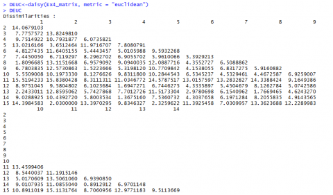
We will use the data in Excel file (Example 4 [CSV]) to calculate a few of the most commonly used similarities/dissimilarities in quantitative datasets.
Euclidean Distance
[latex]d_{ij}=\sqrt{\sum_{k=1}^{n}(x_{ik}-x_{jk})^2}[/latex].
[latex]\textrm{Equation 5}[/latex] Equation for calculating Euclidean Distance metric.
where:
[latex]d_{ij}[/latex] = Euclidean distance between objects i and j,
[latex]x_{i}[/latex] = number of bands present in object i but not in j,
[latex]x_{j}[/latex] = number of bands present in object j but not in i,
[latex]k[/latex] = number of occurrences of objects i and j.
The Euclidean distance (Equation 5) calculates the square root of the sum over all squared differences between two objects.
In our example, the distance between the two hybrids from AGRIGOLD would be calculated as:
[latex]\small d_{12} = \sqrt{(24.7-35.4)^2+(12.93+11.74)^2+(10.7-1.7)^2+(100-99)^2} = \sqrt{197.906} = 14.07[/latex]
You can already see that the unit the respective variable is measured in has a great influence on the results of the Euclidean Distance. Some standardization of the data set is advisable, and we will come to that later.
Manhattan Distance
[latex]d_{ij}={\sum_{k=1}^{n}|x_{ik}-x_{jk}|}[/latex].
[latex]\textrm{Equation 6}[/latex] Equation for calculating Manhattan Distance metric.
where:
[latex]d_{ij}[/latex] = Manhattan distance between objects i and j,
[latex]x_{i}[/latex] = number of bands present in object i but not in j,
[latex]x_{j}[/latex] = number of bands present in object j but not in i,
[latex]k[/latex] = number of occurrences of objects i and j.
The Manhattan distance (Equation 6) describes the distance between two points in a grid, allowing only strictly horizontal or vertical paths. The distance is the sum of the horizontal and vertical components of the path between two points.
In our example, comparing the two first hybrids of Example 4 [CSV]:
d12 = (24.7-35.4) + (12.93-11.74) + (10.7-1.7) + (100-99) = 21.89
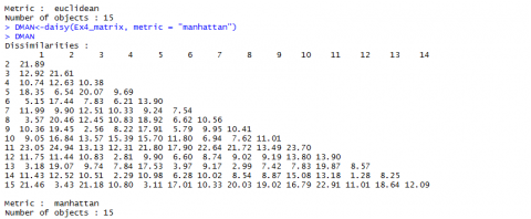
Euclidean and Manhattan Distance Results
Below (Fig, 5 and Fig. 6) are the results for Euclidean and Manhattan distances generated in R:
Correlation
Correlation (linear correlation coefficient, Pearson correlation coefficient):
The correlation coefficient can obtain values between -1 and 1; it measures similarity (Equation 7).
[latex]S_{ij}=\frac{\sum_{k=1}^{n}(x_{ik}-\bar{x_{i}})(x_{jk}-\bar{x_{j}})}{\sqrt{\sum_{k=1}^{n}(x_{ik}-\bar{x_{i}})^2{\sum_{k=1}^{n}(x_{jk}-\bar{x_{j}})^2}}}[/latex].
[latex]\textrm{Equation 7}[/latex] Equation for calculating Correlation Coefficient.
where:
[latex]S_{ij}[/latex] = correlation coefficient between objects i and j,
[latex]x_{i}[/latex] = variable [latex]x_{i}[/latex],
[latex]x_{j}[/latex] = variable [latex]x_{j}[/latex],
[latex]\bar{x}[/latex] = mean of variable x,
[latex]k[/latex] = number of occurrences of variables i and j.
The function cor() in R calculates similarities between columns/variables (which is the more common application for the function)—if you want to compare the rows/objects, you will have to transpose your data matrix first.
Calculating the Correlation
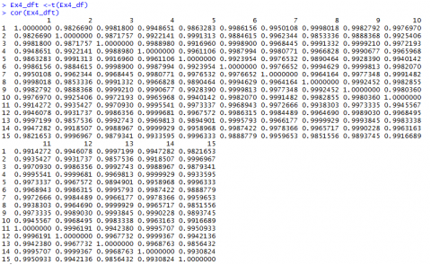
Preparing Data for Statistical Analysis
If we have a closer look at the data from Example 4 [CSV] and the distances we calculated (Fig. 7, we realize that the values depend a lot on in what unit, for example, the yield is measured. Changing the data from t/ha into kg/ha would result in completely different results.
The Euclidean distance between the first two hybrids would change from 14.0679 to a value of 1190.08256! As the numerical value of yield is then much larger than the value of the other variables, yield would have a much larger weight than the other variables.
The example shows that raw data cannot just be used for statistical analysis. It has to be prepared before any statistical analysis is applied.
Real data are never perfect; there are missing values, outliers, or other inconsistencies, which have to be dealt with.
As an example of how to prepare a raw dataset for statistical analysis, we will use the data collected in the file “RawDataEarPhenotypes.xlsx”:
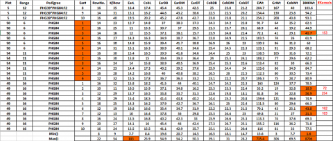
Four inbred lines, their respective F1 (6), F2 (6), and the 2 possible BC1 (2 x 6) were grown in a field trial with three replications. From each of the 3 x 28 plots, 10 randomly sampled ears were evaluated for 14 different ear phenotypes: row number (RowNo.), Kernels per row (K/Row), ear length (EarL), cob length (CobL), ear diameter at the base (EarDB), middle (EarDM), and tip (EarDT), cob diameter at the base (CobDB), middle (CobDM), and tip (CobDT), ear weight (EWt), grain weight (GrWt), cob weight (CobWt), and the 300 kernel weight (300KWt). So we expect a datasheet with 10 x 28 x 3 = 840 rows with data for the 14 variables measured…
Looking for Obvious Inconsistencies
The following inconsistencies can be found in the dataset (Fig. 6):
- There are 832 instead of the expected 840 observations: in two replications of inbred line PHG84, 6 instead of 10 cobs were measured!
- Using the Excel function Min() and Max(), we observe in the 300KWt variable an unexpectedly high value for the 300 kernel weight of 8706—obviously a typing mistake; if we correct this value to 87.6, another obviously too-high value, 998.2 shows up, we correct it to 99.82 In CobL the value of 183 as a maximum value is too high, we change it to 18.3 In EWt the value of 735.4 is too high, we change it to 73.54
- The Min() value in 300KWt column also seems to be very low—what happened?—Obviously, not all cobs had the required number of 300 seeds—so the seeds were counted and weighed, and in an additional column #Kernels, the number of seed weighed is given. There are different ways to handle this problem
- Eliminate the value generated with less than 300 seeds completely from the data set = missing values.
- Replace the value generated with less than 300 seeds completely from the data set with the mean 300KWt calculated based on the available correct data.
- Calculate an estimate for the weight of 300 seeds based on the available information—The problem is, if only a few seeds can be weighed, this estimate can be very insecure—we might consider doing this estimate only for cases where a certain number of seed (for example more than 150) are available.
The column “ca300KWt” is the result of applying first solution 3c and then 3a to the 300 kernel weight data.
- Once you start reading the data into a program like R, you will realize that there is another small typo in the EarL—one value has 2 decimal points: 21..9
Typical Data Clean-up Example
This is an example of a typical data clean-up (Fig. 8).
Generating Consistent Data: Missing Values
Some computer programs tolerate missing values, but eventually, it can become necessary to replace them with estimates for the real value.
One way to go is to replace the missing value with the mean overall values or, better, the mean over the values within the group of your missing value.
In order to make our data set a bit more manageable, we continue with the means over the 10 cobs for all repetitions and variables: “MeanEarPhenotypes.csv”
In this dataset, only the variable ca300KWt still has missing values—4 in total. We replace these with the mean calculated with the two remaining values within each pedigree (Fig. 9).

Cluster Analysis
Cluster analysis is an exploratory technique which allows us to subdivide our sample units into groups, such that similarities of sample units within a group are larger than between groups. Cluster analysis is applied if we have no idea how many groups there are. This is in contrast to another technique called the Discriminant Analysis, where the groups are given, and the sample units are distributed to the groups so they fit best.
Besides the grouping of sample units, cluster analysis may also reveal a natural structure in the data and eventually allow to define prototypes for each cluster in order to reduce the complexity of datasets.
There are several algorithms to perform the task of grouping; we will have a closer look at 2 of them:
- Agglomerative hierarchical clustering
- K-means clustering
Agglomerative Hierarchical Clustering
Agglomerative hierarchical clustering methods produce a hierarchical classification of the data.
There are two ways to do so: (1) starting from a single “cluster” containing all units of the datasets in a series of partitions, the units are divided into n clusters, containing each individual unit, (2) starting out from n individual “cluster”, a series of fusions are performed until only one cluster containing all units is formed (=agglomerative techniques).
Hierarchical classifications can be represented in 2-dimensional diagrams called dendrograms, which will show the stage at which a fusion between units has been made.
Hierarchical Clustering Example
- Download the dataset: Mean Ear Phenotypes [CSV]
The dataset contains the means over all repetitions done in the 4 inbred lines, the 6 F1, the 6 F2, and the 2 x 6 BC1 families. We will perform the cluster analysis based on the Euclidean distance matrix calculated with the raw (non-standardized) data (Fig. 10).
Different Agglomeration Methods
We will be using the hclust() function of the stats package of R:
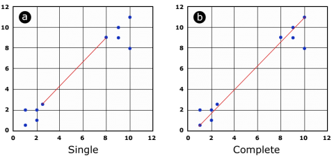
The function allows choosing between different agglomeration methods, which basically differ in how to calculate the distance between a group of units. Given the distance matrix, one can calculate the distance between two groups of units (cluster) based on the minimal distance between two individuals of the group (Fig 11a) or the maximal distance between the two individuals of a group (Fig 11b).
Cluster Analysis Results
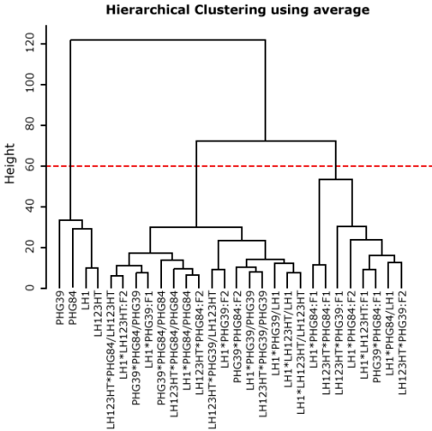
Alternatively, the distance between two clusters can be calculated as the average distance of the units within these clusters; this method is also called Unweighted Pair Group Method with Arithmetic Mean (UPGMA) and is widely applied.

All clustering methods partition the inbred lines clearly apart from the other families (F1, F2, and BC2) (Fig. 12). The methods “complete” and “average” return a similar partition of the units, although a clear partitioning in F1 versus F2 versus BC1 is not achieved. By choosing a height at which to cut off, the researcher decides how many groups or clusters he wants to form within the dataset (Fig. 13).
Deciding a Cut-off Height
Deciding on a cut-off height, we can divide our dataset into 3, 4, or more groups. In Fig. 14, the most obvious cut-off height will be at the level of 3 clusters, dividing inbred lines against mainly F1 and the rest (F2, BC1).
K-means Clustering
The k-means clustering algorithm tries to partition your dataset into a given number of groups with the goal to minimize the “within group sum of squares” over all variables. Checking each possible partition of your n sample units into k groups for the lowest within-group sum of squares is not practical, as the numbers of calculations necessary rise exponentially. In our example dataset, it would be more than 2,375,000 possible partitions to check if we assume k=3 groups. The k-means clustering algorithm, therefore, starts out making an initial partition in the number of groups requested and rearranges these so that the sum of squares is minimized. The technique is called an unsupervised learning technique and can result from each time it is initialized in slightly different results. For k-means clustering, it is recommended to use standardized datasets.
K-means Clustering Example
- Download the dataset: MeanEarPhenotypes [CSV]
To prepare the dataset for the k-means cluster analysis, we remove the first two columns (Pedigree and Type) and standardize the data (Fig. 15)—see file Example-kmeansClusterAnalysis.txt
K-means Cluster Analysis
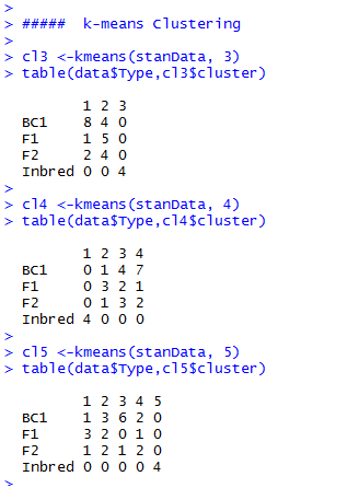
If we compare the clustering results, depending on the number of groups we allow, we see that all k-means clustering analyses clearly put the inbred lines into a single group (Fig. 16).
F1, F2, and BC1 are distributed over the remaining groups. It looks like the “k=3 cluster analysis” is able to assign the F1 and BC1 at least to some extent, mainly to their individual group, but overall, k-means gives us here the same result as the hierarchical cluster analysis.
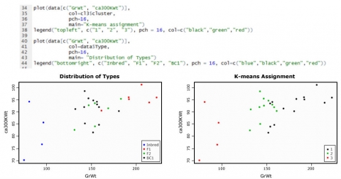
Distribution of Types
The graphics below (Fig. 17) show the data for the variables GrWt and ca300KWt, as an example of how the types are distributed compared to the group assignment through k-means cluster analysis.
Principal Components Analysis
The more variables there are in a multivariate dataset, the more difficult it becomes to describe and extract useful information from it. Also, displaying the data in a graphic becomes harder when more than 3 variables are included. In this case, a Principal Component Analysis (PCA) helps to reduce the dimensionality of our dataset by changing the set of correlated variables we want to describe into a new set of uncorrelated variables. The new variables are sorted in order of importance, the first one accounting for the largest portion of variation found in the original dataset, the latter for less and less large portions of the variation. The hope is that a few of these new variables will be sufficient to describe most of the variability found in your original dataset, so we can replace our data with only a few variables and end up with less complexity and dimensionality.
In our first example, we will look at a dataset that has only two variables for an easy demonstration of PCA. We will use the following dataset: MeanEarPhenotypes [CSV], and create a subset consisting of the columns GrWt and ca300KWt only.
PCA Step by Step
- Download the dataset: MeanEarPhenotypes [CSV], R-code: Example-PCA1 [TXT]
First, we will have to standardize our data; if the scales in your dataset are similar, we can use mean centering for standardization and do the subsequent calculation based on covariance. If the scales in a dataset are very different (weights, temperatures…), it is recommended to divide the mean center values by the standard deviation and use the correlation for subsequent calculations.
Head of the standardized data for the variables GrWt and ca300KWt
head(PCAdata)
GrWt ca300KWt
1 -0.3157250 0.23311021
2 -0.2982722 1.18856570
3 -0.2955165 -0.76213572
4 -0.1779398 0.75378250
5 0.7562440 -0.02213083
6 0.1371291 -0.83589358
#display data in a plot
plot(PCAdata[c(“GrWt”, “ca300KWt”)]
+ col-data$Type,
+ pch-16
+ main-“Distribution of data for PCA example”)
legend(“bottomright”, c(“Inbred”, “F1”, “BC1”), pch = 16, col=c(“blue”,”red”,”green”,”black”))
Distribution of Data
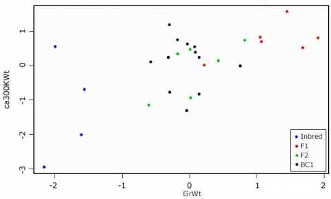
Looking at the scatterplot (Fig. 18), we see that there is some correlation between the two measures. If we want to know which of the variables contributes the most to the overall variance of the dataset, we have to calculate the Eigenvalues for the covariance (or correlation) matrix.
Eigenvectors Output Matrix
my.eigen$values
[1] 1.6208572 0.3791428
rownames(my.eigen$vectors) <- c(“GrWt”, “ca300KWt”)
colnames(my.eigen$vectors) <-c(“PC1”, “PC2”)
my.eigen$vectors
PC1 PC2
GrWt -0.7071068 0.7071068
ca300KWt -0.7071068 -0.7071068
sum(my.eigen$values)
[1] 2
var(PCAdata$GrWt) + var(PCAdata$ca300KWt)
[1] 2
|
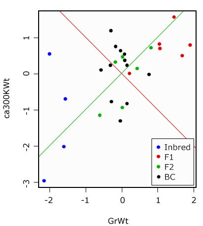
In the output matrix of the Eigenvectors, the first column is also our first Principal Component and the second column is the second Principal Component. The values are a measure of the strength of association with the Principal Component. While values in the first Principal Component trend together, in the second, they trend apart. We will try to visualize this in a graphic.
Display of Principal Components
PC1.slope <- my.eigen$vectors[1,1]/my.eigen$vectors[2,1]
PC2.slope <- my.eigen$vectors[1,2]/my.eigen$vectors[2,2]
abline(0, PC1.slope, col=”green”)
abline(0, PC2.slope, col=”red”)
Graphical display of the Principal Components. PC1 in green, PC2 in red—the two components are orthogonal to each other (Fig. 19).
Percentage of Overall Variance
Finally, we want to ask how much (or what percentage) of the overall variance in our data is represented by the first Principal Component:
PC1.slope <- my.eigen$vectors[1,1]/my.eigen$vectors[2,1]
PC2.slope <- my.eigen$vectors[1,2]/my.eigen$vectors[2,2]
abline(0, PC1.slope, col=”green”)
abline(0, PC2.slope, col=”red”)
PC2.var <-100 * (my.eigen$values[1]/sum(my.eigen$values))
PC2.var <-100 * (my.eigen$values[2]/sum(my.eigen$values))
PC1.var
[1] 81.04286
PC2.var
[1] 18.95714
|
PC1 explains ca. 81% of the variance, and PC2 explains about 19%.
Calculate the PCA Scores
By multiplying the original variable with the respective Eigenvectors, we calculate the PCA scores for each sample unit in our dataset. Plotting the scores shows that the plot is rotated such that the Principal Components form the x and y axis (Fig. 20). The relations between the sample units are unchanged, although one should be aware that a Principal Component per se has no biological meaning.
It is possible to plot the variables as vectors into the graphic (Fig. 20)—how to do this and how to interpret the arrows will be shown in the next example.
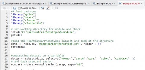
Perform a Principal Component Analysis
PERFORMING A PRINCIPAL COMPONENT ANALYSIS USING INBUILT R FUNCTIONS
- Download the dataset: MeanEarPhenotypes [CSV],
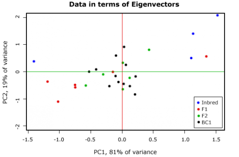
- Create a subset consisting of the columns: RowNo., EarDM, EarL, CobWt, ca300KWt (Fig. 21); we will use the standardized data.
- Download the R code: R-code: Example-PCA2.R [TXT]
Generate a Scatterplot Matrix
With the cpair() function, we can generate a scatterplot matrix of our dataset (Fig. 22).
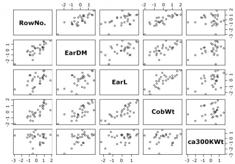
Not unsurprising, for example, there is a strong correlation between the RowNo. and ear diameter.
Calculate the Principal Components
To calculate the Principal Components, we will use the function prcomp() {stats}.
PCA2 <- prcomp(PCAdata, center=T, scale=T)
class(PCA2)
[1] “prcomp”
1s(PCA2)
[1] “center” “rotation” “scale” “sdev” “x”
summary(PCA2)
Importance of components:
PC1 PC2 PC3 PC4 PC5
Standard deviation 1.7858 1.0466 0.7404 0.33744 0.23121
Proportion of Variance 0.6378 0.2191 0.1096 0.02277 0.01069
Cumulative Proportion 0.6378 0.8569 0.9665 0.98931 1.00000
Looking at the results of prcomp, 5 vectors are listed; note that “x” stands for the Principal component scores. In the summary, each Principal component is assigned its standard deviation, the proportion of the overall variance, which is explained with this component as well as a cumulative proportion. The first three components explain already more than 96% of the overall variance in the dataset. As the main goal of the PCA is to reduce the complexity of the dataset, we could ask ourselves how many Principal components we have to keep.
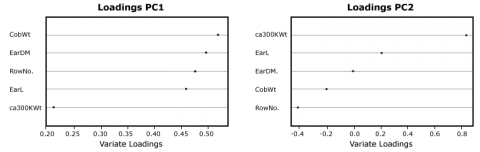
Loadings of the Principal Components
In order to see which variable contributes mainly to the Principal Components, you will have to look at the rotation data or loadings:
PCA2$rotation
PC1 PC2 PC3 PC4 PC5
RowNo. 0.4766670 -0.40713953 0.2610523 0.6767104 -0.2845007
EarDM 0.4964644 0.01002647 0.5805497 -0.3360285 0.5508806
EarL 0.4595622 0.22644933 -0.6767696 0.2657527 0.4570357
CobWT 0.5197882 -0.18893398 -0.2894435 -0.5855696 -0.5171605
ca300KWt 0.2119776 0.86438506 0.2302587 0.1250267 -0.3731665
While all variables contribute almost equally to the first component, the ca300KWt has a strong influence on the second component; in the third component, variables that measure the ear dimensions are prevalent. This can also be shown in a simple graphic (Fig. 23).
Scree Plot
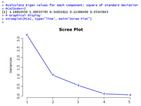
Coming back to the question of how many Principal Components should be considered – there are two ways to answer this question:
- The Kaiser criterion: as long as the Eigen Value of a component is larger than 1, keep it (Fig. 24).
- Make a decision based on a Scree plot: keep components as long as the rate of change is still larger than 0.
So based on the Kaiser criterion, we would keep the first two components; based on the Scree plot, maybe the first three components would be kept; this is up to the researcher.
Create a Biplot
Finally, we want to create a biplot to visualize the results of our PCA (Fig. 25); the observations are plotted as points, and the variables as vectors:
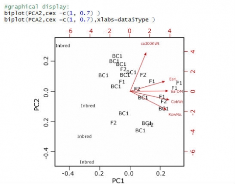
The biplot reveals what we saw looking at the loadings of the principal components: although trending in the same direction as the other 4 variables, the ca300KWt vector is set apart from the other 4. The cosines of the angles between the vectors actually reflect the correlation between these variables.
How to cite this chapter: Frei, U., R. Howard, W. Beavis, A. A. Mahama, & W. Suza. 2023. Multivariate Analysis. In W. P. Suza, & K. R. Lamkey (Eds.), Quantitative Methods. Iowa State University Digital Press.
