
Chapter 12: Data Transformation
Ron Mowers; Ken Moore; M. L. Harbur; Laura Merrick; Anthony Assibi Mahama; and Walter Suza
The analyses of variance (ANOVAs) with which you have worked extensively in the past 4 lessons share basic assumptions about the data being analyzed. The analysis is invalid if these assumptions are incorrect. Fortunately, these assumptions can be quickly tested. Finally, if the assumptions regarding a particular data set are found to be false, there are methods which can be followed to properly modify the data before conducting an analysis.
- Know the assumptions made in conducting the analysis of variance.
- Know how to test for heterogeneity of variances.
- Describe experimental situations which may produce heterogeneity of variances.
- Know how to transform data so that it meets the assumptions of the analysis of variance
Assumptions of ANOVA
There are 3 main assumptions in Analysis of Variance. For an analysis of variance to be valid, all of the following assumptions must apply:
- The error terms are normally, independently, and randomly distributed.
- The variances are homogeneous and not correlated with the means of different samples (treatment levels).
- The main effects and interactions are additive.
Each of these assumptions is further discussed on the following pages.
Normality, Independence and Random Distribution of Errors
Normality, or following a normal distribution, is often assumed of data sets, but is infrequently realized in practice. This is because the number of observations in the data set is often too few for the set to resemble a normal distribution curve. Fortunately, the analysis of variance is a robust procedure, and is rarely seriously affected by deviations from normality.Independence assumes that there is no relationship between the size of error of a treatment group and the experimental units (plots) to which it is allocated. The same treatment effect should be apparent, then, regardless of the experimental units to which the treatment is applied. In other words, the assumption of independence implies that the error associated with each level of treatment should reflect the natural variation in experimental units.
Homogeneity of Variances
Error variances should be constant. Refer to any of the ANOVAs from past lessons, and you will note that the difference between all levels of a treatment is tested using one error term. This error term is pooled, or the average of the variances associated with each level of the treatment. The variances associated with the different treatment levels must be homogeneous if the pooled error can be correctly used to test their differences.
What happens if this assumption of homogeneity is violated? The result will be that the error term used to test the difference between treatments will be too large for comparing treatment levels with small variances and too small for comparing the treatment levels with large variances.
If data are determined to have heterogeneity of variances, then the researcher has two options. She or he may want to arrange the treatment levels into groups with similar variances and analyze each group separately. Alternatively, she or he may decide to transform the data, as will be discussed later in this lesson.
Constant variance implies independence of Means and Variances. When heterogeneity of variances occurs, the variance often does not vary at random with the treatment level. Instead, the variance is dependent on the mean so that the two are correlated. The variance may increase with the treatment mean so that larger means have larger variances.
The assumption of constant variance is more likely to be violated in data sets in which the means vary widely or with certain types of data that we will learn about later in this lesson.
Linear Additive Model
We assume the linear additive model holds. The linear additive model, as you have already seen, can be used to describe an experimental model. The additive model suggests that each treatment effect is constant across different levels of other treatments or blocks. Differences between observations receiving the same treatment level or combination of treatments are, therefore, entirely the result of variation between experimental units.
For example, the linear additive model for the RCBD is shown in Equation 1.
[latex]\small Y_{ij}=\mu+\beta_i+T_j+\beta{T}_{ij}[/latex].
[latex]\small \textrm{Equation 1}[/latex] Linear Additive Model.
where:
[latex]\small Y_{ij}[/latex] = response observed for the [latex]{ij}^{th}[/latex] experimental unit,
[latex]\mu[/latex] = grand mean,
[latex]\small B[/latex] = block effect,
[latex]\small T[/latex] = treatment effect,
[latex]\small BT[/latex] = block error x treatment interaction.
Additive Treatments
If we were comparing different rates of fertilizer, then the assumption of additivity is that the difference in the crop yield produced by fertilizer rates will be the same, regardless of the experimental unit. The data from our experiment might resemble that in the “additive” columns of the following table:
| n/a | Additive | Multiplicative | ||
|---|---|---|---|---|
| Treatment | 1 | 2 | 1 | 2 |
| 1 | 10 | 20 | 10 | 20 |
| 2 | 30 | 40 | 30 | 60 |
| 3 | 50 | 60 | 50 | 100 |
This assumption is occasionally violated when there is an interaction between the plots (experimental units) themselves and the treatment. For example, the difference between the nitrogen rates may be much more profound in experimental units with adequate phosphorous and potassium fertility than in experimental units with poorer soils. Our data may then turn out to be multiplicative, as shown in the two right columns (Table 1).
Data which do not conform to the additivity assumption may be transformed using the log transformation discussed later in this lesson.
Testing Heterogeneity
Bartlett’s Test
Bartlett’s Test is used to test for constant variance. We saw in an earlier example that for two treatments, we could test the equality of variances with the ratio of larger sample variance to smaller, eg. [latex]\small \textrm{F}[/latex]=[latex]{\frac{S^2_{1}}{S^2_{2}}}[/latex] if [latex]\small S_{12}[/latex] is larger. We reject the null hypothesis of equal variances if the F value is high. But how do we do a similar test if there are three or more treatments? We can use a test developed by Maurice Bartlett.
A data set which is suspected of not meeting the homogeneity of variance assumption can be tested using Bartlett's Test for Homogeneity of Variance. We will go through the steps of Bartlett’s test to illustrate the underlying formulas but will later use R in solving problems to test variance homogeneity.
Example
| Experiment | SS (error) | df | [latex]S^2[/latex] | [latex]ln (S^2)[/latex] |
|---|---|---|---|---|
| 1 | 157.8 | 18 | 8.77 | 2.171 |
| 2 | 134.5 | 18 | 7.47 | 2.011 |
| 3 | 325.5 | 18 | 18.08 | 2.895 |
| 4 | 308.4 | 18 | 17.13 | 2.841 |
| 5 | 111.3 | 18 | 6.18 | 1.822 |
| 6 | 214.2 | 18 | 11.90 | 2.477 |
| [latex]S^2_{P}[/latex] | n/a | n/a | 11.59 | n/a |
| [latex]\sum ln S^2_{i}[/latex] | n/a | n/a | n/a | 14.217 |
First, the error sum of squares associated with each mean is recorded in the table above.
Second, the degrees of freedom are listed, and the error sums of squares are divided by the degrees of freedom associated with each level of treatment. So far, this process is very similar to setting up an ANOVA table. In fact, S2 for each treatment level is equivalent to the mean square error for that level.
Third, the ln, or natural log, of each variance is calculated and recorded in the fourth column.
The appropriate means and sums are calculated at the bottom of the table.
Chi-Square Value
Finally, the values from the table are appropriately inserted into the following formula, where a chi-square value is calculated.
Bartlett’s Test for Homogeneity of Variance
[latex]{\chi}^2= \frac{(df)\left[nlnS^2_{p} -\sum ln S^2_{i} \right]}{1+\frac{n+1}{3n(df)}}[/latex].
[latex]\textrm{Equation 2}[/latex] Bartlett’s Test for Homogeneity of Variance.
where:
[latex]\small df[/latex] = degrees of freedom associated with each treatment,
[latex]n[/latex] = number of treatments,
[latex]\small S^2_{p}[/latex] = pooled error variance,
[latex]\small S^2_{i}[/latex] = error variance for treatment.
This value is used to test the null hypothesis H0: all treatment variances are equal. The observed chi-square value is compared with the critical value, using the degrees of freedom associated with the number of treatments, or n-1.
Interpretation
The observed chi-square value is then interpreted in the following manner:
- If P>0.01, then we accept that there is no significant difference between the variances and, therefore, no need to transform the data.
- If P<0.001, then we reject the null hypothesis and determine that the variances are indeed different. The data must therefore be transformed or analyzed in another appropriate manner.
- If 0.01>P>0.001, then we must try to determine whether there is any theoretical basis for why the data would not meet the heterogeneity of variance requirement; otherwise, we should not transform.
If necessary, the data can usually be transformed using one of the methods below.
[latex]{\chi}^2= \frac{(18)\left[6(2.450) -14.217 \right]}{1+\frac{6+1}{3(6)(18)}}=8.521[/latex].
[latex]\textrm{Equation 3}[/latex] Example calculation of Bartlett’s Test for Homogeneity of Variance.
Ex. 1: Evaluating the Variances
Let us try this using R and a different set of data.
The data in the QM-mod12-ex1data.xls worksheet are from a growth chamber experiment in which a number of treatments were applied to eastern gamagrass seed in an attempt to break dormancy and thereby increase germination percentage. The treatments consisted of:
- control (no treatment)
- wet chilling for 2 weeks
- wet chilling for 4 weeks
- wet chilling for 2 weeks with scarification, and
- wet chilling for 4 weeks with scarification
The experimental design was a CRD with five replications.
The data are expressed as percentages. This should lead us to suspect that there may be a potential for problems with the assumptions for the ANOVA.
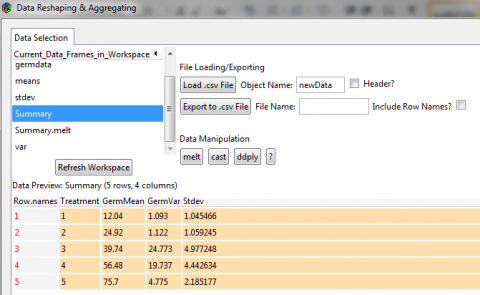
In this exercise, we will use Excel to create a table of treatment means and variances which we will examine to see if they conform to the homogeneity assumption.
Ex. 1: Creating a Pivot Table
1. Using the mouse, select all the data in the worksheet. Be sure to select the top row, which contains the data labels.
2. Select PivotTable from the Insert menu.
3. A dialog box will open, and the data you have selected will automatically appear in the box next to Select a table or range.
4. Click the circle next to New Worksheet and then OK.
5. The next screen will show an empty table with a panel on the right side titled PivotTable Field List, which is used to format the table.
6. Drag the Treatment field into the Row Labels box in the panel.
7. Drag the Germination button into the Values box in the panel.
8. Click or Double-click on the Sum of Germination field and select Value Field Settings… from the popup menu that appears.
9. Select Average from the list of options that appear, then click OK to calculate and display the five treatment means.
10. Once again, drag the Germination button into the Values box in the panel.
11. Click on the Sum of Germination field and select Value Field Settings… from the popup menu that appears.
12. This time, select Var from the list of options that appear, then click OK to calculate and display the five treatment variances.
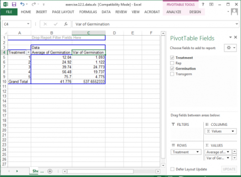
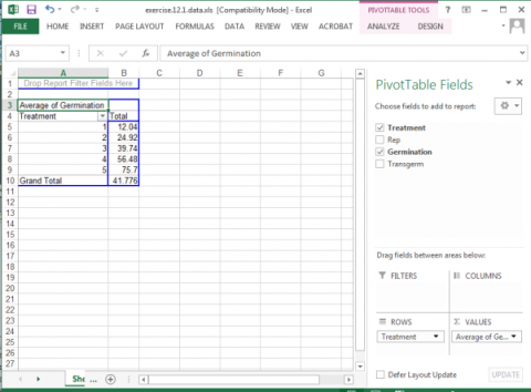
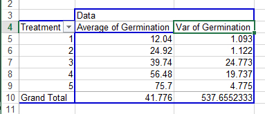
Your completed pivot table should look like Fig. 3.
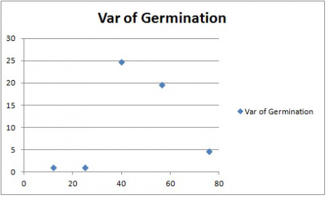
Ex. 1: Examining Homogeneity Assumption
In looking at the variances associated with the five treatments, there appears to be a potential problem with the homogeneity assumption (Fig. 4). The variance of Treatment 1 is 1.093 compared with 24.773 for Treatment 3. The ratio of these two variances is 22.67, which is relatively large. This situation should lead us to examine more thoroughly the assumption of homogeneity.
Note: Later in this unit, we will learn how to “transform” data so that the variances are more equal. Sometimes it will help us to decide what transformation function to use if we look at how both variance and standard deviation vary with treatment means.
To calculate the standard deviation for treatment means, simply choose “Std Dev” instead of “Var” in Step 12.
Ex. 1: Plotting the Variance against Means
A good way to visualize what is going on with the data is to plot the variances against their associated means.
In this exercise, we will use Excel to create a plot of the means and variances. The most expedient way to accomplish this is to create a Pivot Chart using the Pivot Table we just made in Exercise 1.
Create an XY graph of the means and variances using the following steps:
- Using your mouse, place the cursor anywhere within in the Pivot Table you created for the last exercise.
- At the very top of the Excel window to the right, a menu item labeled PivotTable Tools will appear. Select this menu item and then click on the PivotChart icon that appears.
- Select the first chart style that appears in the Column template.
- The graph that is created should look something like (Fig. 5).
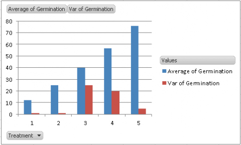
Our assumption for the ANOVA is that the variances of the five treatments are equal. By looking at the graph, we see that the variances for Treatments 3 and 4 are considerably higher than the others, which should lead us to explore our assumption further.
Note that you can produce the same style chart if you have produced a pivot table with standard deviations instead of variances.
Sometimes, it is easier to visualize the relationship between the variance and treatment means if we plot them in a scatter plot. This is a little more tricky than the PivotChart you just made, but it allows us to better see how variance increases with treatment means. In addition, to choose which transformation function to use (see Table 12.5), sometimes you need to compare the relationship between variance and mean to that between standard deviation and mean to see which relationship is more linear.
Ex. 1: Creating a Scatterplot
To produce a scatterplot with variances on the Y-axis and treatment means on the X-axis:
1. Select the “Average” and “Var” columns from your PivotChart (Fig. 6). Do not select the treatment column or the Grand Total row. Copy and paste these below your original chart.
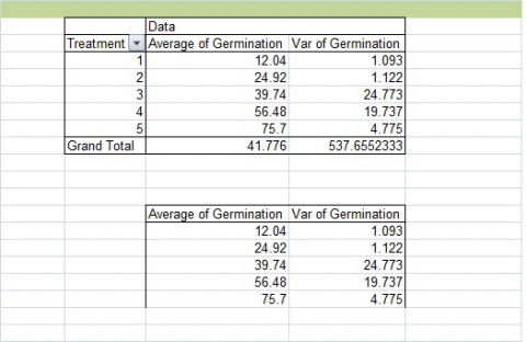
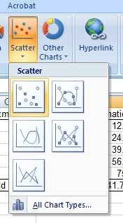
2. Highlight your new table. Then choose Insert from the menu bar, then Scatter, then the first chart style (Fig. 7).
Your chart should look like Fig. 8. Again, the treatment means are on the X-axis, and the variances are on the Y-axis.
In this case, there does not seem to be a linear relationship between variance and treatment mean. However, this chart again shows that the variances associated with two of the treatments are many times greater than those associated with the other. Data transformation may be required so that the variances meet the assumptions of the Analysis of Variance.
The same method can be used to create a plot with Standard Deviation on the Y-axis and Treatment means on the X-axis. Simply create a pivot table with treatment means and standard deviation, and then follow the two steps above.
Notes to educators and students
There is some prerequisite knowledge required in order to understand everything in this lesson. Participants should be familiar with designing linear models and conducting ANOVAs and also understand how the least significant differences (LSDs) are calculated.
Ex. 2: Introduction
When conducting an analysis of data, there are numerous assumptions that are made about the data. Sadly, in the real world, these assumptions are often violated, leading to poor interpretation of the results. In this activity, we will explore ways to deal with these assumption violations when it comes to performing an analysis of variance (ANOVA).
R Code Used In This Exercise
Packages:
- plyr
- reshape2
- ggplot2
- agricolae
Code:
- setwd()
- detach()
- names()
- log()
- read.csv()
- as.factor()
- cbind()
- sqrt()
- head()
- aov()
- melt()
- asin()
- str()
- summary()
- qplot()
- LSD.test()
- attach()
- aggregate()
- bartlett.test()
Ex. 2: Review of 3 ANOVA’s Main Assumptions
Review – These Are The 3 Main Assumptions Of The Anova
The error terms are normally, independently, and randomly distributed.
This means that the error terms follow a normal distribution, although this is difficult in smaller sample sizes. There should also be independence between the size of the error of a treatment group and the experimental units to which it is allocated.
The variances are homogenous and not correlated with the means of different levels.
The error variances should be constant. Remember that the difference between all levels of a treatment is tested using one error term (pooled), and if this assumption is violated, then the error term used to test the differences between treatments will be too large for comparing treatment levels with small variances and too small for comparing treatment levels with large variances.
The main effects and interactions are additive.
This means that we assume that the linear additive model we are using to analyze the data holds true. Sometimes this assumption is violated because there is an interaction between the plots and the treatments, but this data can be transformed using the log transformation.
In this lesson, we will explore how to determine if your data should be transformed and, if so, what kind of transformation is appropriate.
Ex. 2: Exercise Introduction
You are a student, and you wish to study the effects of 5 treatments on breaking gamagrass seed dormancy. The treatments were control (no treatment), wet chilling for 2 weeks, wet chilling for 4 weeks, wet chilling for 2 weeks plus scarification, and wet chilling for 4 weeks plus scarification. You decide to test the treatments on a single, common variety using a completely random design with 5 replications for each of the treatments. The data for these treatments are expressed as the percent germination in the file Set1.csv. In this activity, we will use R to check the second and third assumptions of the ANOVA by creating a table of treatment means and variances which we will examine to see if the homogeneity of the variances assumption was violated. Then, if the assumption is violated, we will explore ways to transform the data for a more accurate analysis.
Our first step is to start visualizing our data, and one way to do this is to create a table of means and variances of the means. First, you will need to read in the data and ensure that it was read in properly as well as make sure that the “Treatment” column is considered to be a factor.
Ex. 2: Read the Data
Read in the data and check the structure:
germdata<-read.csv(“Set1.csv”, header=T)
head(germdata)
Treatment Rep Germination
1 1 1 12.7
2 1 2 11.3
3 1 3 13.4
4 1 4 10.8
5 1 5 12.0
6 1 1 25.9
str(germdata)
‘data.frame’: 25 obs. of 3 variables:
$ Treatment : int 1 1 1 1 1 2 2 2 2 2 …
$ Rep : int 1 2 3 4 5 1 2 3 4 5 …
$ Germination : num 12.7 11.3 13.4 10.8 12 25.9 24.5 26.2 23.9 24.1…
Since “Treatment” is considered an integer, not a factor, we need to change that with the as.factor function:
germdata$Treatment<-as.factor(germdata$Treatment)
Treatment<- as.factor(germdata$Treatment)
detach(germdata)
attach(germdata)
str(germdata)
‘data.frame’: 25 obs. of 3 variables:
$ Treatment : Factor w/ 5 levels “1”, “2”, “3”, “4”,..: 1 1 1 1 1 2 2 2 2 2 …
$ Rep : int 1 2 3 4 5 1 2 3 4 5 …
$ Germination : num 12.7 11.3 13.4 10.8 12 25.9 24.5 26.2 23.9 24.1 …
Ex. 2: Visualize the Data
To help visualize the data, we will start by making a table of the treatment means and variances, and standard deviations. This can be done with the following code, which analyzes the data set using the specified function (mean, variance, and standard deviation, respectively) based on a specified variable in the data set (here, it is Treatment). The code also renames the new column that is made to better reflect which function was used. Otherwise, without renaming, the column head would just read “Germination,” regardless of what you have actually calculated. This first code calculates the treatment means:
means <- aggregate(germdata[“Germination”], by=germdata[“Treatment”], FUN=mean)
names(means)[names(means)++”Germination”] <- “GermMean”
means
Treatment GermMean
1 1 12.04
2 2 24.92
3 3 39.74
4 4 56.48
5 5 75.70
The same code format can be used to calculate the treatment variances and standard deviations just by changing the “FUN=” and the name of the new column.
var <- aggregate(germdata[“Germination”], by=germdata[“Treatment”], FUN=var)
names(var)[names(var)==”Germination”] <- “GermVar”
var
Treatment GermVar
1 1 1.093
2 2 1.122
3 3 24.773
4 4 19.737
5 5 4.775
stdev <- aggregate(germdata[“Germination”], by=germdata[“Treatment”], FUN=sd)
names(stdev)[names(stdev)==”Germination”] <- “Stdev”
stdev
Treatment Stdev
1 1 1.093
2 2 1.122
3 3 24.773
4 4 19.737
5 5 4.775
Ex. 2: Combine into a Single Table
Now we can combine these into a single table for easy reference.
Summary<-cbind(means, var$GermVar, std$Stdev)
Summary
Treatment GermVar
1 1 1.093
2 2 1.122
3 3 24.773
4 4 19.737
5 5 4.775
You can leave the column names as is, but there is a simple way of renaming them using the “plyr” package:
library(plyr)
Warning message:
package ‘plyr’ was built under R version 3.1.1
Summary<-rename(Summary, c(“var$GermVar”=”GermVar”, “stdev$Stdev”=”Stdev”))
Summary
Treatment GermMean GermVar Stdev
1 1 12.04 1.093 1.045466
2 2 24.92 1.122 1.059245
3 3 39.74 24.773 4.977248
4 4 56.48 19.737 4.442634
5 5 75.70 4.775 2.185177
Ex. 2: Graph Means and Variance
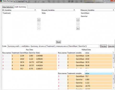
For this next step, we want to graph the treatment means and the treatment variances on the same graph. Normally in R, making a bar graph is very straightforward, but in this case, we have two variables to plot at the same time, so the code becomes a little more complex. Before we can do anything, however, we have to manipulate the data set into a format that R can read in order to give us the output that we want. You will need to utilize the package “reshape2”.
library(reshape2)
From here, you can use the following code to melt your data from the wide format to the long format. We only want means and variances for this next bit, so we are only including those variables in our new melted data set.
Summary.melt <- melt(data = Summary, id.vars=c(‘Treatment’)
+ measure.vars=c(‘GermMean’,’GermVar’))
Summary
Treatment variable value
1 1 GermMean 12.040
2 2 GermMean 24.920
3 3 GermMean 39.740
4 4 GermMean 56.480
5 5 GermMean 75.700
6 1 GermVar 1.093
7 2 GermVar 1.122
8 3 GermVar 24.773
9 4 GermVar 19.737
10 5 GermVar 4.775
Ex. 2: Reshape Data
Reshaping data can take some practice; the melt function is not always intuitive, and it can take a while to manipulate your data set into the desired format. There is another way of achieving the same results with another package called “reshapeGUI”. After you install the package, open the library and then use the code reshapeGUI() to open a more friendly graphic user interface. Here, you can actually see what is happening to your data as you select your data set and then choose the ID and Measure variables in the ‘melt’ tab.
library(reshapeGUI)
Loading required package: gwidgets
Attaching package: ‘gwidgets’
The following object is masked from ‘package:plyr’:
id
Loading required package: gwidgetRGtk2
Loading required package: RGtk2
Warning message:
package ‘reshapeGUI’ was built under R version 3.1.1
Ex. 2: Reshape GUI
reshapeGUI
Ex. 2: Preview Result
You can hit the preview button to see what your data will look like. The Execute button will actually run the code you have generated, but if you want to save the code itself, you can copy and paste it into a script editor.
Now we can start plotting our means and variances. The package “ggplot2” has a lot of versatility in visualizing data, so we will use this package:
library(reshapeGUI)
Now use this code to create a bar plot that includes both the treatment means and the treatment variances and also includes some nice colors and a graph title:
means.var.varplot <- qplot(x-Treatment, y=value, fill=variable, data=Summary.melt, geom=”bar”, stat=”identity”, position=”dodge”, main=”Barplot of Means and Variance of germination for 5 treatments”)
means.var.barplot
This gives us this graph (Fig. 9).
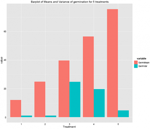
Remember how one of the assumptions of the ANOVA is equal variances across the treatments? Looking at this graph here, we can clearly see that this is not true of this data set. The variances for treatments 3 and 4 are much higher than the other treatments, and this should prompt you to explore this further.
Ex. 2: Scatter Plot to Visualize Data
Another way to visualize this data is to plot the variances against the means in a scatterplot which can be done using ggplot2 with the following code:
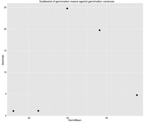
means.var.scatterplot <- qplot(data=Summary, x=GermMean, y=GermVar,
+ main=”Scatterplot of germination means against germination variances”) +
+ geom_point(size = 5)
means.var.scatterplot
And the graph looks like this (Fig. 10):
Ex. 2: Bartlett’s Test
As we saw with the bar graph, treatments 3 and 4 clearly have greater variances than the other treatments in the data set. However, this is not enough evidence to prompt data transformation, and a different test should be run to be sure.
Running the Bartlett’s test for homogeneity of variances:
This test lets us test to see if the variances between treatments are significantly different enough to warrant a data transformation. It uses the formula in Equation 2 above.
Ex. 2: Conclusions
This tests the null hypothesis that all treatment variances are equal, and the calculated chi-square value is compared to the critical value, which is based on the degrees of freedom. When it comes to interpreting the test, there are several possible outcomes based on the p-value:
- If the p-value is >0.01, then we accept the null hypothesis and don’t transform the data
- If P<0.001, the null is rejected, and we need to transform the data
- If 0.01>P>0.001, then you must try to figure out whether there is any reason why the data would not meet the requirement of heterogeneity of variances; otherwise, we don’t transform the data.
Performing Bartlett’s test in R is very easy and can be done with one line of code
bartlett.test(Germination~Treatment, germdata)
Bartlett test of homogeneity of variances
data: Germination by Treatment
Bartlett’s K-squared = 13.4583, df = 4, p-value = 0.009241
Looking at these results, our p-value falls between 0.01 and 0.001, which is the range in which you must decide if there is a theoretical basis for transforming the data or not. Since our experimental data is expressed in percentages (which often leads to unequal variances), we can conclude that the variances are not homogenous, and we do have a reason for transforming this data set.
Data Transformation
There are 3 main transformations to achieve more constant variance. Data which fail to conform to assumptions regarding independence of variance and mean, independence of standard deviation and mean, or additivity may be transformed using one of many transformations. The most common three methods are shown in Table 3.
| Condition | Transformation | Types of Data |
|---|---|---|
| Standard deviation proportional to mean | Natural log, ln(y) | growth data and counts with a wide range of values |
| Variance proportional to mean | Square root, sqrt(y) | small whole number data, counts of rare events |
| S2 from binomial data | Arcsine, arcsin*sqrt(y) | percentages, proportions |
Different conditions have different mathematical relationships, which can be used to produce constant variance after transformation. We will examine some of these further.
The Natural Log Transformation
The natural log transformation is appropriately used to transform data where the standard deviation of treatments is roughly proportional to the means of those treatments. It is also appropriate where effects appear to be multiplicative rather than additive. This kind of transformation is most often necessary when dealing with growth data, where differences between plants become more obvious as their mean size increases.
For example, review the data set in Table 4.
| Block | 1 | 2 | 3 | 4 | 5 |
|---|---|---|---|---|---|
| 1 | 10.35 | 16.80 | 28.86 | 38.84 | 36.85 |
| 2 | 12.14 | 16.68 | 26.68 | 39.14 | 49.04 |
| 3 | 12.04 | 19.75 | 29.07 | 35.39 | 57.72 |
| 4 | 10.26 | 16.18 | 28.35 | 32.36 | 50.47 |
| 5 | 9.14 | 18.68 | 25.06 | 38.55 | 40.07 |
| Mean | 10.79 | 17.62 | 27.60 | 36.46 | 46.83 |
| Std.Dev. | 1.28 | 1.52 | 1.70 | 2.72 | 8.40 |
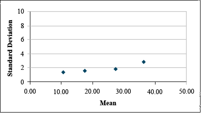
Data before Transformation
It is clear from looking at the data set that the standard deviation differs among treatments. A plot of the standard deviations by treatment means reveals that the standard deviation tends to increase with treatment mean. (Fig. 11)
Transform using Natural Log
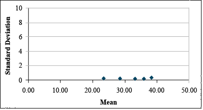
If Bartlett’s test confirms that these differences in standard deviation are significant, then we should transform these data using the natural log transformation. This gives us the data set and plot below.
| Block | 1 | 2 | 3 | 4 | 5 |
|---|---|---|---|---|---|
| 1 | 2.34 | 2.82 | 3.36 | 3.61 | 3.61 |
| 2 | 2.50 | 2.81 | 3.28 | 3.67 | 3.89 |
| 3 | 2.49 | 2.98 | 3.37 | 3.57 | 4.06 |
| 4 | 2.33 | 2.78 | 3.34 | 3.48 | 3.92 |
| 5 | 2.21 | 2.93 | 3.22 | 3.65 | 3.69 |
| Mean | 2.37 | 2.87 | 3.32 | 3.59 | 3.83 |
| Std.Dev. | 0.12 | 0.09 | 0.06 | 0.08 | 0.18 |
The transformation, thus, can be used to reduce the apparent relationship between the standard deviation and the means of the treatments (Fig. 12).
The Square Root Transformation
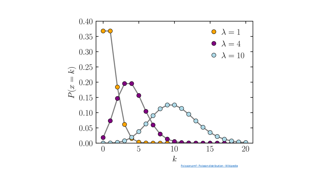
The square root transformation is most often necessary in dealing with counts of rare events — those with a very low probability of occurring in any one individual. Such counts tend to follow a Poisson distribution instead of a normal distribution. The mean tends to increase as the number of observations that are greater than zero increases. The result of such a distribution is that the variance tends to be proportional to the mean. This distribution might arise if we were dealing with insect counts, as your book suggests, or perhaps if we were sampling weed populations in a particularly “clean” field.
For example, review the data set in Table 6.
| Block | 1 | 2 | 3 | 4 | 5 |
|---|---|---|---|---|---|
| 1 | 7.37 | 27.71 | 47.01 | 58.04 | 72.32 |
| 2 | 12.80 | 37.12 | 58.95 | 71.43 | 86.79 |
| 3 | 11.50 | 34.86 | 56.09 | 68.22 | 83.32 |
| 4 | 11.16 | 34.27 | 55.35 | 67.39 | 82.42 |
| 5 | 8.46 | 29.60 | 49.42 | 60.74 | 75.24 |
| Mean | 10.26 | 32.71 | 53.36 | 65.17 | 80.02 |
| Std.Dev. | 5.09 | 15.29 | 24.63 | 30.96 | 36.18 |
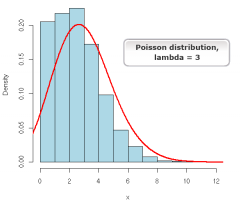
The Poisson Distribution has the equation form:
[latex]\textrm{P(Y=k)}= \frac{e^{-\mu}\mu^{k}}{k!}[/latex].
[latex]\textrm{Equation 4}[/latex]] Formula for calculating a certain number on a distribution of mean and variance/.
where:
[latex]k[/latex] = Poisson random variable or number of occurences, e.g., 0, 1, 2, …
[latex]e[/latex] = Euler’s number,
[latex]\mu[/latex] = expected value,
[latex]![/latex] = factorial function,
[latex]k![/latex] = k × k – 1 × k – 2 ... × 1.
For example: 4! = 4 × 3 × 2 × 1
Fig. 13 shows a Poisson distribution curve.
Data before Transformation
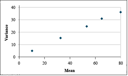
It is clear from looking at the data set that the variances differ greatly among treatments. A plot of the variances by treatment means reveals that variance tends to increase with treatment mean (Fig. 14).
Transform using Square Root
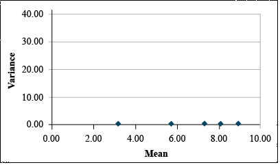
If Bartlett's test confirms that these differences in variance are significant, then we should transform these data using the square root transformation. This gives us the data set and plot at below (Table 7 and Fig. 15).
It is easy to see that the transformation has reduced the relationship between variance and mean.
| Block | 1 | 2 | 3 | 4 | 5 |
|---|---|---|---|---|---|
| 1 | 2.71 | 5.26 | 6.86 | 7.62 | 8.50 |
| 2 | 3.58 | 6.09 | 7.68 | 8.45 | 9.32 |
| 3 | 3.39 | 5.90 | 7.49 | 8.26 | 9.13 |
| 4 | 3.34 | 5.85 | 7.44 | 8.21 | 9.08 |
| 5 | 2.91 | 5.44 | 7.03 | 7.79 | 8.67 |
| Mean | 3.19 | 5.71 | 7.30 | 8.07 | 8.94 |
| Std.Dev | 0.13 | 0.12 | 0.12 | 0.12 | 0.11 |
The Arcsine Transformation
The arcsine transformation is most often necessary on data expressed as a percentage or proportion. These data are most likely to conform to a binomial distribution, where the variance tends to be greater near the center of the distribution.
For example, observe the following data set (Table 8)
| Block | 1 | 2 | 3 | 4 | 5 |
|---|---|---|---|---|---|
| 1 | 38.75 | 68.20 | 59.63 | 59.39 | 83.93 |
| 2 | 30.64 | 34.68 | 50.96 | 72.17 | 83.65 |
| 3 | 43.42 | 51.45 | 49.60 | 73.44 | 93.05 |
| 4 | 52.41 | 62.91 | 57.15 | 77.48 | 85.44 |
| 5 | 51.73 | 44.03 | 58.91 | 73.74 | 84.82 |
| Mean | 43.39 | 52.25 | 55.25 | 71.24 | 86.18 |
| Variance | 83.72 | 186.18 | 21.62 | 47.85 | 15.24 |
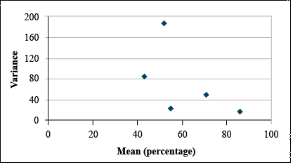
Data before Transformation
It is clear from looking at the data set that the standard deviation differs among treatments. A plot of the standard deviations by treatment means reveals that the standard deviation tends to increase with treatment mean. (Fig. 16)
Transform using Arcsine
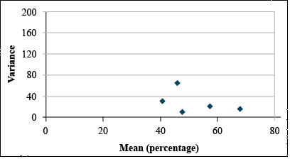
If the Bartlett's test confirms that these differences in variance are significant, then we should transform these data using the arcsine transformation. This gives us the data set and plot at right (Table 9 and Fig. 17).
| Block | 1 | 2 | 3 | 4 | 5 |
|---|---|---|---|---|---|
| 1 | 38.50 | 55.67 | 50.55 | 50.41 | 66.37 |
| 2 | 33.61 | 36.08 | 45.55 | 58.16 | 66.15 |
| 3 | 41.22 | 45.83 | 44.77 | 58.98 | 74.71 |
| 4 | 46.38 | 52.48 | 49.11 | 61.67 | 67.57 |
| 5 | 45.99 | 41.57 | 50.13 | 59.17 | 67.07 |
| Mean | 41.14 | 46.33 | 48.02 | 57.68 | 68.37 |
| Variance | 28.66 | 63.26 | 7.18 | 18.23 | 12.86 |
It is easy to see that the transformation has reduced the relationship between variance and mean.
Generally, the most appropriate data transformation for percentage data is the angular or arcsine transformation. In this exercise, we will transform the germination data using the angular transformation in Excel.
The angular transformation is more complicated to calculate than appears on the surface. Although we will calculate it using a single equation, the calculation actually involves the following steps:
- The percentage data are converted to proportions by dividing by 100.
- The square root of the proportion is taken using the SQRT function.
- The arcsine of the square root is taken using the ASIN function.
- Convert from radians to degrees by multiplying by (180/PI). This last step is not required. Either degrees or radians give the same results. However, converting back to degrees makes the transformed data look more like the original data - only compressed.
Ex. 3: Natural Log Transformation
Once you have decided how to transform the data, this can be done quickly in Excel. Using the germination percentages found in the Exercise 12.1 data, follow these steps. In each case, you will need to create a new column heading. Since you will likely be importing these data into R, it is easiest to give them a one-word heading. Don’t worry about originality — just select something simple that will be easy to use in R code.
The Natural Log Transformation
The natural log is sometimes referred to as “Ln”, so change the title of column D to “LnGerm.” Below that, type in “=ln(C2)”. Select that cell, then double click on the tiny box in the right hand corner to copy down the rest of the data. Your table should look like the one below (Fig. 18).
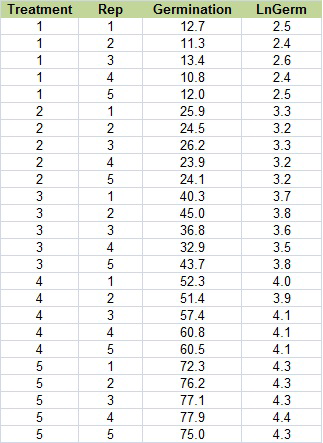
Ex. 3: Square Root Transformation
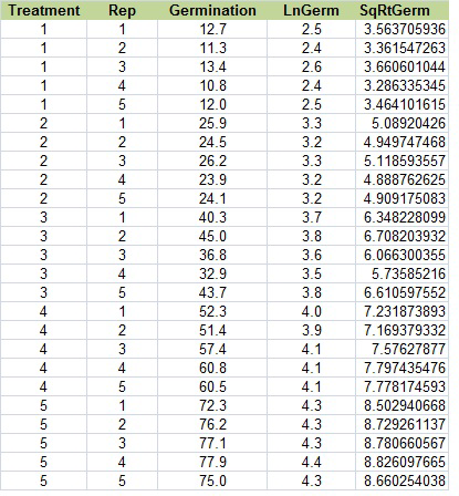
The Square Root Transformation
Change the title of column E to “SqRtGerm” (real original, see?). Below that, type in “=sqrt(C2)”. Select that cell, then double click on the tiny box in the right hand corner to copy down the rest of the data. Your table should look like this (Fig. 19):
Ex. 3: Arc Sin (Angular) Transformation
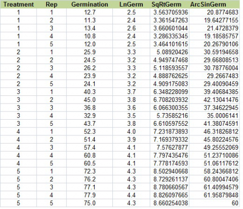
The Arc Sin (Angular) Transformation
The arc sin transformation is somehow legitimate statistical voodoo. There is a whole lot going on, converting percentages to proportions, taking the square root and arcsin, and converting from radians to degrees.
Change the title of column F to “AsinGerm. Below that, type in “=asin(sqrt(C2/100))*180/PI()”. Select that cell, then double-click on the tiny box in the right-hand corner to copy down the rest of the data. Your table should look like Fig. 20, below.
Ex. 3: Data Transformation using R
So, what kind of data transformation should we perform? There are many different ways, and each type of transformation is appropriate in different circumstances. We will explore only 3 of them in this activity.
The Natural Log Transformation
This transformation is good for when the standard deviation of the treatments is more or less proportional to the means of the treatments and where the effects seem to be multiplicative instead of additive.
R code:
1nGerm<-log(Germination)
The Square Root Transformation
This is most often used when the data consists of counting rare events and tends to follow a Poisson distribution, not a normal distribution. In this instance, the variance tends to be proportional to the mean. R code:
sqrtGerm<-sqrt(Germination)
The Arcsine (Angular) Transformation
This is typically used on data that is expressed in percentages or proportions because they are more likely to have a binomial distribution where the variance tends to be greater at the center of the distribution. Calculating the arcsine transformation is a bit tricky and involves several steps:
- Percentage data is divided by 100
- Then the square root is taken
- Then the arcsine is taken
- The last step of converting from radians to degrees is optional and is done by multiplying by 180/pi
R code:
asingerm<-asin(sqrt(Germination/100))*180/pi
Ex. 3: Combine All Transformations in One Table
We can combine each of these transformations into a single table with the following code:
transform<-cbind(germdata[,1:3], lnGerm, sqrtGerm, asinGerm)
transform
Treatment Rep Germination lnGerm sqrtGerm asinGerm
1 1 1 12.7 2.541602 3.563706 20.87747
2 1 2 11.3 2.424803 3.361547 19.64277
3 1 3 13.4 2.595255 3.660601 21.47284
4 1 4 10.8 2.379546 3.286335 19.18586
5 1 5 12.0 2.484907 3.464102 20.26790
6 1 1 25.9 3.254243 5.089204 30.59195
7 1 2 24.5 3.198673 4.949747 29.66809
8 1 3 26.2 3.265759 5.118594 30.78776
9 1 4 23.9 3.173878 4.888763 29.26675
10 1 5 24.1 3.182212 4.909175 29.40090
In the previous part of the activity, Bartlett’s test showed us that our variances were not homogenous and, therefore, we should transform the data. Since we have percentage data and our scatterplot of the means and variances shows that the variance tends to be greatest in the center of the distribution, the arcsine transformation is most appropriate for our data.
Ex. 3: Bartlett's Test and ANOVA
Once we have transformed our data, we can run Bartlett’s test again with the new data:
bartlett.test(asinGerm~Treatment, germdata)
Bartlett test of homogeneity of variances
data: asinGerm by Treatment
Bartlett's K-squared = 9.7311, df = 4, p-value = 0.04521
Since our p-value is now >0.01, it is safe to assume that the variances are homogenous and we can proceed to the ANOVA. Use this formula so we can calculate LSDs next. For some reason, using the anova(lm()) format doesn’t work for calculating LSDs in R.
anovasin<-aov(asinGerm~Treatment, data=transform)
summary(anovaasin)
Df Sum Sq Mean Sq F value Pr(>F)
Treatment 4 4930 1232.4 331 <2e-16 ***
Residuals 20 74 3.7
---
Signif. codes: 0 '***' 0.001 '**' 0.01 '*' 0.05 '.' 0.1 ' ' 1
According to the ANOVA, the chances of getting this F-value or a higher one are very small (P<0.0001), and we can conclude that there are one or more differences among the different treatments.
Ex. 3: LSD and Conclusions
To take a closer look at the differences between the treatments, we can calculate the least significant difference and see which of the treatment means differ.
library(agricolae)
LSD.Treatment<- LSD.test(anovaasin, "Treatment")
LSD.Treatment
$Statistics
Mean CV MSerror LSD
39.70057 4.860259 3.723166 2.545616
$parameters
Df ntr t.value
20 5 2.085963
$means
asinGerm std r LCL UCL Min Max
1 20.28937 0.9196122 5 18.48934 22.08939 19.18586 21.47284
2 29.94309 0.7002702 5 28.14307 31.74311 29.26675 30.78776
3 39.05297 2.9304004 5 37.25295 40.85299 35.00061 42.13041
4 48.73486 2.5682770 5 46.93484 50.53488 45.80225 51.23710
5 60.48258 1.4479205 5 58.68255 62.28260 58.24367 61.95880
$comparison
NULL
$groups
trt means M
1 5 60.48258 a
2 4 48.73486 b
3 3 39.05297 c
4 2 29.94309 d
5 1 20.28937 e
Based on this output, we can see that the least significant difference is ~2.55 and each of our treatment means have been placed in their own group which means that each treatment is significantly different from each other. Treatment 5 has the best germination, while treatment 1 (the control) has the worst germination.
The last thing to be done is to transform the means back to their original scale. Since we used the arcsine function, this is the code to transform the data:
inverse<-(sin(asinmeans$asinGermMean*(pi/180)))^2*100
inverse
[1] 12.02436 24.91403 39.69486 56.50011 75.72583
Review Questions
- Why is it sometimes necessary to transform data?
- How do you decide which method of transformation is appropriate?
Summary
Analysis of Variance Assumptions
- Errors are independent with normal distribution.
- Error variances are constant and independent of treatment means.
- The additive model is correct.
Bartlett's Test
- Tests for heterogeneity of variance
- Accept H0 : Variances are similar if the P-value is greater than 0.10 and reject if less than 0.01.
Normal Quantile Plot
- Visual verification of normal distribution.
Data Transformations
- Three transformations for constancy of variance.
- Natural log (ln) if standard deviation is proportional to mean.
- Square root if variance is proportional to mean.
- Arc Sine (√y) if percentage or binomial proportion data. (y = proportion.)
How to cite this chapter: Mowers, R., K. Moore, M.L. Harbur, L. Merrick, A. A. Mahama, & W. Suza. 2023. Data Transformation. In W. P. Suza, & K. R. Lamkey (Eds.), Quantitative Methods. Iowa State University Digital Press.
The probability density function that approximates the distribution of many random variables (as the proportion of outcomes of a particular sort in a large number of independent repetitions of an experiment in which the probabilities remain constant from trial to trial) and that has the form where µ is the mean and s is the standard deviation
not affected by small errors. Applied to statistics that are considered useful over a broad range of situations where small errors do not change the outcome.
The response for different treatments can be determined by separating the contrasts or making them independent. Another term for them is calling them orthogonal. The differences can be compared between varieties and populations from the same experiment. To be independent, any interaction between the treatments must be removed. Thus, differences of variety or population may be compared without concern for interaction with the other effect.
Orthogonality means that the contrasts ask independent questions. There isn't any overlap in the information for comparison of treatment means.
Evaluation of the homogeneity of variance by calculating a Chi-squares value with the formula given in the "Mean Comparisons" module.
The natural log of a number y is the value x for which e^x=y where e is the value 2.718. By definition the natural log of 1 is 0.
A transformation useful where the standard deviation is roughly proportional to the mean. Using the natural log, the data may be transformed to produce a more normal distribution.
A transformation useful where the variance is roughly proportional to the treatment mean. This often occurs in counts of rare events.
A transformation useful on data collected of proportions or percentages. These data may be transformed by taking the inverse of the sine or arcsine of the number.
The binomial and Poisson distributions are related. The binomial distribution calculates the probability of a certain number of events occurring of two possible options. For instance, the number of times you will have three heads in a total of ten coin tosses.
