
Chapter 2: Distributions and Probability
Ron Mowers; Ken Moore; Dennis Todey; M. L. Harbur; Kendra Meade; William Beavis; Laura Merrick; Anthony Assibi Mahama; and Walter Suza
In Chapter 1, we learned about the scientific method, principles in the design of experiments, and how descriptive statistics summarize data, especially the center and spread of a distribution. In this chapter, we extend these topics, looking further into how to draw samples (using appropriate instruments, e.g., Fig. 1) from populations and some possible distributions of random variables.

An old saying warns that it is “sometimes difficult to see the forest for the trees.” The same situation can arise with experimental data. Even with a well-designed experiment, special skill is needed to understand the mountains of data which are produced (experts, Fig. 2). We must pay attention to the variability of the data and the distribution of values. By plotting data and looking for overall patterns in the data, we can improve our understanding of the results.
- How sampling can affect your view of a population
- How to use Excel to produce a frequency histogram
- How to interpret frequency histograms and percentiles
- How to recognize the normal distribution
- How to determine the z-value for a member of the population

Samples & Populations
Sampling Conducted in a Designed Experiment
The way a population is sampled, or an experiment is designed and conducted affects the conclusions that we can draw.

One of the first considerations for any experiment is the objective of the experiment. In Chapter 1 on Basic Principles, we saw how the scientific method is an iterative process, and that hypotheses are formed and tested as part of the overall scientific goal. Once the scientist decides on an objective, he or she carefully considers what design to use for the experiment. We saw earlier that the principles of randomization, replication, and controlling extraneous variables are important in experimental design. Not only does the experiment need to be well-designed, but scientists must also take measurements very carefully (with appropriate instruments, e.g., Fig. 3), and all aspects of the conduct of the experiment must be done as meticulously as possible, to ensure that the experiment can achieve the objectives.
To draw conclusions from the experiment, we need to understand the nature of the data and decide on proper statistical analysis. Data can be continuous, count data, or even form classes (categorical). It is from the nature of the data that we can make probability statements.
Sampling to Characterize a Population
An experiment is usually conducted in order to gain information about a population (Fig. 4). What is a population? It can be many things: all farmers in the United States, the corn produced in Marshall County, Iowa, or the plants in a 20-acre (8-hectare) soybean field. It is important to understand the scope of your population because it defines the population to which your results apply. If, for instance, the samples you collected are from a single 20-acre (8 ha) soybean field, then the only inferences you can make apply to that single field. If, however, you sampled several fields within a watershed, you could extend your inferences to the entire area.
We seek to describe parameters, or characteristics of that population. Ideally, we would like to evaluate every unit within that population, but this is often impractical — i.e., it would be expensive and time-consuming to contact every farmer in the country, and the testing of all of the soil in a field would require the permanent removal of hundreds of tons of topsoil.
We often resort to taking a sample, or set of measurements, from the population. This sample is more likely to accurately represent the population if we randomize our samples — that is, if we take soil samples randomly from different sections of the field, rather than from one section. For example, would a measurement of soil pH represent a whole field if all samples were taken near the edge of a field, next to a limestone road?
Randomization
Therefore, we often resort to taking a sample, or set of measurements, from the population. This sample is more likely to accurately represent the population if we randomize our samples — that is, if we take soil samples randomly from different sections of the field, rather than from one section. For example, would a measurement of soil pH represent a whole field if all samples were taken near the edge of a field, next to a limestone road?

Even careful selection of sampling sites and using proper and careful procedures in taking the sample can produce values which do not represent the whole population (Fig. 5). In the late spring of 1998 (a relatively wet spring in Central Iowa) a soil sample was taken from the Iowa State University Agronomy Farm to measure the soil moisture content. The 5 ft (1.5 m) soil core suggested that only 3 in. (7.6 cm) of water was available in the profile. This was judged as far too low; the site field capacity was around 10 in. (25.4 cm). Sampling at another point in the field indicated 8 in (20 cm) of water in the profile. Apparently, the sampler hit a core of sand which drained very quickly and produced non-representative results despite careful sampling methods. This is why replication and critical review of the data is necessary.
Many issues become apparent when trying to assess the parameters of a population by sampling. In this hypothetical example, you will assess the mean and variability of potassium in a field.
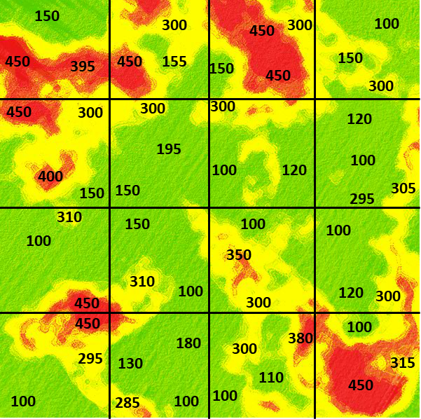
The field in this example is the 480-acre (194 ha) field illustrated in Fig. 6. In the figure, color variation depicts variation in potassium levels measured in parts per million (ppm), with red representing 450 ppm, yellow as 300 ppm, and green as 150 ppm. The figure illustrates that potassium levels vary depending on soil properties.
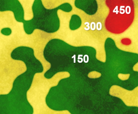
However, in the illustration below (Fig. 7), we can see that different areas of the field vary much more widely than implied in Fig. 6. Even within the broader pattern of major soil variants, here, the darker shades indicate higher levels of potassium, and lighter shades indicate lower ones.
Pick a set of three separate squares (locations) in the field to sample from (Fig. 7). Select sets of locations to calculate an average potassium value for the field. For example, a set with 300, 150, and 450 would result in a mean of 300.
What does this suggest about how to design a sampling scheme to best represent the “population” mean value for the field? What happens when you increase the number of samples or vary their location? Would it be better to be random in your sampling scheme or systematic?
If you do this computation several times, between sets, you will notice that variation in the calculated average value occurs depending on where the samples are drawn.

Discussion
Where did you sample? How many samples did you need to understand the variability? What other issues are involved in sampling?
Accurate Samples
Our sampling example illustrates that it can be hard to get a sample to accurately reflect the population (Fig. 8).
We see from the example in the previous screens that it is difficult to get a representative sample for measuring an underlying parameter of the population, such as the average potassium concentration in an entire field. Taking three observations, and calculating a mean from them, better represents the true population mean than would an individual value. More than three observations would be even better.
It is generally better to take a random sample than a systematic one. Random samples provide a method to get unbiased estimates of population values. W.G. Cochran gives an example illustrating this on page 121 of his book Experimental Designs, co-authored with Gertrude Cox. Even experts have a bias when trying to select a representative sample.
In an experiment to measure the heights of wheat plants in England, several expert samplers chose what they thought were eight representative plants from each of six small areas containing about 80 plants. Every expert ended up choosing samples taller than the average of all the plants in the area. Of the 36 total samples, only 3 had shorter average wheat height than the corresponding area. Samplers averaged from 1.2 cm to nearly 7 cm over the actual height for systematic samples compared with the actual average for the six plots. It is likely that their eyes were drawn to the taller plants. A properly conducted random sampling scheme would have avoided this bias.
Histograms & Percentiles
Purpose of Histograms
The frequency histogram gives a “picture” of the population. Once data are collected, we wish to understand the nature of the data better, and one method is to picture the data distribution with a histogram. The histogram is a diagram that gives frequencies of occurrence of data points on one axis and the values of the measurements on a second axis. In the frequency histogram, the value (height) of each bar is the number of variates (samples) that have that value or fall in that data range. An example is given here in Fig. 9.
The histogram gives the overall pattern of the data. It shows how spread out the data is, and which values occur most frequently. It also shows potential outliers or unusual data values.
Creating a Histogram
Proportions of datasets can be viewed in histograms.
One can view in the histogram the proportion of data less than or greater than a given value. We can also find values for which, say, 10% of the observations will be less than that value. This defines the “10th percentile” of the distribution. The median is the 50th percentile. Other useful percentiles are the first quartile (25th percentile) and third quartile (75th percentile).
The following exercise will use the Weldon, Illinois (USA) data provided in the Excel file named QM-mod2-ex1data.xls. For this exercise, we will use Weldon Root Pulls Set 4552 worksheet in the file. In the homework in the chapter on Central Limit Theorem, Confidence Intervals, and Hypothesis Tests, we will use a second dataset located in this same Excel file, but in a different worksheet. For a portion of the homework assignment, instead of the Weldon data, we will use data from Slater, Iowa (USA) found in the worksheet titled Slater Root Pulls Set 4552.
Ex. 1: Using Histograms (1)
An example of the use of histograms for exploratory data analysis
Our company entomologist called to ask me a question about data. One of his technicians, after using equipment to record root-pull data, thought values taken for the Slater, Iowa location were too high. Root-pull data are taken with a data recorder connected to an electronic load cell. A boom on a front-end loader of a tractor is hitched by cable to corn plants, and the force required to pull plants from the ground is recorded from the load cell. Entomologists can then select for corn hybrids with stronger root systems, sometimes even infesting with corn rootworm eggs, to select hybrids effective against these pests. But, to correctly select, we must have good measurements.
We decided to compare the measurements obtained from the Slater location with those taken the week before from a location near Weldon, Illinois. The entomologist asked for histograms of the distributions of the root-pull measurements from each location, means, standard deviations, quantiles, and medians for the data. In particular, he wanted to know if his group should stop additional root pulling at Slater because of poor quality data.
Typically, we need to do some work to get the data into the correct form to do statistical analysis.
The scientists provided data to me in an Excel file. My first step was to get the data for each location into a separate worksheet, with the titles of each variable in the first row. I then went through the following steps, which I request that you do in the following exercise.
Ex. 1: Using Histograms (2)
Open the data table in the Excel file named QM-mod2-ex1data.xls. Choose the Weldon worksheet. Because Weldon was the first location where data were taken, we want to examine this distribution and later compare it with our Slater data.
First, we need to inspect the data. For example, we need to ensure the data for any particular characteristic are not a mixture of character and numeric values. If there is a mixture, it may be necessary to modify data in the Excel worksheet. Also, for future use of SAS or R software or other statistical analyses, it is important to keep the names of the variables as in the first row in the Excel spreadsheet, with appropriate data arranged in the rows below each column. Other text or headings in the Excel spreadsheet can mess up your data analyses when transferring the data to another analysis program (Fig. 10).
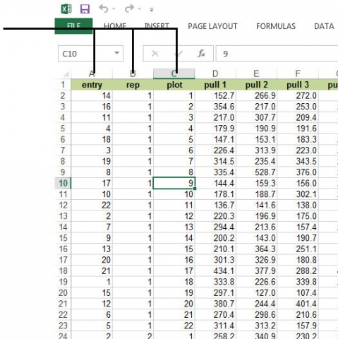
Notice that there are columns for entry (corn hybrid number), rep, and plot within the rep. There are 22 corn hybrids in each of the 3 reps (blocks) of this experiment. Root pull measurements are recorded for 8 plants within each row for each plot.
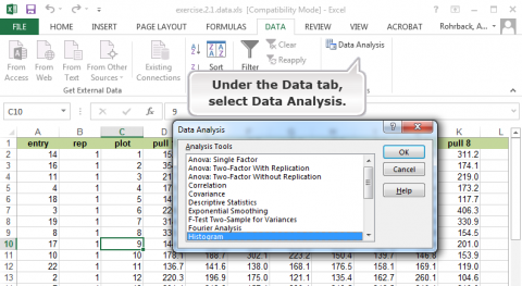
For a detailed description of how to create a histogram in Excel, go to Excel Help under the File tab and search for histogram. The first option gives a step-by-step description.
Ex. 1: Using Histograms (3)
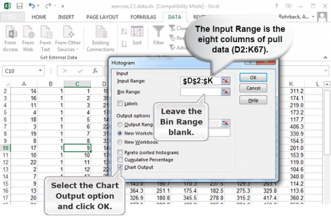
Follow the steps in Figs 11, 12, and 13, to generate a histogram.
Ex. 1: Using Histograms (4)
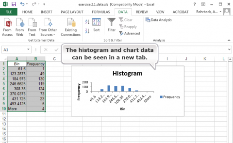
Now that we have the histogram, how do we interpret it?
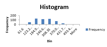
The histogram visually shows the distribution of the root pull values, ranging from low of 62 to high of 555 pounds (you wouldn’t want to try to hand pull that one) (Fig. 14). The first quartile, as the name suggests, is the value below which 25% of the distribution lies. For the Weldon root-pull distribution, 25% of the values are less than 165.50. The median is the second quartile (227.75 in this example) and the third quartile is the value below which 75% of the distribution lies (294.02).
Quartiles can be easily calculated in Excel. Select an empty cell and enter the formula “=Quartile(D2:K67, 1)” for the first quartile (25th percentile). The “1” in this function will give you the first quartile, a “2” will give you the second quartile, and a “3” will give you the third quartile. The median can be calculated using 2 in the formula instead of 1, and the 3rd quartile can be calculated using 3 in the formula.
In general, quantiles are the values below which a certain proportion of the distribution lies. For example, the 90th percentile is the value below which 90% of the distribution lies (347.92 in this case).
The maximum and minimum values of a sample can be found using the “Max” and “Min” formulas, respectively.
The distribution of root pulls tapers off toward each extreme, with only a few values higher than 400 or lower than 100 pounds. The mean is 233.78, very close to the median, and the standard deviation is 87.89. It is the shape of this distribution and its summary statistics which we will use to compare with the data from Slater.
What about getting the output into a Word document?
You can use copy and paste or cut and paste to get portions of the output into other programs such as Microsoft Word. Always place your analyses into Word documents before submitting them.
Probability
Taking a Random Sample
When an experiment is performed, there is frequently a chance that the value observed from a trial will differ from the previous observation, even when the environment is the same. Consider four soil samples taken throughout a field. The farmer wishes to apply the fertilizer evenly throughout the field, so all samples are considered to have been taken from the same environment. When the soil samples are analyzed, it is determined that the pH differs for each of the four samples. The differences in pH between soil samples are due to variables that cannot be controlled in the trial or experiment. When a trial or experiment is affected by variables that cannot be controlled, it is called random.
Sample Space
Within every random experiment, there exists a sample space. This is a mathematical space; you could think of the sample space as the area on a graph from which all possible observations could be drawn. The pH measurements from the soil samples exist in a one-dimensional sample space of all possible pH measurements (Fig. 15).
Events
The sample space of an experiment contains subsets called events. In the soil sample experiment, each event is a measurement of a particular pH. Since pH is a continuous measurement and, therefore, more complex, let’s use the example of a trait that differs between plants due to one gene. Each gene has slight changes within its makeup that cause differences between plants. Each of these forms of the gene can be differentiated and are called alleles. For this example, let’s say that there are two alleles segregating in a population. In other words, there are two possible outcomes to each trial, and the sample space is made up of these two possible outcomes. The results of the test can be that the allele form is A1 or A2, and the sample space is called A. An event, in this case, is the observation of either A1 or A2 from sample space A.
Defining Sample Spaces and Events of Interest
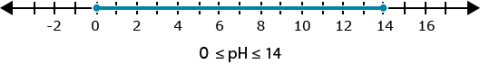
It is possible to imagine that there are more than two alleles of gene A in the segregating population. However, it’s important to understand that this is an example of defining a sample space and events of interest. This decision is usually made from previous information about the observations being taken or the environment. The population of interest may be known to the researcher, and they know that there are only two alleles of gene A in the population. In reference to the soil sample experiment, there aren’t any pH scores higher than 14. This results in a defined sample space of 0 ≤ pH ≤ 14. These sorts of definitions are common throughout mathematics and statistics. It is necessary to make some limitations on possibilities to allow an experiment to be analyzed.
What Is Probability?

In a random experiment, there is uncertainty about what the outcome will be. The outcome will be within the sample space, but where in the sample space remains uncertain until the observation is made. It is useful to be able to measure how likely an event is to occur during an experiment. The measure of the expectation that an event will occur during an experiment is called probability (Fig. 16).
Probabilities have classically been calculated as the ratio of the number of times an event occurred to the total number of events. If an event occurs h times and the total number of observations is n, then the probability of the event occurring is h/n. The sum across all events in a sample space will be 1. This is a defined property of probabilities.
Mathematical Symbols Used in Probability Equations
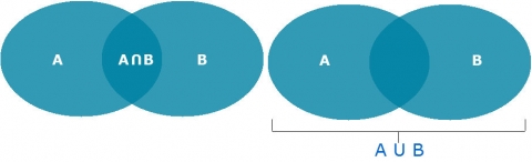
The symbol ∪ means the “union of” or “or”, so A∪B means the set of those elements that are either in A, or in B, or in both. Below we will use the symbol, ∩, which means “intersect” or “and”, so A∩B means the set that contains all those elements that A and B have in common (Fig. 17).
Mutually Exclusive

To better understand when events are mutually exclusive, let’s go back to the classic example of flipping a coin (Fig. 18). When you flip a coin, it cannot be both heads and tails. The events of heads or tails on the same coin flip are mutually exclusive. It’s very common to want to determine the probability of two mutually exclusive events.
The probability of a flip resulting in heads (h) or a flip resulting in tails (t) is defined as:
Pr(h)=0.50
Pr(t)=0.50
Pr(h or t) = Pr(h U t) = Pr(h)+Pr(t) = 1
Calculating the Probability Associated with Two or More Events
The calculation of the probability of two or more events occurring follows some basic rules that depend on whether or not the events are mutually exclusive. For example, a chromosome with one copy of gene A cannot carry A1 and A2 at the same time (Table 1).
| Allele | Number of times allele was observed (n) | Total observations (n) | Probability of allele |
|---|---|---|---|
| A1 | 120 | 200 | [latex]\text{Pr}(A_1)=\frac{120}{200}=0.60[/latex] |
| A2 | 80 | 200 | [latex]\text{Pr}(A_1)=\frac{80}{200}=0.40[/latex] |
However, if two chromosomes are considered, there are two alleles. If these two chromosomes segregate independently, so the two events that occur are non-mutually exclusive. This is not usually immediately obvious — for more details, keep reading.
Non-Mutually Exclusive Events
When two events can occur at the same, they are not mutually exclusive. Consider the example of two alleles in a diploid plant, i.e., there is an allele on each of two chromosomes. Gene A has two events, A1 and A2. The events that occur on each chromosome within a plant are inherited independently of each other and are not mutually exclusive. Calculating that two events will occur together (either simultaneously or sequentially) is done by calculating the two probabilities by each other.
Calculating that the two chromosomes will both carry allele A1:
[latex]\text{Pr}(A_1\text{ and }A_2)=\text{Pr}(A_1A_2)=0.6\times0.6=36[/latex]
[latex]\text{Equation 1}[/latex] Mutually exclusive probability formula.
Joint Probability
The probability associated with two independent events occurring is called the joint probability. It is calculated as the product of the probabilities of each of the events occurring. A common use of joint probability is a Punnett Square, which is a way of calculating the probabilities and possibilities associated different alleles of a gene on two chromosomes (Fig. 19).
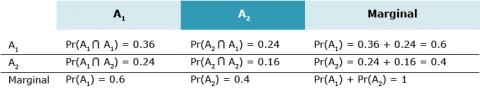
Marginal Probability
Another term for the probability of an event occurring is the marginal probability. The joint probabilities associated with an event can be summed to the marginal probability (Fig. 20).
Conditional Probability
A conditional probability can be calculated when it is known that one event has occurred or will occur. It is calculated as the ratio of both events occurring to the probability of the known event.
[latex]\text{Pr}(A_1\text{ given }A_2) = \text{Pr}(A_1|A_2) = \dfrac{\text{Pr}(A_1\cap A_2)}{\text{Pr}(A_2)} = 0.5=\text{Pr}(A_2)[/latex]
[latex]\text{Equation 2}[/latex] Conditional probability probability formula.
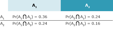
Events may not be independent of each other. In this case, the probability of both occurring is not the product. An example of this would be two linked genes, gene A and gene B. Gene A has the two alleles mentioned before. Gene B also has two alleles segregating in the population, B1 and B2. Since inheriting alleles at locus A is not independent of locus B, the probability of any two alleles occurring together on the same chromosome (the joint probability) has to be determined through the behavior of the two events. For this example, the joint probabilities have been given. In order to calculate the probability of allele B1 occurring when it is known that allele A1 is present, the following calculation can be used:
Assume that [latex]\textrm{Pr}(B_1 \cap A_1) = 0.3[/latex]. Then
[latex]\text{Pr}(B_1|A_1)=\dfrac{\text{Pr}(B_1\cap A_1)}{\text{Pr}(A_1)}=\dfrac{0.3}{0.6}=0.5[/latex]
[latex]\text{Equation 3}[/latex] Equation for calculating conditional probability.
This is exactly how bio-markers are used to determine genetic risk for many human diseases, and it is how markers are used in selection during plant breeding.
Probability Distributions
Each set of events in a sample space has an associated probability distribution. A distribution is a means of depicting the frequency with which each event occurs. Along the x-axis are the events, and along the y-axis are the probabilities from 0 – 1. The probabilities across all events on the sample space equal 1 (or 100%) and the distribution describes how the probability is allotted across all events. The two types of observations, discrete and continuous, have different types of probability distributions.
Discrete Distribution
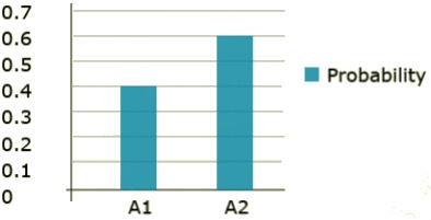
Within a discrete distribution, each event type is clearly defined and has a probability assigned to it. The segregating gene A is an example of a discrete data type. There are two clearly defined events, A1 and A2. Each of these events has a probability assigned to it and those probabilities add to 1. Each of the events serves as a step in the total distribution. The probability distribution can be seen in Fig. 21.
Continuous Distribution
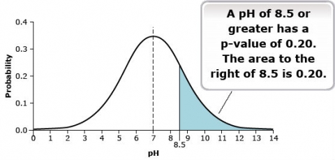
Continuous data types have an infinite number of possible events in the sample space. For example, a pH measurement could theoretically be measured to an infinite number of significant digits. This results in a necessary change to the probability distribution. When there are an infinite number of possible events, no single event has a probability. This situation results in a continuous distribution rather than a distribution comprised of discrete events. The continuous distribution is derived from an infinite number of events. The probability of an event of interest is measured as the area under the distribution to the left or right of the event of interest. That probability is more commonly called a p-value. The probability distribution for the pH of the soil samples is given in Fig. 22.
Normal Distribution
The Most Common, Best-Studied Statistical Distribution
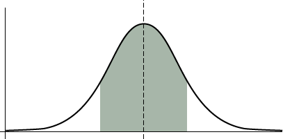
In the root-pull examples, we saw histograms of a distribution which had most values concentrated toward the center and fewer at the extremes. Although not a perfect bell-shaped curve, the curve formed by connecting the tops of the rectangles in the frequency histogram approximates the shape of a bell. These bell-shaped distributions, referred to by statisticians as normal distributions (Fig. 23), are typical for many types of data, including plant heights, grain yields, grain moistures, soil nutrient values, and many others.
Mathematicians and scientists first noticed and mathematically described the normal distribution in the early 1700s. At that time, many scientists were studying astronomy, and they saw a characteristic bell-shaped curve in histograms of the errors of their measurements. Abraham De Moivre first described the distribution mathematically in 1733. The famous French mathematician Pierre LaPlace and German mathematical prodigy Karl Gauss both applied the normal curve to errors of measurement.
What it Does
Normal distribution allows us to calculate probabilities of events.
By using this type of distribution, we can infer a great amount of information and make probability statements based on the distribution. The probability function for a normally distributed random variable, x, is described mathematically as:
Normal Distribution Equation (Equation 4)
[latex]f(x)=\frac{^{e{^-{(x-\mu)}}^2{/2\sigma^2}}}{\sigma\sqrt{2\pi}}[/latex]
[latex]\text{Equation 4}[/latex] Normal Distribution Equation, or probability density function,
where:
[latex]f[/latex]= probability function
[latex]x[/latex]= a variate with normal distribution
[latex]\sigma^2[/latex]= variance of populaton
[latex]\sigma[/latex]= standard deviation of populaton
[latex]\mu[/latex]= population mean
[latex]e[/latex]= base of natural logarithm
The probabilities for the occurrence of an event, such as corn yields between 150 and 170 bushels/acre (9.4 – 10.7 tons/ha) are found by summing the areas under the distribution, also called integrating the function. The area is approximated by computer programs which subdivide the area into very small rectangles and then sum their areas. Adhering to the rules of probability, we know the total area under the curve and above the horizontal axis sums to 1.
Basic Parameters
The normal distribution is based on knowledge of two main parameters: the mean and standard deviation.
While the Normal Distribution equation may appear daunting, the main aspect of it is that you can calculate the probability of ranges of values in a normal distribution by knowing two parameters:
- mean
- standard deviation
Based on knowledge of these parameters, you can substitute their values and predict the outcomes. However, this assumes that you know the true values for the parameters describing the population. If we do not know the true values and instead estimate the values from a sample of the population we have to recognize that the sample could be biased and have some error.
Reasons for Widespread Use
There are four main reasons for the widespread use of the normal distribution:
- The normal distribution allows probabilities to be assigned to outcomes of an experiment, completing the experiment process from collecting data to interpreting results using these probabilities.
- Many variables have distributions close to the theoretical normal distribution.
- Even variables with other distributions, such as the binomial distribution (e.g., number of seeds germinating from 400 planted) are reasonably approximated by the normal when samples are large. Other variables can be transformed to closely follow the normal distribution.
- Averages from any distribution approach the normal distribution as sample size gets large. This characteristic is very helpful because we often want to make probability statements about mean
Properties of Normal Distribution
Properties of the normal distribution help us draw statistical inferences.
Properties of the normal distribution include the following:
- The distribution is symmetric about its mean
- Roughly two-thirds of the values (68%) lie within one standard deviation of the mean
- About 95% of the population is within 2 standard deviations of the mean
- Probabilities for intervals of values can be computed
To compute probabilities, for example those in Appendix 1, we only need to use the normal distribution with mean zero and standard deviation one (μ=0, σ=1). We then convert any value in the population to its number of standard deviations above or below the mean. For example, if corn yields are normally distributed with mean 150 bushels/acre (9.4 tons/ha) and standard deviation 10, we know that a yield of 140 bushels/acre (8.8 tons/ha) is one standard deviation below the mean. Using property #3, we expect 95% of the values for this population to be between 130 and 170 bushels per acre (8.2 – 10.7 tons/ha).
Z-Scores
Z-Scores are the number of standard deviations above or below the mean.
Knowing the mean and standard deviation of a normally distributed variable completely describes the population distribution and allows comparison with other populations. It is also useful for evaluating where a specific value occurs in the distribution, how common or how extreme, i.e., how far it occurs from the mean. These comparisons are evaluated using the z-score (Equation 5). The z-score formula is defined as:
[latex]Z=\frac{x_i-\mu}{\sigma}[/latex]
[latex]\text{Equation 5}[/latex] Z-score formula,
where:
[latex]x_i[/latex]= value of observation i
[latex]\mu[/latex] = population mean
[latex]\sigma[/latex] = population standard deviation
The z-scores from a normal population have a standard normal distribution, i.e., a mean of 0 and a standard deviation of 1. They are dimensionless because the numerator and denominator of the fraction have the same units, and when doing the division, the units are removed. These facets of the z-score make it useful for comparing populations with known mean and standard deviation. Any value in a normally distributed population can be assigned a z-value.
Calculation
Let’s look at an example. On July 1 you hear on the radio that daily high temperatures during the month of June averaged 85.6°F (29.8°C), while the average June daily high temperature over many years is X = 81.6°F (27.6°C). The 4°F (2.2°C) difference doesn’t seem that large, but how warm is this based on historical June data? The standard deviation for monthly average high temperatures for Ames, IA in June is about 3.75°F, using data since 1900. Meteorologists have seen that average monthly high or low daily temperatures are normally distributed (see Fig. 24). What is the z-score for 85.6°F, and what is the probability of a value this high or higher?
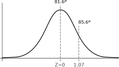
[latex]Z=\frac{x_i-\bar{x}}{\sigma}[/latex] = [latex]Z=\dfrac{85.6-81.5}{3.75}[/latex] = 1.07
[latex]\text{Equation 6}[/latex] Example calculation using Z-score formula,
where:
[latex]x_i[/latex]= value of observation i
[latex]\bar{x}[/latex] = sample mean
[latex]\sigma[/latex] = population standard deviation
Interpretation
The value of 85.6°F (29.8°C) is just a little more than 1 standard deviation larger than the mean. The probability for a z-score less than or equal to 1.07 is 0.8577. Since this is the probability less than z, or to the left of z, the probability of a higher value is 1 – 0.8577 = 0.1423. This means that there is a 14% chance of obtaining a value larger than 85.6°F June monthly average high. The 85.6°F is somewhat warm, but not extremely so. The standardization of values produced using the z-score allows comparison of different distributions which is sometimes difficult when looking only at raw numbers.
Suppose we want to compute the probability of finding a value less than 23.3 if it comes from a normal distribution with mean = 27.3 and standard deviation = 6.25. Note that here
z = (23.3 – 27.3) / 6.25 = -0.64.
By the symmetry of the normal distribution, the probability of a value less than z = -0.64 is the same as the probability of a value greater than z = 0.64. The probability of a value greater than z = 0.64 is 1 – P(z < 0.64) = 1 – 0.7389 = 0.2611. Therefore, the probability of a value less than 23.3 is 26%.
A Second Example of the Calculation of Z-Scores
Determining the probability of some value occurring between two values in normal distribution is also possible. By calculating the z-value of the two numbers, one can calculate the range between them and percentage chance of that occurrence. If we use the June temperature example in the previous screens, let’s find out how often temperatures in June are between plus and minus 4°F (2.2°C) of the mean high temperature (81.6°F or 27.6°C). Also, we make use of the symmetric nature of the normal distribution (see Fig. 25). We found above that 14% of the time temperatures are greater than 85.6 °F (29.8°C). We then know that 14% of the time temperatures will be less than 77.6°F (29.8°C). To complete the calculation:
[latex]P(avg\pm 4^{\circ} F)=100\%-P(Z>1.067)-P(Z1.067)=72[/latex]]
[latex]\text{Equation 7}[/latex] Calculating Z score.
This same calculation can be done for any two values and their associated z-values. We have also illustrated the comparability of z-values above.

Normal vs. Non-Normal Distribution
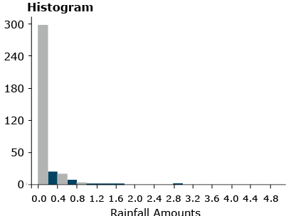
As we can see, for normally distributed data, it is relatively easy to compute probabilities. Not all distributions follow a normal distribution, however, and become more difficult to handle. One example is precipitation data (Fig. 26).
Other methods of computing probabilities are needed for non-normal distributions.
Other Distributions
Non-Normal Continuous Distributions
There are many other distributions which do not follow the normal, bell-shaped curve. The distribution of rainfall events (measured from a trace to several inches or centimeters) is an example of a non-normal continuous distribution. This distribution only takes values greater than zero. As shown in Fig. 26, the histogram seems to decrease exponentially.
Other continuous distributions may be skewed rather than symmetric. Some data follow a distribution in which the logarithm of the variable is normally distributed. These data are skewed to varying degrees. Even symmetric data, such as from a uniform distribution, do not follow the bell-shaped histogram of a normal distribution.
Non-Normal, Non-Continuous Distribution
Some data cannot follow a normal distribution because they are discrete and not continuous, for example, count data. We could have a uniform distribution of count data if, for example, corn plants in each 100 square-foot area (two 30 in. rows, 20 ft. long) planted with a precision planter have 60 plants in each plot.
Another example of count data is for rare events, such as the number of a certain type of weed in these same 100-square-foot plots. Counts of rare events often follow what is called a Poisson distribution. The formula for this distribution is in Equation 8:
[latex]P_k=\frac{\mu^ke^{-\mu}}{k!}[/latex]
[latex]\text{Equation 8}[/latex] Poisson Distribution Equation for count data,
where:
[latex]P_k[/latex]= probability of count being [latex]k[/latex]
[latex]\mu[/latex]= population mean
[latex]e[/latex]= base of natural logarithms.
In this equation, [latex]k![/latex] is the product of all integers less than or equal to [latex]k[/latex], [latex]k![/latex] = [latex]k(k-1)(k-2) . . .(2)(1)[/latex]. The symbol e is the base of the natural logarithm, approximately equal to 2.71828. It is used to describe exponential growth phenomena, such as compound interest.
Poisson Distribution Example
An example of the Poisson distribution is given in the text of Robert Steel and James Torrie (1980, Principles and Procedures of Statistics, 2nd edition), in which the number of yeast cells is counted in each square of a grid of 400. It was rare to get even as many as four cells in a square, and for this sample there were never more than six. The observed frequencies are given in Fig. 27.
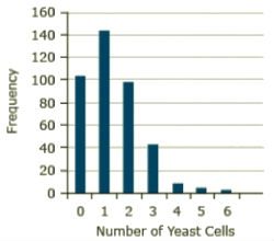
Calculations
The total number of yeast cells for this sample is 529, and the mean or average per square is 529/400 = 1.3225. If this estimate is substituted for the true mean, the formula becomes
For example, the estimated probability for three cells computed from the formula is
[latex]P_k=\frac{\mu^ke^{-\mu}}{k!}=P_k=\frac{1.3225^3e^{-1.3225}}{k!}[/latex]
[latex]\text{Equation 9}[/latex] Calculation of probability for Poisson Distribution
[latex]P_k=\frac{1.3225^3e^{-1.3225}}{3!}[/latex] = [latex]0.1027[/latex].
[latex]\text{Equation 10}[/latex] Calculation of probability for Poisson Distribution; k = 3.
The expected frequency with 400 squares is 400(0.1027) = 41.09. The observed frequency of squares with three cells is 42. The Poisson distribution does a good job of describing the distribution in this sample.
We will see this distribution again when we explore transformations later in the course to make data more closely follow a normal distribution.
Binomial Distribution
Another discrete distribution even more common in agronomic data is the binomial distribution. This is used, for example, in counting numbers of germinated seeds, seedlings which emerge, or diseased plants. In this distribution, we measure for each experimental unit (plant or seed) one of two outcomes, for example, germinated or not, or alive or dead. We assume a true proportion p of seeds which would germinate and that each sample is of the same size, say n = 100 seeds. Each seed will germinate or not independently of any of the other seeds. The distribution of the number of seeds germinating follows what is called the binomial distribution.
Because of the importance of the binomial distribution, we will devote an entire unit to studying it.
Even though there are numerous examples of distributions other than the Normal, it is such an important distribution that we will concentrate in the next several units on analysis methods for normally distributed data.
Summary
Samples Represent the Population
- Sampling scheme or experiment design affect our ability to test hypotheses
- “Representative plants” generally have more bias than a random sample
Histogram
- Gives a “picture” of the population
Normal Distributions
- Bell-shaped curve
- Characteristic of many types of data (yields, plant heights, errors in a measurement)
- Provides a mechanism to assign probabilities
Properties of Normal Distributions
- Bell-shaped curve
- Symmetric about the mean, μ
- 68% of values are within 1 σ and 95% are within 2 σ of mean
Z-scores
- Tell how many standard deviations above or below the mean
- Defined as (Y – μ)/σ
- Allow computation of probabilities with the normal distribution
Non-normal Distributions
- Many examples (daily rainfall)
- Some may be transformed to be normal
How to cite this chapter: Mowers, R., K. Moore, D., Todey, M.L. Harbur, K. Meade, W. Beavis, L. Merrick, A. A. Mahama, & W. Suza. 2023. Distributions and Probability. In W. P. Suza, & K. R. Lamkey (Eds.), Quantitative Methods. Iowa State University Digital Press.
definition
For plant breeding: a group of individuals of the same species within given space and time constraints.
For statistics: the complete set of units with a common trait for which a certain value summarizing the measured data is needed.
A common trait of a population, such as the mean or standard deviation.
Process of assigning experimental units without any bias. Usually executed by random number generation.
The probability density function that approximates the distribution of many random variables (as the proportion of outcomes of a particular sort in a large number of independent repetitions of an experiment in which the probabilities remain constant from trial to trial) and that has the form where µ is the mean and s is the standard deviation
