
Chapter 14: Nonlinear Regression
Ron Mowers; Dennis Todey; Ken Moore; Laura Merrick; Anthony Assibi Mahama; and Walter Suza
Many of the relationships between variables encountered in agronomy are nonlinear. The growth of plants and most other organisms approaches a physiological limit as they age, so their rate of growth diminishes with time. Many other natural phenomena occur in a nonlinear manner with respect to time and can best be described using nonlinear functions. In Chapter 7 on Linear Correlation, Regression, and Prediction, we discussed how to recognize and define the linear relationship between two variables and how the change in one variable can be used to predict the resulting change of another. In Chapter 13 on Multiple Regression, we learned how to fit polynomial equations to approximate nonlinear relationships between two variables. In this chapter, some of the most common nonlinear relationships and their application are presented and discussed.
- To identify strong relationships that are not strictly linear
- How to perform a regression with nonlinear terms
- How to fit data with and test the usefulness of various types of nonlinear regression equations
Approximation of Non-Linear Data
Relationships Among Variables
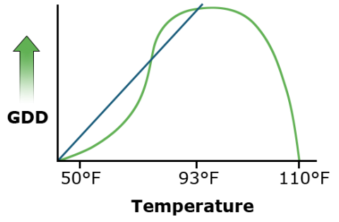
Many relationships are curvilinear rather than linear. Relationships among variables in agronomic data are often assumed to be linear. Many statistics are based on this assumption of linearity between variables because calculations are simpler. The growing degree day formula for corn and other warm-season crops, for instance, assumes that a plant sustains linear growth between 50° F (10° C) and 86° F (30° C) (Fig. 1). Much of the experimental data that is gathered, however, is inherently nonlinear. This is often caused by the nonlinear reaction of many physical and biological processes to time, temperature, and other conditions. Distributions of these data often follow other more complex but definable equations.
Almost any relationship can be fit using higher-order polynomials, as you learned in Chapter 13 on Multiple Regression. However, while the numerical relationship can be modeled with a polynomial, it may be devoid of any practical meaning or significance. We often refer to such relationships as “black box” or empirical because there is no clear or obvious relationship between the model parameters and the biology of the response. The parameters of many nonlinear models are often better defined and correspond to biological processes that can be interpreted with respect to them.
Since computation becomes easier when relationships are linear or can be approximated as linear, efforts are undertaken to create linear relationships. In Chapter 12 on Data Transformation, we discussed transformations such as the log, square root, and arcsine to make data conform to the assumptions of the ANOVA, simplifying the calculations to be performed in the analysis. Another method of approximation is to assume that a linear relationship is valid over a portion of the data. While not appropriate for a whole data set, it may be useful over a small part of it.
Assumptions such as this are wrong to a certain extent. A corn plant develops more slowly at colder temperatures (GDDs overestimate growth) but develops more rapidly at higher temperatures (GDDs underestimate growth in the upper 70s and low 80s). Some error is then introduced by this assumption.
Interpolating Data
When interpolating data in the small area of interest, the linear approximation may be acceptable, especially when small errors are acceptable and their existence is understood. But when such approximations are extrapolated beyond this region, errors can grow quickly.
Statisticians refer to linear versus nonlinear equations with respect to their parameters. For example, the equation Y= + β1 Χ + β2Χ2 is linear in the parameters ( , β1, β2) even though it is quadratic in Χ. It follows a linear model because the multiple linear regression can be done with Χ2 considered as a variable in the equation.
Some other equations, such as the power curve Y = Χβ are nonlinear in the parameters. However, as we see next, this equation can be linearized by taking logarithms. This is an advantage because we can use the familiar linear regression methods to fit data to this equation.
Still, other functions are not easily linearized by taking logarithms, for example, the S-shaped logistic curve of plant growth, Y = /(1 + β exp(-δΧβ)), where exp refers to Euler’s constant e raised to the power in parentheses. These nonlinear functions require a complex iterative solution technique rather than the common linear regression methods.
A log transformation works to linearize many functions which involve an exponent. This is performed by taking the log of both sides of an equation. Other transformations may be applied in different situations.
Difference Comparisons
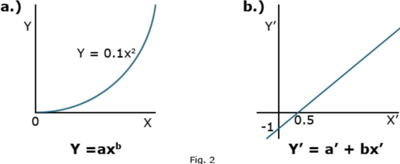
The power curve (Equation 1) is a simple example of this application.
[latex]Y=ax^b[/latex].
[latex]\textrm{Equation 1}[/latex] Formula for a power curve.
Taking the log or exponent of each side of Equation 1 produces linear equations (Equations 2 and 3)
[latex]\small \textrm{logY}=\textrm{log a + blog x}[/latex].
[latex]\textrm{Equation 2}[/latex] Linear form or Power curve formula using log.
[latex]\textrm{Y}^1=a^1 + bx^1[/latex].
[latex]\textrm{Equation 3}[/latex] Linear form or Power curve using exponent.
where the primed values are used in place of the log values. The two different plots produced by these equations are shown in Fig. 2.

Comparing Equations
Instead of the non-linear relation of the first plot, the linear equation plotted is produced. Correlation and regression equations from Chapter 7 on Linear Correlation, Regression, and Prediction can then be applied to measure the relationship. Taking the anti-log of both sides removes the logs and leaves the original equation form using X and Y.
Functional Relationships
Nonlinear Relationships
Several other nonlinear relationships are applicable to agricultural data and analysis. The structure and application of some of the major ones are described here.
The exponential curve describes slow change at small values of X with rapidly increasing values at large X’s (exponential growth). A negative exponent changes the distribution to one of exponential decay. Its shape can change into a nearly infinite number of curves depending on the parameters a and b of the equation. One form is given as Equation 4.
[latex]Y=ab^x[/latex].
[latex]\textrm{Equation 4}[/latex] Exponetial decay curve.
The parameters a and b can be any value. The more common representation uses the exponential function (Equation 5).
[latex]Y=ae^{bx}[/latex].
[latex]\textrm{Equation 5}[/latex] Exponential function curve.
Exponential Graph
These equations produce a graph that appears similar to the power curve (Fig. 3).

In Equation 5, where the b is contained in the exponent, e is Euler’s constant. It is an irrational number, which is approximately equal to 2.7183. The value e is raised to the power in the exponent to calculate the value of the function.
Exponential Relationships
A positive b models exponential growth, while a negative b models exponential decay toward a value a. When discussing exponential growth or decay, the X is often replaced by t for time since growth or decay is often a function of time.
Taking the log of this function produces Equation 6.
[latex]\textrm{log y}=\textrm{log a + bx}[/latex].
[latex]\textrm{Equation 6}[/latex] Formula log of exponential growth or decay.
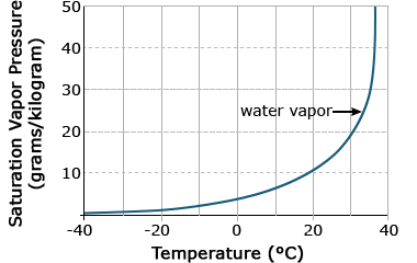
Again, a straight line is produced, which is easier to work with computationally. Biological relationships of the exponential function can be seen in the early growth of plants, where initial growth is slow, followed by a rapid increase. Another exponential relationship is that between air temperature and the saturation vapor pressure, or the amount of water needed to saturate air. As air temperature increases, the amount of water needed to saturate it increases dramatically (Fig. 4).
Ex. 1: Calculating the Regression Equation for an Exponential
An experiment was conducted to study the development of cabbage over an 8-week period following emergence. Height (cm) of the cabbage above the cotyledon was measured at weekly intervals. In this example, we will use simple linear regression to fit a straight line describing height as a function of time (weeks) to evaluate how well it fits the data. We will continue by transforming the Y variable so that we can fit the nonlinear exponential function to the data, also using simple linear regression. We will be using the linear regression program in Excel that you learned in Chapter 7 on Linear Correlation, Regression, and Prediction for this example.
Fit a linear regression equation for data on the growth of cabbage and determine if a nonlinear (transformed) model will fit better.
Steps:
- Open the Excel data file Module 14 Example 1 data [XLS].
- Select Data Analysis from the Data menu at the top of the window and select Regression from the list of Analysis Tools that appear. Click OK.
- Enter the Input Y Range: by clicking on the spreadsheet icon to the right of the input box.
- Using your mouse, select the data in the Height column, including the column heading. Click on the icon to the right of the input box labeled Regression, which will input the range and return you to the Regression window.
- Repeat step 4 for the Input X Range: this time selecting the Week column of data.
- Check the Labels box. This tells Excel that the first row will contain data labels.
- Under Output options, select New Worksheet Ply: which will cause the results to be listed in a new worksheet.
- Under Residuals, select Residual Plots and Line Fit Plots, then click OK.
The SUMMARY OUTPUT for the analysis should appear in a new worksheet. If not, go back to the steps above and make sure the input data are correct and all the other options have been selected.
We are most interested in the fit statistics that are presented in the Regression Statistics table (Table 1):
| Regression Statistics | |
|---|---|
| Multiple R | 0.981418 |
| R Square | 0.963181 |
| Adjusted R Square | 0.957044 |
| Standard Error | 0.982233 |
| Observations | 8 |
Ex. 1: Examining the Fit of Data
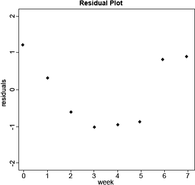
Based on these statistics alone, we would likely conclude that the straight-line fits pretty well. The R Square is very high at 0.963, so the equation does a pretty good job of describing the relationship. However, when we look at the residual plot, we see that the equation actually overpredicts early and late in the time period and underpredicts from weeks 2 – 5. This is cause for concern because we expect residuals to be distributed randomly about the regression line. When that is not the case, as is here, it indicates that the model may not describe the relationship as well as we thought.
data<-read.csv(“14_ex1.csv”)
head(data)
Week Height
1 0 4.5
2 1 5.5
3 2 6.5
4 3 8.0
5 4 10.0
6 5 12.0
1m_1<-1m(data-data,Height~Week)
summary(1m_1)
Residuals:
Min 1Q Median 3Q Max
-0.9881 -0.8110 -0.1399 0.8408 1.2083
Coefficients:
Estimate Std. Error t value Pr(>|t|)
(Intercept) 3.2917 0.6340 5.192 0.00203 **
Week 1.8988 0.1516 12.528 1.58e-05 ***
—
Signif. codes: 0 ‘***’ 0.001 ‘**’ 0.01 ‘*’ 0.05 ‘.’ 0.1 ‘ ‘ 1
Residual standard error: 0.9822 on 6 degrees of freedom
Multiple R-squared: 0.9632
Adjusted R-squared: 0.957
F-statistic: 157 on 1 and 6 DF, p-value: 1.582e-05
Ex. 1: Calculating Residuals
Calculate the residuals of the model. (Fig. 5)
1m.res1<-resid(1m_1)
plot(data$Week,lm.res1,xlab=”Week”,ylab=”residuals”,main=”Residual
Plot,pch=20,ylim=c(-2,2))
Ex. 1: Calculating ANOVA
Calculate the anova table for the linear model Height~Week.
y<-aov(lm_1)
summary(y)
Df Sum Sq Mean Sq F value Pr(>F)
Week 1 151.43 151.43 157 1.58e-05 ***
Residuals 6 5.79 0.96
—
Signif. codes: 0 ‘***’ 0.001 ‘**’ 0.01 ‘*’ 0.05 ‘.’ 0.1 ‘ ‘ 1
The significance of the test indicates that a linear model does account for enough of the variability to be useful, but the bias discovered when examining the residuals leads us to believe that perhaps another equation might describe the relationship better. Knowing that plant growth is inherently nonlinear, let’s examine a nonlinear relationship.
Ex. 1: Transforming the Data and Calculating Residuals
Add a column to the data set where each entry is the natural log of the corresponding entry for height.
data$lnHeight<-log(data$Height)
head(data)
Week Height lnHeight
1 0 4.5 1.504077
2 1 5.5 1.704748
3 2 6.5 1.871802
4 3 8.0 2.079442
5 4 10.0 2.302585
6 5 12.0 2.484907
Plotting Residuals With Log-Transformed Data/Fitting Parameters ‘a’ and ‘b’
Run the linear model with lnHeight as the response variable and Week as the explanatory variable and then look at the residuals of the model.
lm_2<-1m(data=data,1nHeight~Week)
summary(lm_2)
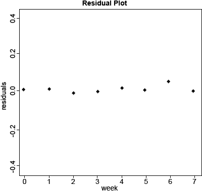
Calculate the residuals of the model and plot them from the log-transformed data (Fig. 6).
lm.res2<-resid(lm_2)
plot(data$Week,lm.res2,xlab=”Week”,ylab=”residuals,main=”Residual
Plot(ln(Height))”,pch=20,ylim=c(-0.5,0.5))
Exercise 2
Ex. 2: Estimating Nonlinear Regression
We have seen how the linearized exponential equation can be fit to data using a least-squares approach in the second part of Exercise 1. Being able to use this approach is nice because it allows an algebraic solution for estimating the model parameters. Many nonlinear equations, however, cannot be linearized easily and cannot be solved using the least-squares approach. Other regression methods have been developed to estimate the parameters of nonlinear equations. The process is called nonlinear regression and arrives at a solution for the estimated parameters by fitting them iteratively until the error SS for the complete model is minimized. There are different algorithms for doing this, some more complicated than others, but most work by trying different values of the parameters until no further improvement in the fit is realized by doing so.
Execute the nonlinear least square, ‘nls’, procedure.
a<-5
b<-0.2
fit1=nls(data=data,Height~a*exp(b*Week),start=list(a=a,b=b))
#Look at the confidence interval
confint(fit1,level=0.95)
Ex. 2: Summary of the Model
Look at the summary of the model.
summary(lm_2)
lm(formula=lnHeight~Week,data=data)
Residuals:
Min 1Q Median 3Q Max
-0.029532 -0.016742 0.000069 0.009151 0.048509
Coefficients:
Estimate Std. Error t value Pr(>|t|)
(Intercept) 1.495918 0.017216 86.89 1.57e-10 ***
Week 0.199402 0.004115 48.45 5.18e-09 ***
—
Signif. codes: 0 ‘***’ 0.001 ‘**’ 0.01 ‘*’ 0.05 ‘.’ 0.1 ‘ ‘ 1
Residual standard error: 0.02667 on 6 degrees of freedom
Multiple R-squared: 0.9975
Adjusted R-squared: 0.997
F-statistic: 2348 on 1 and 6 DF, p-value: 5.182e-09
summary(fit1)
Formula: Height~a*exp(b*Week)
Parameters:
Estimate Std. Error t value Pr(>|t|)
a 4.504885 0.169353 26.60 1.86e-07 ***
b 0.197576 0.006714 29.43 1.02e-07 ***
—
Signif. codes: 0 ‘***’ 0.001 ‘**’ 0.01 ‘*’ 0.05 ‘.’ 0.1 ‘ ‘ 1
Residual standard error: 0.3788 on 6 degrees of freedom
Number ofiterations to convergance: 3
Achieved convergence tolerance: 1.785e-06
Ex. 3: Plotting the Exponential Curve
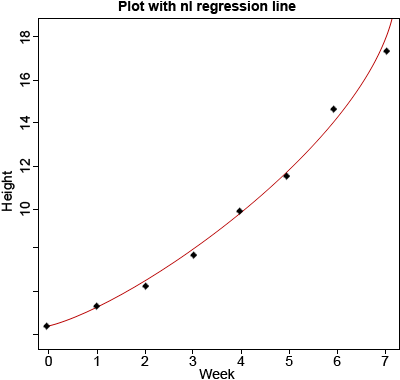
Download and read Module 14 Example [CSV] in R and plot the data with Week on the x-axis and Height on the y-axis. Use nls outputs (a as the intercept and b as the slope) to overlay the non-linear regression line (Fig. 7).
data<-read.csv(’14_ex1.csv’)
plot(data$Week, data$Height,xlab=”Week”,
ylab=”Height,main=”Plot with nl regression
line”,pch=20,ylim=c(4,18))
x<-seq(0,8,0.1)
y<-4.504885*exp(0.19757*x)
lines(x,y,col=”red”)
Ex. 3: ANOVA
anova(lm_1)
Analysis of Variance Table
Response: Height
Df Sum Sq Mean Sq F value Pr(>F)
Week 1 151.430 151.430 156.96 1.582e-05 ***
Residuals 6 5.789 0.965
—
Signif. codes:
0 ‘***’ 0.001 ‘**’ 0.01 ‘*’ 0.05 ‘.’ 0.1 ‘ ‘ 1
anova(lm_2)
Analysis of Variance Table
Response: lnHeight
Df Sum Sq Mean Sq F value Pr(>F)
Week 1 1.66997 1.66997 2357.6 5.182e-09 ***
Residuals 6 0.00427 0.00071
—
Signif. codes:
0 ‘***’ 0.001 ‘**’ 0.01 ‘*’ 0.05 ‘.’ 0.1 ‘ ‘ 1
Monomolecular Function
Other nonlinear (in parameters) functions are not easily linearized and require nonlinear regression to fit. A monomolecular function (Equation 8) is an inverted form of the exponential function. It rises rapidly initially and then approaches an asymptote, or some limiting value. The asymptote, which is parameter estimate a in Equation 7, can be thought of as the maximum possible response.
[latex]Y=a(1-be^{-cx})[/latex].
[latex]\textrm{Equation 7}[/latex] Formula for a monomolecular function curve.
The value Y is a(1-b) at X=0 and approaches a maximum at larger values of X (Fig. 8). Thus, a is called the asymptote, the value which is approached but never reached. A practical application of this model would be the response of crops to fertilizer application. Applying additional fertilizer increases yields up to a point. The rate of yield increase drops off rapidly as that value is approached. This is often referred to as “diminishing returns.” In the area of soil fertility, the monomolecular function is often referred to as Mitscherlich’s equation.
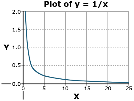
An asymptote is a value that a function will approach infinitely closely without ever reaching. A simple example is the function y = 1/x.
Why doesn’t this value ever reach the y or x-axis?
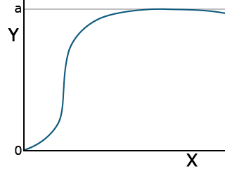
Total Growth Functions: Logistic
Two functions have applications in describing the total growth or complete life cycle of a plant. Both are exponential in form, beginning from the origin. This makes sense because, at time zero, there should be no growth. They have an inflection point, where the concavity of the curve changes, and approach an asymptotic Y value as X increases. Each has different parameters.
The logistic function has the form listed in Equation 8.
[latex]Y=\frac{a}{1-be^{-cx}}[/latex].
[latex]\textrm{Equation 8}[/latex] Formula for a logistic curve.
This function is also asymptotic, approaching a maximum as X becomes very large (Fig. 9).
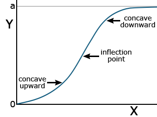
Total Growth Functions: Gompertz
The Gompertz function is another common equation for describing plant growth. It has the form:
[latex]Y = ae^{{-be}^{(-cx)}}[/latex].
[latex]\textrm{Equation 9}[/latex] Formula for Gompertz function curve.
While the logistic function is more symmetric about the inflection point (the point where the curve changes from being concave upward to concave downward), the Gompertz function levels off more rapidly than the logistic function (Fig. 10).
Nonlinear Model Calculation
Functions Are Compared Using Error Mean Squares or R2
Some nonlinear models have linear forms using a log or other transformation that improves the ease of computation. Using the linear transformation allows the use of linear regression techniques from the chapters on Linear Correlation, Regression and Prediction, and Multiple Regression. Other nonlinear functions can not be linearized and require nonlinear modeling software. The use of computers has reduced the difficulty of obtaining parameters for equations. The technique for finding the parameters of these equations is qualitatively the same as for a linear equation. The idea is to minimize the deviations of the data around the line. The calculation is much less straightforward, however. Generally, it requires an initial guess of the values of the constants and then iterates closer to a solution by nudging the values closer to the “best fit.”
The choice of functional relationship is somewhat arbitrary. There are accepted functions for certain applications. Often, testing several functions for a “best fit” approach works well.
Ex. 4: Estimating Regression Equations
Start R, set your working directory, and make sure all of the data sets for Nonlinear Regression are in the working directory folder. Verify the file reads in correctly by checking the ‘head’ of the data (first download the .xls or .xlsx file and save it as a .csv format).
data<-read.csv(“14_ex4.csv“)
a<-500
b<-25
c<-0.5
Plot the logistic function line over data.
m1 = nls(data=data,Yield ~ a/(1+b*exp(-c*Week)), start=list(a=a,b=b,c=c))
confint(m1, level=0.95)
plot(data$Week,data$Yield,xlab = “Week”, ylab=”Yield”, main = “data +
Logistic”,pch=20)
x<-seq(o,10,0.1)
y<-496,3023/(1+27.7107*exp(-0.6156 *x))
lines(x,y,col=”red”)
Ex. 4: Plot Monomolecular and Gompertz
Plot the monomolecular function line over data.
data<-read.csv(“14_ex4.csv”)
a<-500
b<-10
c<-0.1
m2 = nls(data=data,Yield ~`a*(1-(b*exp(-c*Week))), start=list(a=a,b=b,c=c))
confint(m2, level=0.95)
plot(data$Week,data$Yield,xlab = “Week”, ylab=”Yield”, main = “data + Monomolecular”,pch=20)
x<-seq(0,10,0.1)
y<-2.076e+03*(1-(1.037*exp(-3.075e-02*x)))
lines(x,y,col=”red”)
Plot the Gompertz function over data.
data<-read.csv(“14_ex4.csv”)
a<-500
b<-5
c<-0.25
m3 = nls(data=data,Yield ~ a*exp(-b*exp(-c*Week)), start=list(a=a,b=b,c=c))
Ex. 4: Computation
Compute the confidence interval of the model and create a plot of data with the Gompertz function overlaid.
confint(m3,level=0.95)
plot(data$Week,data$Yield,xlab = “Week”,
ylab=”Yield”, main = “data +
Goompertz”,pch=20)
#Plot the Gompertz function line
x<-seq(0,10,0.1)
y<-555.1372 *exp(-5.1347*exp(-0.3499*x))
lines(x,y, col = “red”)
Selecting the Best Function
If we have several nonlinear models and want to select the best of these functions, there are several considerations. First, knowledge of theoretical reasons that one of these functions should be superior is probably the most important consideration. For example, the monomolecular model is theoretically a good function to relate crop growth to fertilizer application. The logistic and Gompertz models are theoretically more appropriate for modeling growth as a function of time. If we do not have a strong theoretical model or want to choose among several potential models, we can use statistics from fitting the models to make the comparison. First, we can compare the error mean squares of the models. We want the smallest error mean square possible. Secondly, we can try to compare R2 values. However, this is difficult for two reasons. We can always fit a model perfectly (R2 = 1) if we just include enough parameters or variables in the model. It is also difficult to use R2 because the statistic is computed as the proportion of variation accounted for based on the sums of squares after correcting for the mean. Nonlinear models often do not even have a mean value as one of the parameters, and such a statistic is not generally computed for these models.
Summary of Nonlinear Functions
The main functions discussed in this lesson are summarized for easy referral.
| Function | Equation | Graph | Application |
|---|---|---|---|
| Power Curve | [latex]Y=ax^{b}[/latex]
[latex]\text{log}Y=\text{log}a+b \text{ log}x[/latex] |
 |
Relates diameter and weight in growth |
| Exponential Growth/Decay | [latex]Y=ae^{bx}[/latex] |  |
exponential growth or decay, spoilage, saturation vapor pressure |
| Monomolecular | [latex]Y=a(1-be^{cx})[/latex] | 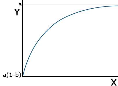 |
Initial plant growth |
| Logistic | [latex]Y=\frac{a}{1+be^{-cx}}[/latex] | 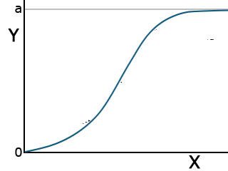 |
Total plant growth |
| Gompertz | [latex]Y=ae^{-bc^{-cx}}[/latex] |  |
Total plant growth |
Summary
Curvilinear Relationships
- Nonlinear (in parameters) which can be linearized Examples: Power curve, Exponential Growth
- Nonlinear not easily transformed Examples: Monomolecular, Logistic, Gompertz
Nonlinear Functions
- Can fit with R NLIN
- Compare models using error SS (or R2 if mean is in model)
- Test for significance with F-test
How to cite this chapter: Mowers, R., D. Todey, K. Moore, L. Merrick, A. A. Mahama, & W. Suza. 2023. Nonlinear Regression. In W. P. Suza, & K. R. Lamkey (Eds.), Quantitative Methods. Iowa State University Digital Press.
A limiting value of some function. A graph of an asymptotic function will show a line approaching but never reaching a certain function.
